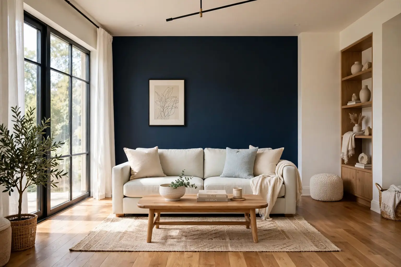
A wall color combination works when the two colors have clear jobs: one sets the mood, the other gives the eye somewhere to rest. Most rooms go wrong not from a bad color, but from two colors fighting for attention, or from a strong shade with nothing calm beside it. The pairs below each name where the colors go, which trim suits them, and what kind of light they need. Test a large painted sample on the wall before you buy a full can. For a sense of how one strong neutral behaves across a whole room, these grey kitchen ideas show grey paired with white, wood, and warm metal in the same careful way.
Key Takeaways
- Give each color a job: one main wall color, one supporting color, and white or wood trim to separate them.
- Put the stronger color on one wall, or on the lower half of the walls, and keep the rest of the room calmer.
- Match the pair to your light: warm pairs suit north facing or dim rooms, while cooler pairs suit bright, sunny rooms.
- Repeat the accent color once more, in cushions, art, or a rug, so the wall color looks planned rather than random.
- Paint a large sample on two walls and check it in morning light, midday light, and evening lamplight before committing.
- Keep ceilings and trim in a simple white or cream unless the pair is designed to wrap the whole room.
1. Warm White Walls With One Navy Accent Wall
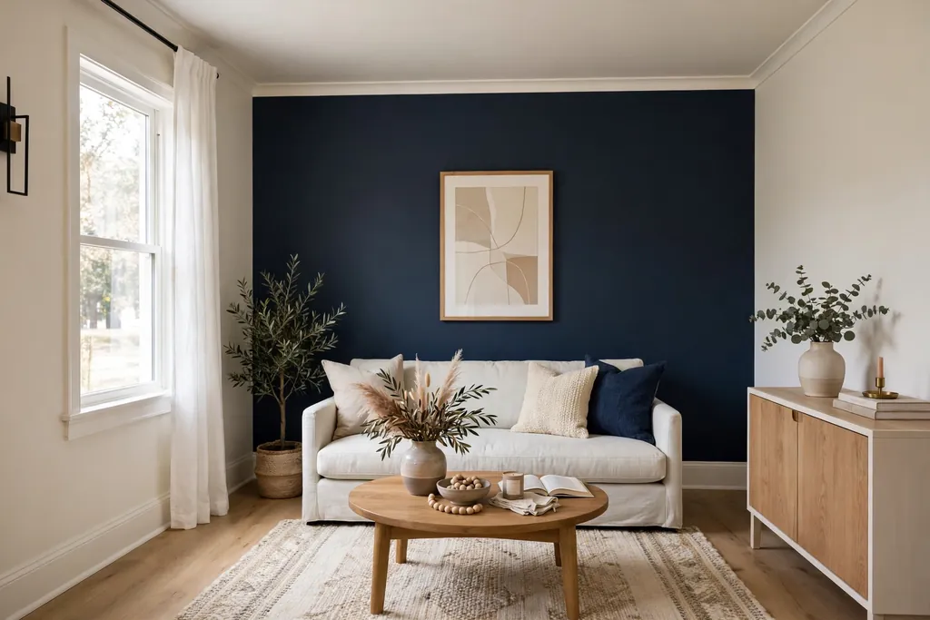
Paint three walls warm white and one wall deep navy for a room with a clear focal point and no dark corners. The navy wall suits the wall behind a sofa or a bed, where furniture already breaks up the surface. Warm white keeps the other walls bright, so the room still feels open even with one dark wall in it.
Use white or cream trim and a pale rug so the navy reads as a backdrop, not a cave. Add the navy once more in a cushion or a throw, and keep the rest of the soft furnishings in warm neutrals. If the room is small or dim, pick a navy with a touch of warmth rather than a cold, inky blue, and keep the ceiling white.
2. Greige on Every Wall With Bright White Trim
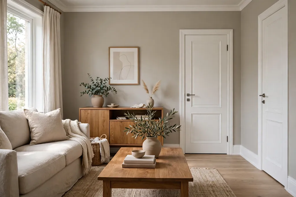
Paint all four walls greige, a blend of grey and beige, and let bright white trim, doors, and ceilings do the crisp work. This is the calmest pair on the list, and it suits a room where furniture, art, or a view should lead. Greige shifts through the day, looking greyer in morning light and warmer at night, which keeps a plain room from feeling flat.
Keep floors and large furniture in warm wood or cream so the greige does not turn cold. Add contrast with black or dark wood frames and one deep toned cushion, since an all neutral room needs at least one darker note. This pair suits renters and cautious painters too, because it works with almost any sofa color.
3. Sage Green and Cream in a Bedroom
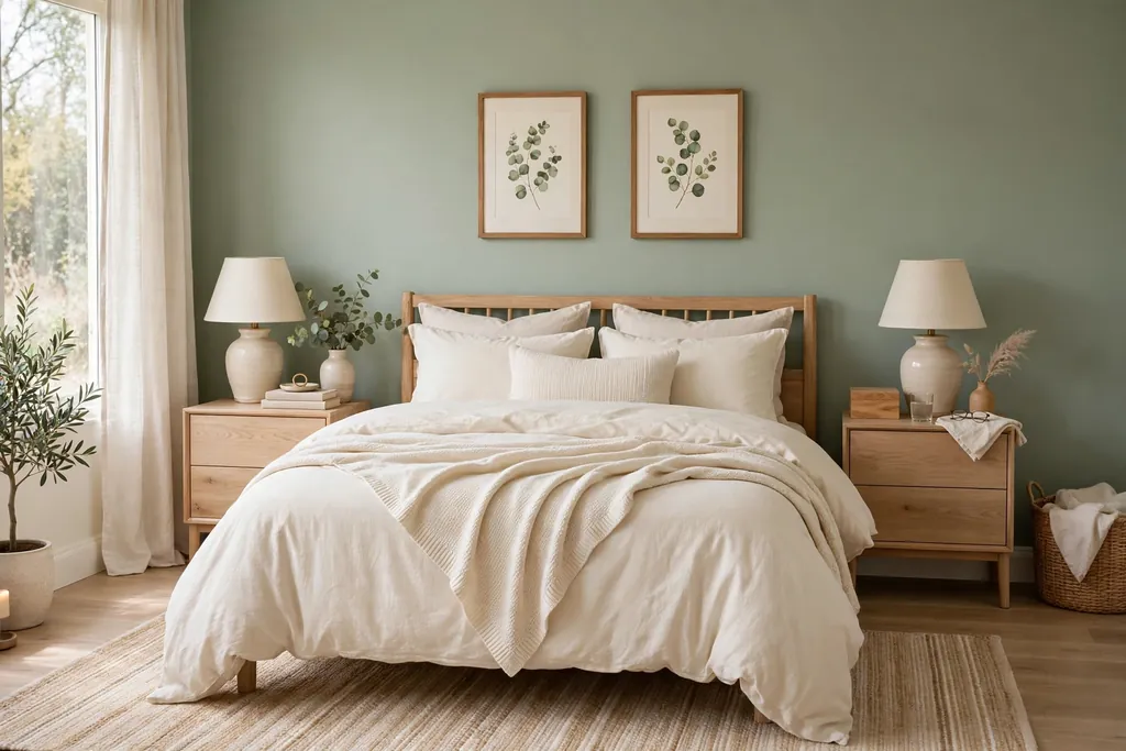
Pair soft sage green walls with cream bedding, curtains, and trim for a bedroom that feels calm without feeling washed out. Sage sits between green and grey, so it reads as a color in daylight and as a soft neutral in the evening. Cream keeps it gentle, while white would make the green look colder by comparison.
Use wood in a light oak tone for bedside tables and frames, and add one deeper green plant or cushion for depth. Keep patterns quiet, such as a plain linen duvet with a single striped throw, so the wall color stays the main note. Sage suits a bedroom with modest daylight, since it does not need strong sun to look clear.
4. Terracotta Feature Wall With Warm White Around It
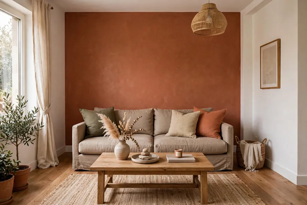
Paint one wall terracotta, a warm clay tone between orange and brown, and keep the other walls warm white. This pair brings warmth fast, and it suits a living room or dining room with wood floors and woven textures. The terracotta wall works best behind a sofa, a sideboard, or a fireplace, where it frames furniture rather than standing empty.
Balance the warmth with cream linen, rattan or light wood, and black or bronze details for contrast. Avoid pairing terracotta with pink toned floors or counters, since the two warm tones can clash. Test the terracotta in evening light too, because warm wall colors deepen a lot under lamps.
5. Charcoal Lower Walls With Pale Grey Uppers
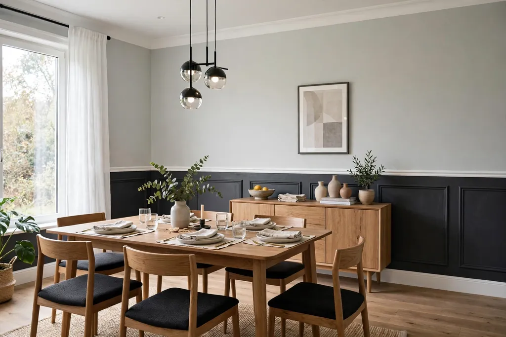
Split the walls at chair rail height: charcoal below, pale grey above, with a white rail between them. This color blocking gives a room depth at floor level and lightness at eye level, which suits a dining room or a hallway where the lower walls take scuffs. The white rail makes the split look deliberate rather than unfinished.
Keep furniture and art above the rail simple, and choose a pale rug so the charcoal does not darken the floor area. This pair needs decent light, so add a mirror or a light toned curtain if the room is dim. Wipe the charcoal section with a washable finish, since the lower wall is the part hands, bags, and pets reach most.
6. Blush Pink and Soft Grey in a Bedroom
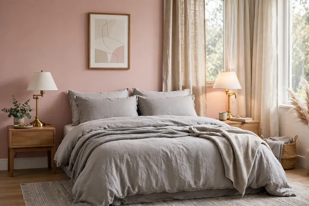
Combine blush pink walls with soft grey bedding, curtains, and upholstery for a bedroom that feels gentle and grown up rather than sweet. Blush reads as a warm neutral when the grey beside it is soft and cool, and the grey stops the pink from feeling too bright. This pair suits a bedroom with good daylight, where blush stays clear instead of turning peach.
Keep wood tones light, use brass or brushed nickel for lamps and handles, and add white for the ceiling and trim. If blush feels like a big step, paint one wall blush and the rest soft grey first, then extend the pink later if you like it. For more ways to use pink as a main color, see these pink kitchen ideas for blush paired with white, wood, and brass.
7. Deep Teal Walls With Warm White and Wood
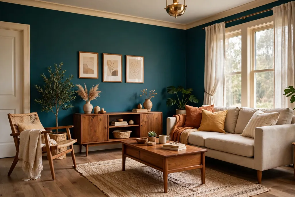
Paint the walls deep teal and set warm white trim, a pale ceiling, and mid wood furniture against them. Teal sits between blue and green, so it feels rich without the heaviness of navy, and the wood warms it up. This pair suits a living room or study with good daylight, where the teal stays clear rather than reading as near black.
Use warm white, not bright white, for trim and curtains, since a cold white can make teal look harsh. Add one warm metal, such as brass in a lamp or frame, and keep the rug in a pale, plain tone so the floor reflects light back up. In a small room, use teal on two walls only and warm white on the rest.
8. Olive Green and Cream With Black Details
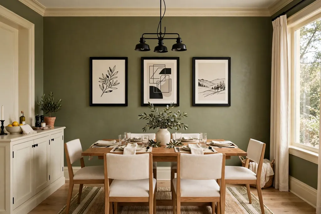
Pair olive green walls, an earthy green with a yellow brown base, with cream trim and black details in frames, handles, and lamp bases. Olive suits a room with warm wood floors and terracotta or clay accents, and the black details stop the earthy tones from looking muddy. Cream keeps the scheme light, while white would fight the warmth of the olive.
Keep patterns simple and natural, such as linen, wood grain, and woven baskets, and add one plant for a fresher green note. Olive can look murky beside cool grey floors, so test it against your flooring first. This pair suits a dining room or a living room where you want color that still feels grounded.
9. Butter Yellow and White for a Sunny Room
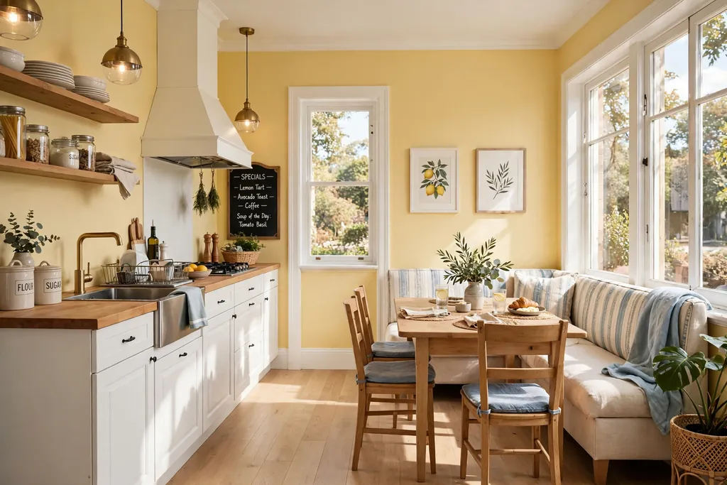
Paint the walls butter yellow, a soft creamy yellow, and pair them with white trim, white curtains, and light wood floors. This pair cheers up a room with limited daylight without shouting, and it suits a kitchen diner or a small living room where you want warmth. The key is restraint: pick a yellow one step paler than the chip you first like, since color looks stronger across four walls.
Keep counters, shelves, and large furniture in white or pale wood so the yellow leads. Add one deeper note, such as a dark wood frame or a green plant, so the room does not feel washed out. Butter yellow can clash with warm orange wood floors, so check samples together before you commit.
10. Dusty Blue and White With Natural Wood
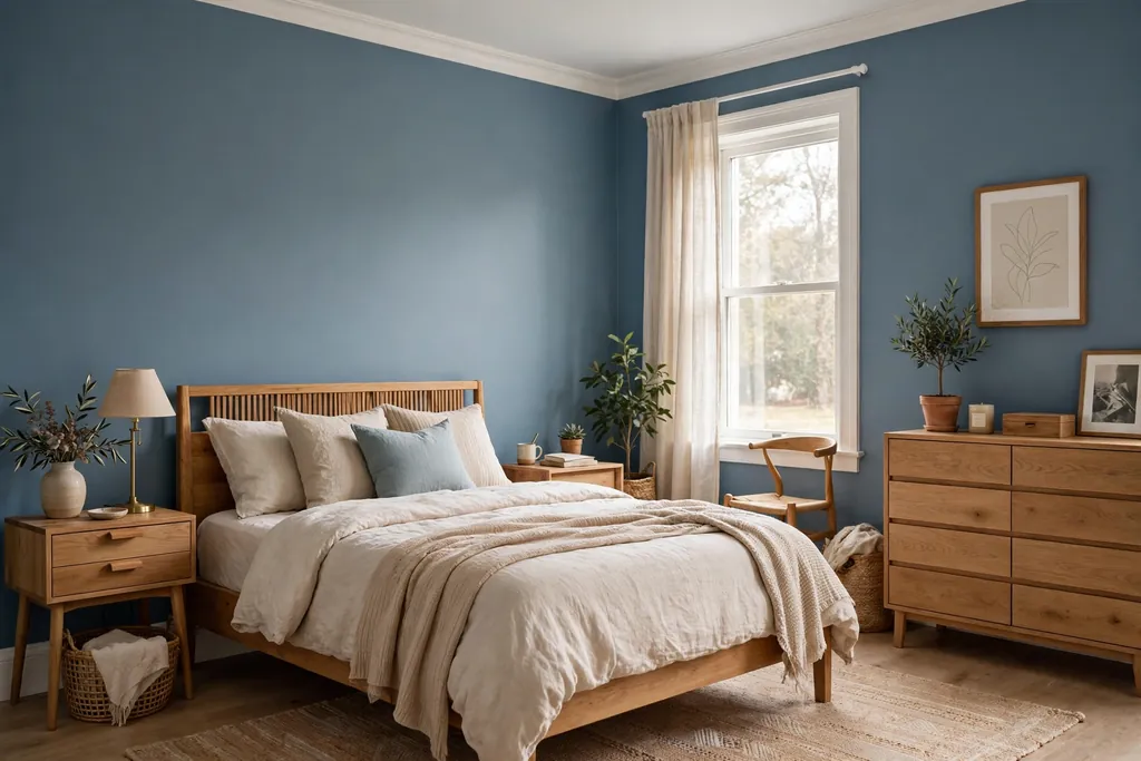
Combine dusty blue walls, a muted blue with a grey cast, with white trim and natural wood furniture for a calm, coastal feeling room. Dusty blue suits a bedroom or living room with decent daylight, where the color stays clear instead of turning grey. White keeps it fresh, and wood stops it from feeling cold.
Use cream or white bedding and curtains, simple black or iron details, and one woven texture such as a jute rug or a rattan basket. Keep strong colors elsewhere limited, because dusty blue can clash with warm orange toned floors; a pale rug can soften that contrast. This is a forgiving pair for a first time accent color, since dusty blue reads as a soft neutral in low light.
11. Warm Taupe and Chocolate Brown Layers
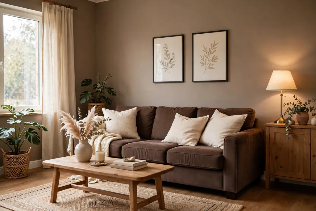
Layer warm taupe walls with chocolate brown in a headboard, a sofa, or a wood stain for a room built on depth rather than contrast. Taupe, a deeper neutral with a brown grey base, feels calm and grounded, while the chocolate note gives the room weight. This pair suits a larger room, where the deeper tones have space to breathe.
Keep the ceiling and trim pale, and add cream linen and one brass or aged bronze detail so the browns do not go flat. Because taupe absorbs light, plan good lamps and a pale rug, and keep the backs of shelves and the insides of bookcases light. This pair suits a bedroom or a living room where you want warmth without a bright color.
12. Black and White With One Warm Wood Tone
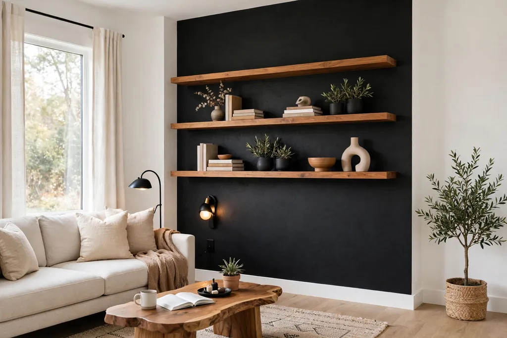
Paint one wall matte black, keep the rest bright white, and bring in one warm wood tone in floors, shelves, or a table. The black wall gives a room a sharp focal point, while the white walls and the wood stop it from feeling stark. This pair suits a modern living room or a study, especially behind a sofa, a desk, or a media unit.
Use a matte or satin black rather than gloss, so reflections do not fight the wall, and keep art on the black wall simple and large. Add warm white bulbs in the evening, since cool light can make black walls feel cold. For help choosing the right undertone for the rest of the room, see these ideas for colors for your kitchen cabinets, which cover how warm and cool tones behave beside wood and white.
13. Soft Lilac Grey and White for a Gentle Color
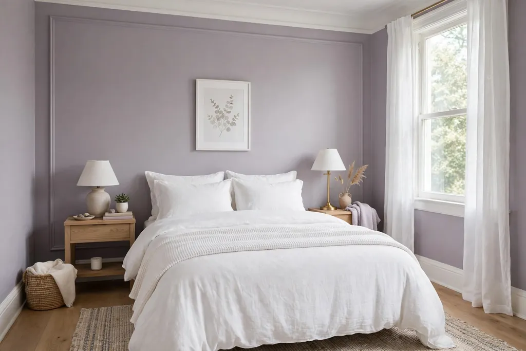
Paint the walls a soft lilac grey, a pale purple grey, and pair them with white trim, white bedding, and silver or chrome details. This pair adds color to a bedroom or a small sitting room without the boldness of a true purple, and it reads as lavender in daylight and as soft grey in the evening. White keeps it light, while cream would warm it too much and blur the lilac note.
Keep furniture in pale wood or white, and add one deeper purple or plum cushion for depth. Avoid pairing lilac grey with strong yellow or orange, since the two can fight; stick to white, silver, and pale wood. This pair suits a room where you want a hint of color that still works with most bedding and art you already own.
14. Match the Pair to the Light in the Room
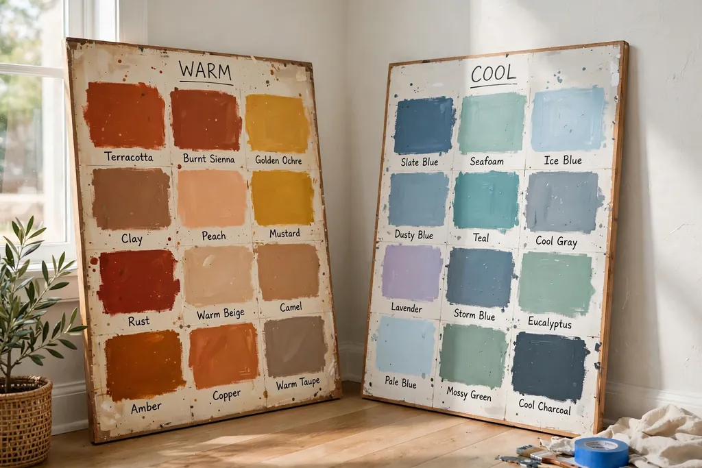
Use the room’s direction as the deciding factor: warm pairs for north facing or dim rooms, cooler pairs for bright south facing rooms. A north facing room gets cool, flat light, so a warm white with terracotta, taupe, or butter yellow will read warmer there than it does on the chip. A bright south facing room can carry cooler pairs, such as dusty blue and white or sage and cream, without them turning cold.
Test this by painting two large sample boards, one for each color, and moving them around the room through the day. Check them beside the floor, the sofa fabric, and the trim, since wall color is judged against those surfaces, not on its own. This step costs little and prevents the most common regret: a pair that looked right in the shop and wrong at home.
Conclusion
A pulled together room rarely comes from one bold wall color alone. It comes from a pair with clear jobs, trim that separates the colors cleanly, and one repeated accent that ties the walls to the furniture. Start with the pair that suits your light, paint large samples, and put the stronger color where it earns its place: one wall, the lower half, or the wall behind the main piece of furniture. Once the walls sit right, the rest of the room gets easier, because cushions, art, and rugs only need to echo a color that is already there.
Save this list on Pinterest for your next painting weekend, and work through it in order: pick the pair for your light first, test samples second, then paint the accent wall before the supporting walls, so you can stop and adjust if the balance feels off.
FAQs
How do I pick a wall color combination for a small room?
Start with a pale main color, such as warm white, greige, or pale sage, and put the stronger color on one wall only. Keep the ceiling white and the trim pale, and repeat the accent color once in soft furnishings. A single dark wall in a small room works when the other walls stay light and the floor is pale or mid toned.
Should the two wall colors be from the same color family?
Not always. Pairs from the same family, such as taupe and chocolate brown, feel calm and layered. Pairs from different families, such as terracotta and warm white or navy and warm white, feel bolder because one color is clearly the accent. The rule that matters is contrast in depth: one color should be clearly lighter than the other.
What trim color works with most wall color combinations?
White or warm white trim works with nearly every pair on this list, because it gives a clean edge between wall colors and furniture. Use bright white with cool pairs, such as dusty blue and white, and warm white with warm pairs, such as terracotta or taupe, so the trim does not fight the walls.
How do I test a wall color combination before painting the whole room?
Paint two large sample boards, at least two feet square, one for each color, and move them around the room for a few days. Check them in morning light, midday light, and evening lamplight, and hold them beside the floor, sofa fabric, and trim. A small chip is not enough, since color looks much stronger across a full wall.
Can I use two strong wall colors in one room?
Yes, if one of them is limited to a single wall or a lower wall section, and the other is balanced with pale trim, a light ceiling, and plain furniture. Two strong colors across all four walls usually fight each other, so give the stronger color a clear boundary, such as a chair rail, a corner, or one feature wall.
Do wall color combinations need to match the floor?
They need to sit well beside the floor, not match it exactly. Warm floors suit warm wall pairs, such as terracotta, taupe, and butter yellow, while cool grey floors suit cooler pairs, such as sage, dusty blue, and greige. When in doubt, hold a sample beside the floor in daylight and check whether the undertones agree.