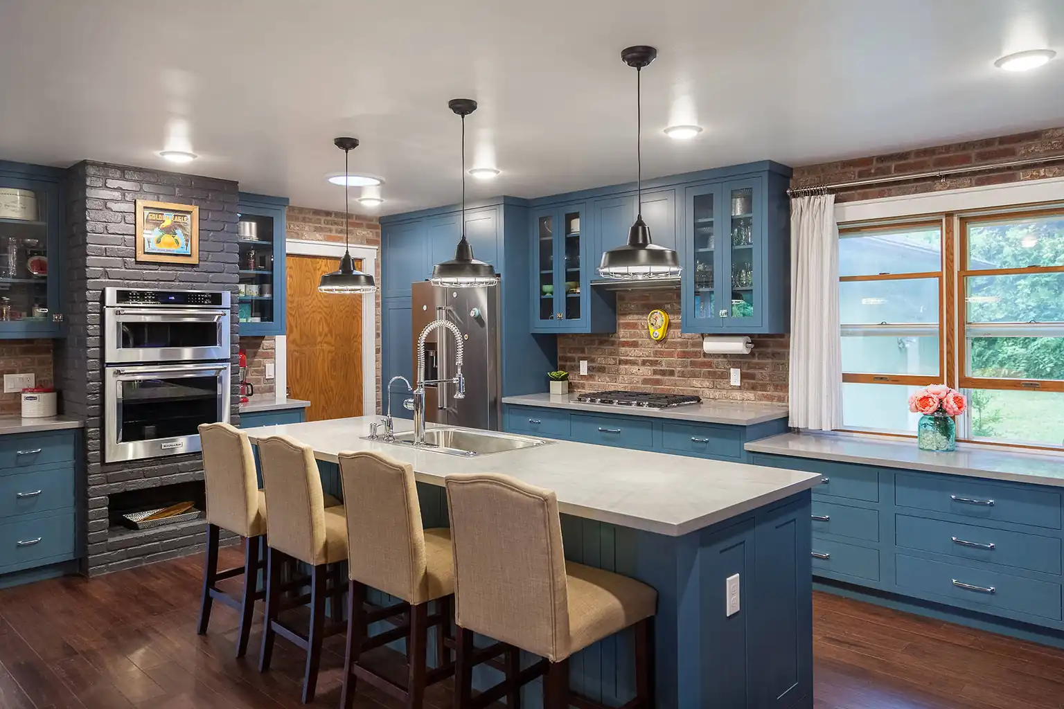
Cabinet color sets the mood of a kitchen more than any other single choice, because the cabinets cover the largest area in the room. This list of 30 colors for your kitchen cabinets runs from warm whites and soft neutrals to navy, forest green, burgundy, and stained wood tones. Each idea names the undertone to watch for, the counters, metals, and wall colors it pairs with, and one care note from daily use. Paint a large sample board first and live with it in morning and evening light before you commit to a full set of doors.
Key Takeaways
- Start with undertone, not the color name. Warm undertones suit north facing rooms, while cool undertones can look crisp in bright, sunny kitchens.
- Mid tone colors such as greige, stone gray, and sage hide everyday marks better than very pale or very dark cabinets.
- Pair dark cabinets with pale counters and good task lighting so the room stays easy to work in.
- Stained wood tones like walnut and natural oak bring warmth without paint, but they need protection from water and steam near the sink.
- Always test a large sample on a door or board and check it beside your floor, counters, and appliances before ordering paint or cabinets.
1. Classic White
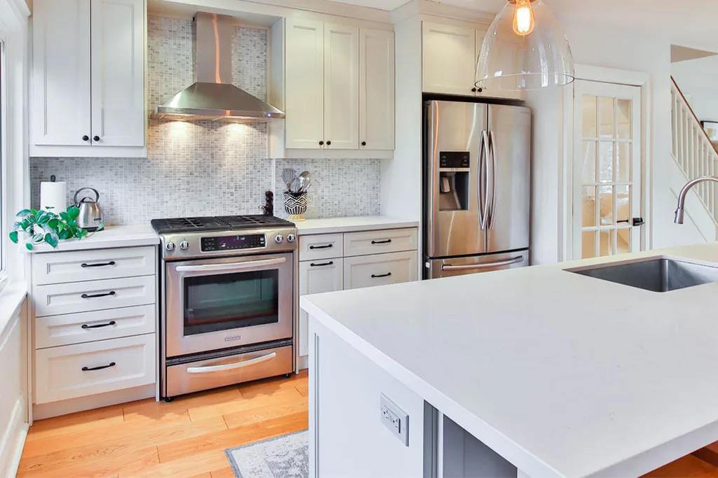
A clean warm white keeps a kitchen bright and makes small rooms feel less crowded. Choose a white with a slight warm undertone so it does not turn blue beside stainless steel appliances. It pairs with almost any counter, from pale stone to dark wood, and with chrome, nickel, or black handles. The trade off is upkeep: white shows crumbs, splashes, and scuffs quickly, so pick a washable satin or semi gloss finish and wipe doors near the stove each week.
2. Creamy Off-White
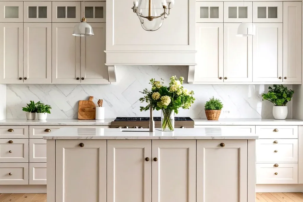
Creamy off-white softens the look of classic white and suits kitchens that get cool or limited daylight. Its yellow beige undertone pairs well with wood counters, cream tiles, and brass or bronze handles. Keep nearby whites, such as ceilings and appliances, in the same warm family, because a blue white appliance panel can make cream cabinets look dingy by comparison. Cream hides light dust better than bright white, but cooking splashes still show, so a washable finish matters here too.
3. Soft Greige
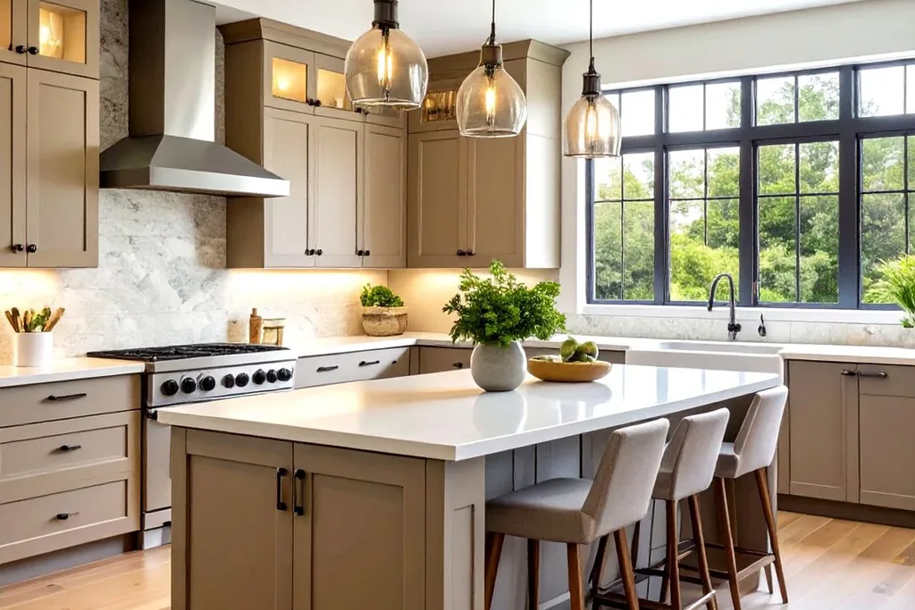
Greige blends gray and beige, which makes it one of the most flexible colors for your kitchen cabinets when you cannot decide between warm and cool. It bridges stainless appliances and warm wood floors in the same room. Pair it with white counters and black or brushed nickel handles for a calm, current look. Greige can shift tone during the day, looking gray in the morning and beige at night, so check a large sample in both lights before you order.
4. Warm Taupe
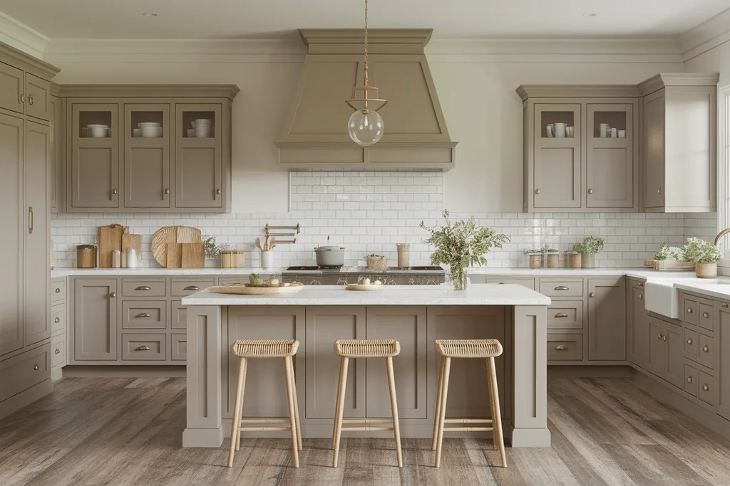
Warm taupe is a deeper neutral with a brown gray base that feels calm and grounded. It works well in larger kitchens where white might feel stark, and it pairs with cream tiles, pale counters, and aged brass handles. Taupe hides everyday marks better than pale colors, which suits busy family kitchens. Because it absorbs light, keep the walls and backsplash pale and plan good under cabinet lighting for food prep areas.
5. Light Gray
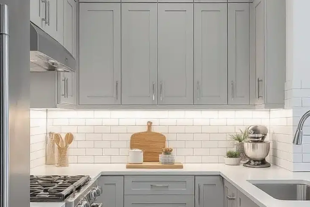
Light gray gives a cool, orderly feel and sits comfortably with stainless steel, chrome, and white counters. It is a safe partner for gray toned floors and stone look surfaces. In a north facing room it can turn chilly, so warm it up with wood shelves, a wood floor, or warm white walls. Light gray shows less dust than white but still marks near handles, so choose a smooth, wipeable paint finish.
6. Charcoal Gray
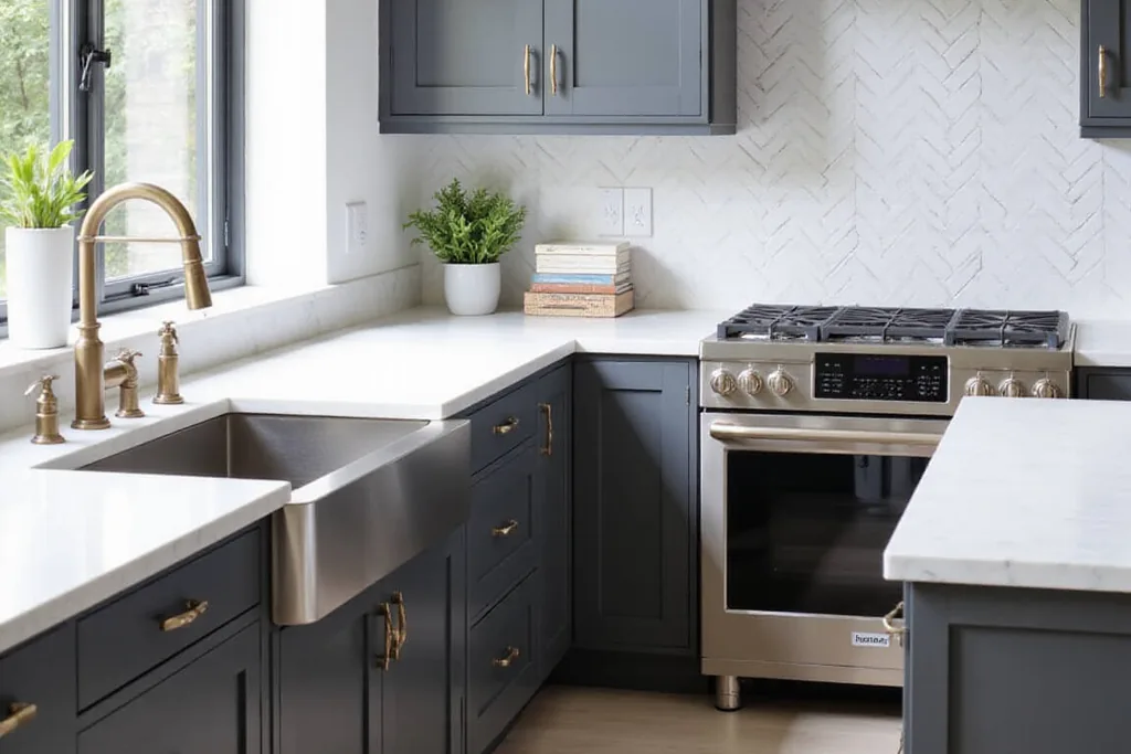
Charcoal is a strong, near black gray that hides scuffs and cooking marks better than most pale colors. Use it on all cabinets in a bright kitchen, or on lower cabinets and an island with pale uppers in a smaller room. Pale counters and a light backsplash keep the contrast clear and stop the space feeling heavy. Charcoal shows light dust and flour, so expect a quick wipe of the doors near your main prep area.
7. Matte Black
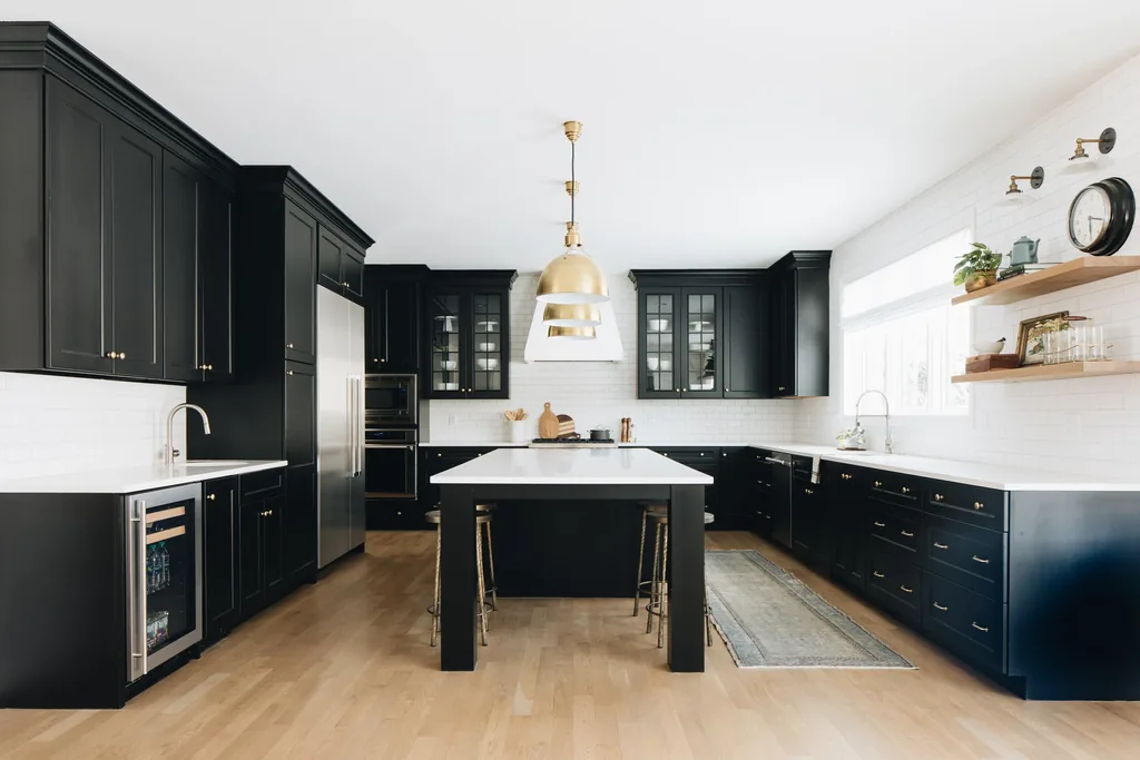
Black cabinets make a bold, simple statement and pair well with white counters, pale wood, and warm metals such as brass. A matte or satin finish looks softer than gloss and hides fewer reflections, but black shows fingerprints, dust, and water spots clearly, especially around handles and the sink run. Choose black when you are happy to wipe doors often, and add strong task lighting so the dark fronts do not swallow detail at night.
8. Navy Blue
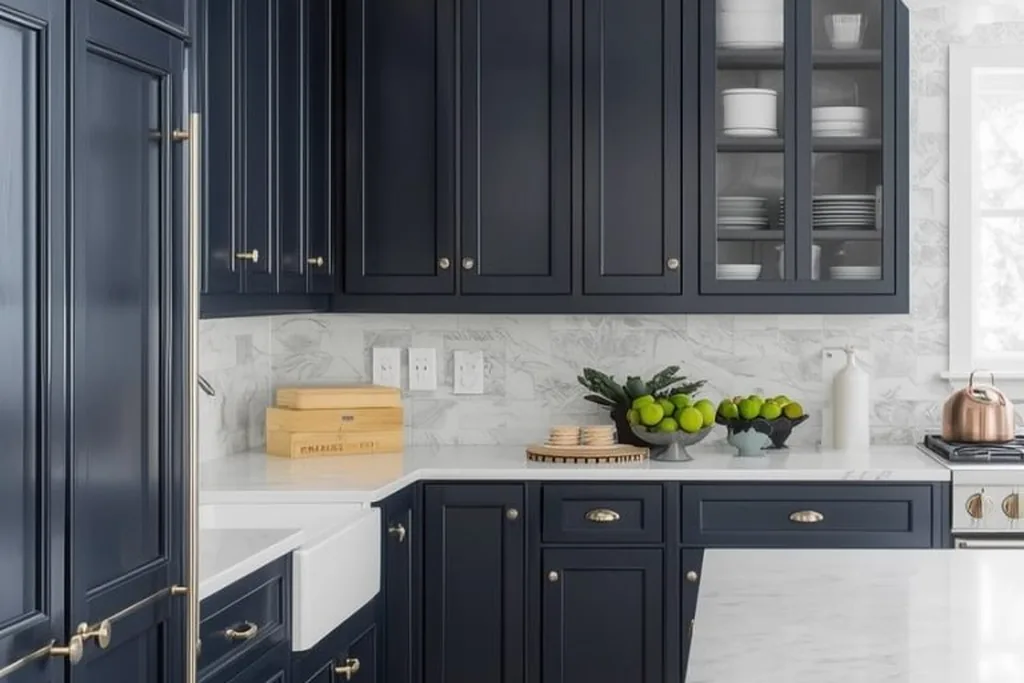
Navy is the classic deep blue for cabinets, formal enough for traditional doors and simple enough for flat fronts. Its cool undertone pairs with white or pale stone counters, marble look tiles, and brass or gold tone handles. Navy hides marks well and reads almost neutral once the room is dressed. In a low light kitchen it can look close to black, so test it beside your floor and keep walls and counters pale for balance.
9. Slate Blue
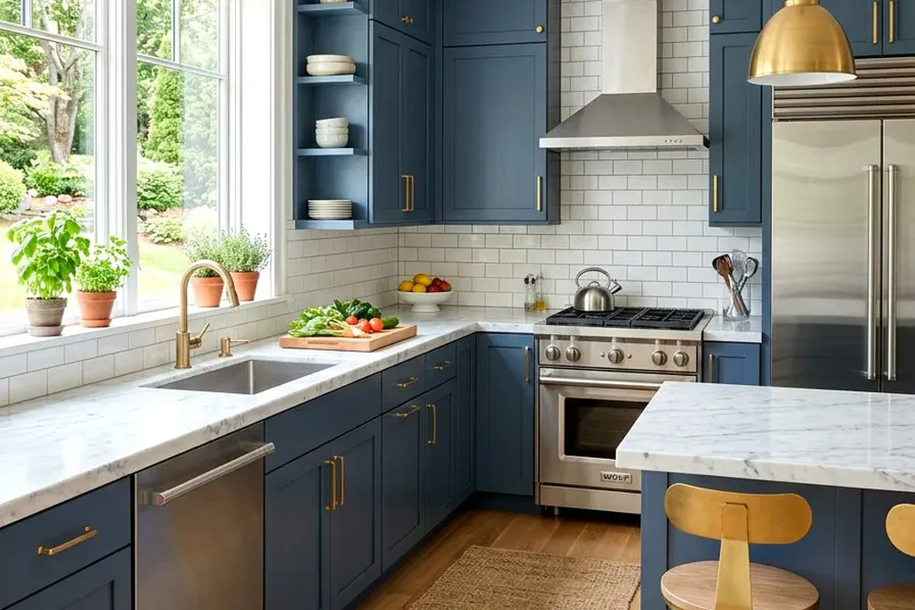
Slate blue mixes blue with gray, which calms the color down and makes it easier to live with than a brighter blue. It pairs with chrome or nickel handles, pale wood, and white counters, and it suits both coastal and modern rooms. The gray in the mix can turn dull under yellow lighting, so check it under the bulbs you actually use. Slate hides mid level marks well and needs only routine wiping.
10. Dusty Blue
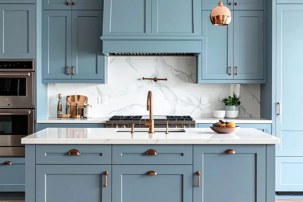
Dusty blue is a muted, softened blue with a gray cast that gives a cottage or vintage feel. Pair it with cream counters, wood shelves, and simple black or iron handles. It works best in kitchens with decent daylight, where the color stays clear instead of turning gray. Keep strong colors elsewhere in the room limited, because dusty blue can clash with warm orange toned floors; a pale rug or runner can soften that contrast.
11. Deep Teal
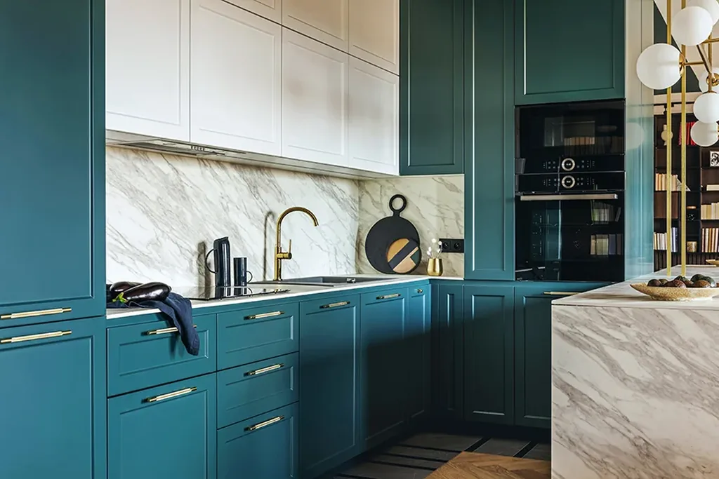
Deep teal sits between blue and green and gives cabinets a rich, jewel like depth. It pairs with warm metals, white tiles, and pale counters that reflect light back into the room. Teal is a confident choice for a full run of cabinets, and it also works on an island with neutral cabinets around it. It shows dust more than mid greens do, and small chips in paint stand out on dark colors, so keep touch up paint from the same batch.
12. Forest Green
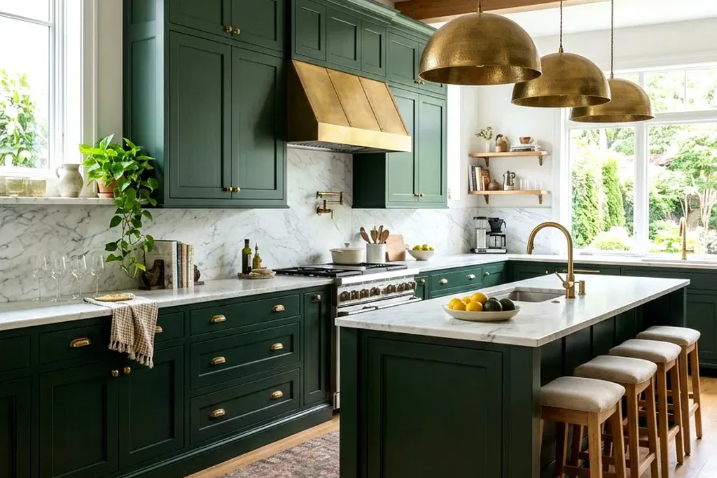
Forest green is a deep, traditional green that suits shaker and framed cabinet doors. Brass handles, pale stone counters, and a white or cream backsplash keep it from feeling dark. Its depth hides cooking marks well, which helps near the stove. Forest green needs reasonable light: in a small, windowless kitchen it can read almost black at night, so pair it with pale walls and plan bright, warm task lighting over counters.
13. Sage Green
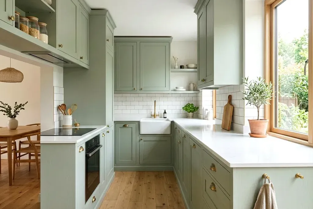
Sage is a soft gray green that feels calm and works with many materials, which is why it suits so many kitchens. Pair it with light oak shelves or counters, cream tiles, and black or brushed nickel handles. Sage hides light marks better than white and is gentle in both bright and modest light. Watch the undertone in your sample: some sage paints lean blue, others lean yellow, and the difference shows clearly beside your floor.
14. Olive Green
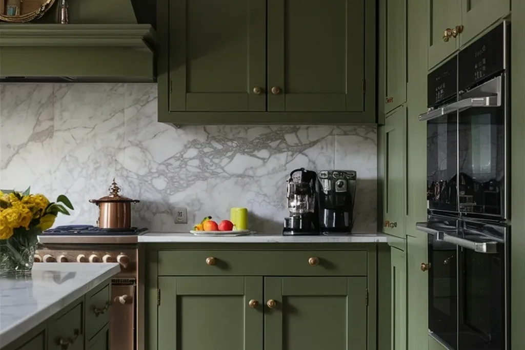
Olive brings an earthy, mid tone green with a yellow brown base. It pairs with terracotta or clay accents, black handles, and warm wood, and it suits rustic and Mediterranean leaning rooms. Olive can look murky beside cool gray floors, so test it against your flooring first. It hides everyday splashes well, and a satin finish keeps the color clear without the glare that gloss can add on large door fronts.
15. Pale Eucalyptus
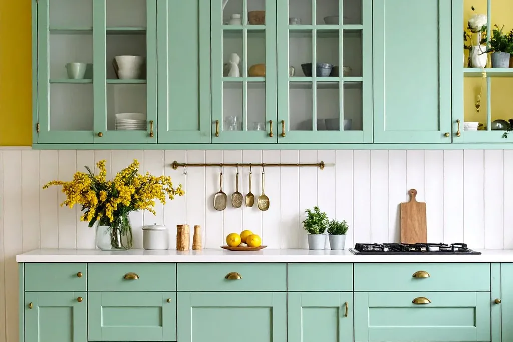
Pale eucalyptus is the lightest option in the green family, a soft green gray that brightens a room almost like white but with more character. Pair it with chrome or nickel handles, pale wood, and white counters for a fresh, quiet scheme. Because it is so pale, it shows marks much like white does, so a washable finish and regular wiping near the stove are worth planning. Check that it does not read as plain gray under your lighting.
16. Burgundy
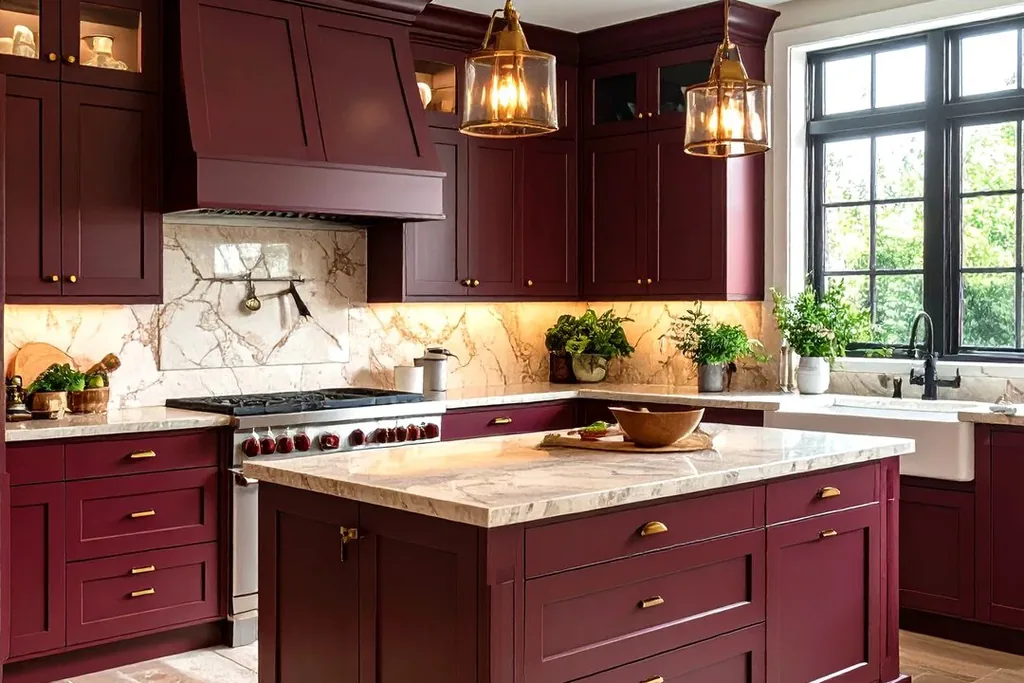
Burgundy is a deep wine red that gives traditional kitchens a formal, settled feel. It pairs with cream or pale stone counters, warm wood, and brass or antique bronze handles. Burgundy is strong, so in a small kitchen you might use it on lower cabinets or an island and keep uppers pale. Dark red shows dust and dried water spots, and sunlight can shift red paints over time, so keep windows in mind when you place the strongest color.
17. Brick Red
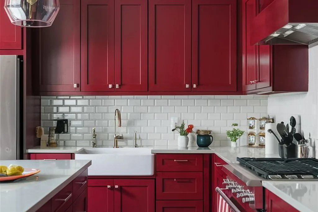
Brick red is a muted, earthy red softened with brown, which makes it easier to live with than a bright primary red. It fits farmhouse and rustic kitchens and pairs with wood counters, cream tiles, and black or iron handles. Use it where you want warmth without dark heaviness. Like other reds, it can fade unevenly in strong sun, and it shows pale dust, so a mid sheen, wipeable finish is the practical choice.
18. Terracotta
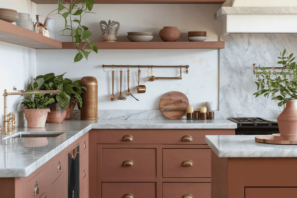
Terracotta is a warm clay color between orange and brown that suits sunny, Mediterranean leaning kitchens. Pair it with cream tiles, pale counters, and black or aged bronze handles, and let wood and woven textures support the earthy feel. Terracotta can fight with pink toned floors or counters, so lay samples beside both before deciding. It hides dust and light soil well, which makes it a forgiving choice for a busy cooking space.
19. Blush Pink
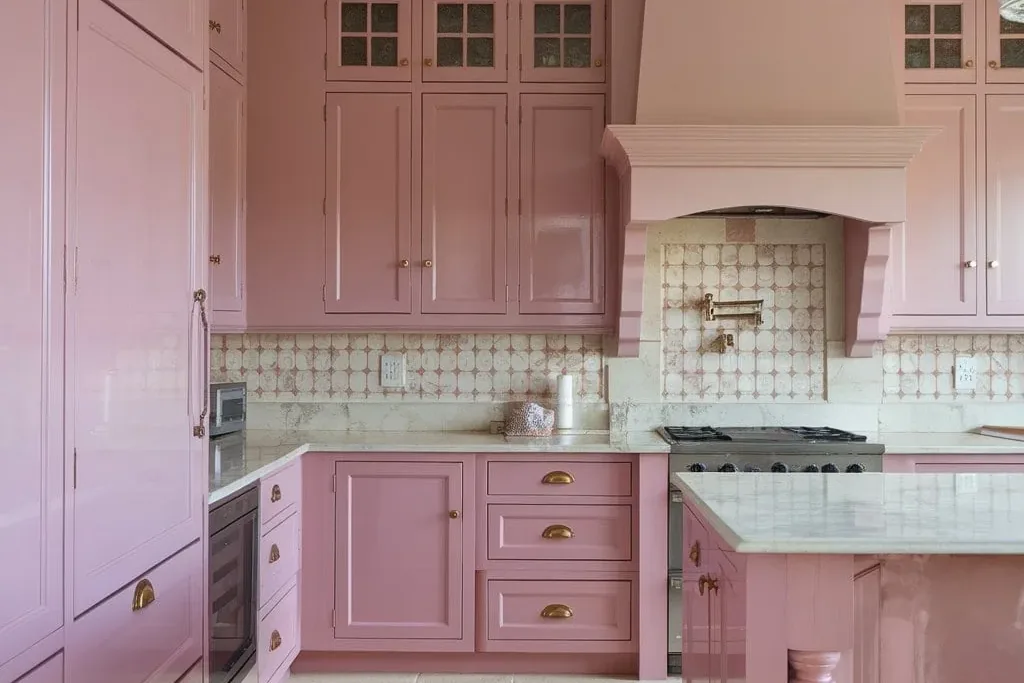
Blush is a soft, pale pink that reads gentle rather than sweet when the rest of the room stays neutral. Pair it with white counters, brass handles, and pale wood, and keep appliances and walls simple. A satin finish keeps blush looking clean and avoids a chalky effect. Blush shows scuffs like other pale colors, and strong sun can make some pinks fade, so test the sample on the wall run that gets the most daylight.
20. Butter Yellow
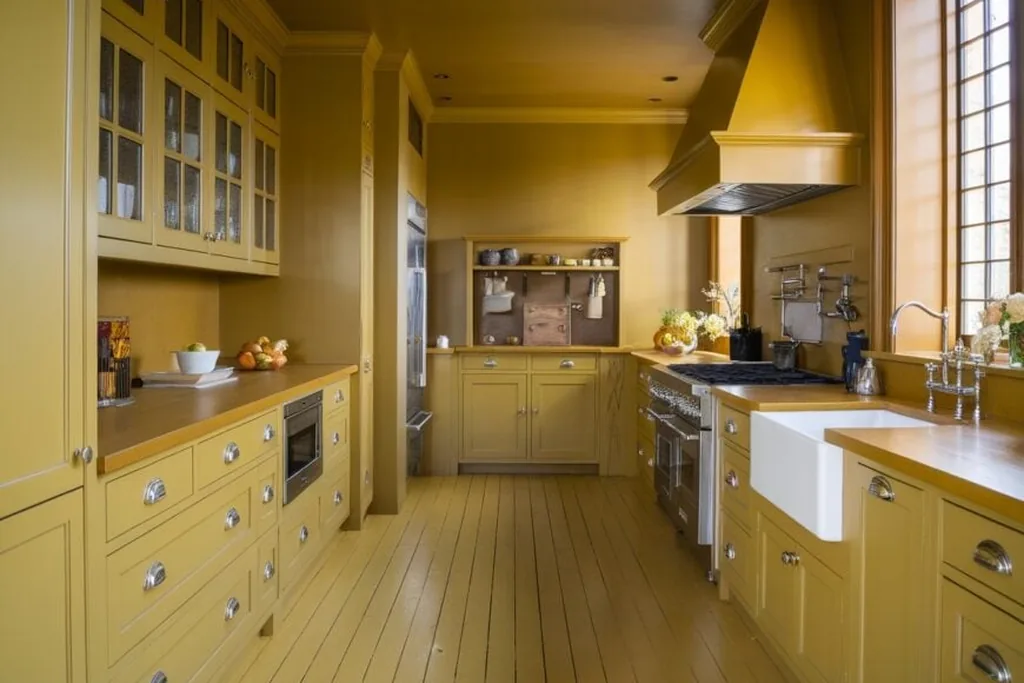
Butter yellow is a soft, creamy yellow that cheers up a kitchen with limited daylight without shouting. Pair it with white tiles, light wood, and simple chrome or black handles. The key is restraint in the sample: colors look stronger over a full run of cabinets, so choose a shade one step paler than the chip you first like. Butter yellow can clash with warm orange wood floors, so check them together before you commit.
21. Mustard Ochre
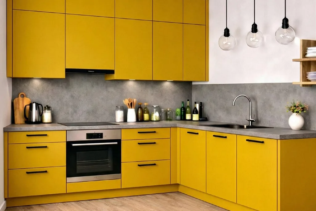
Mustard ochre is a deeper, golden yellow with a retro character that suits mid century and eclectic kitchens. Pair it with black handles, dark or pale counters, and warm wood to ground the color. Mustard is demanding: it reflects onto nearby walls and can make whites look yellow, so keep surrounding whites warm in tone. Use it in a room with decent light, and expect it to show cooking splashes much like other mid tones.
22. Sand Beige
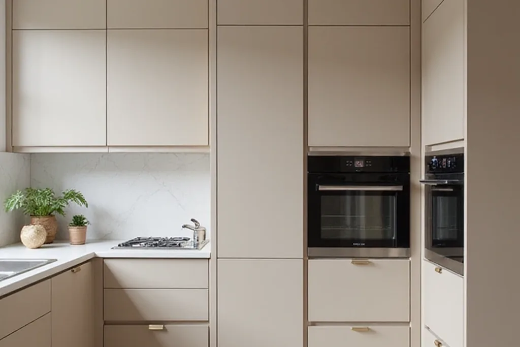
Sand beige is a light, warm neutral that sits between cream and pale brown. It is a good step away from white when you want softness and better hiding power for everyday marks. Sand pairs with white counters, wood shelves, and almost any handle metal, from chrome to black. Its weakness is that it can look flat under weak lighting, so add contrast with a darker handle, a patterned runner, or wood accents at counter level.
23. Walnut Brown
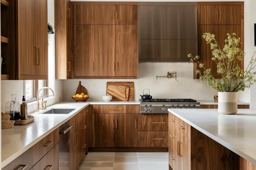
Walnut is a rich mid brown stain that shows the wood grain, giving cabinets warmth and depth without paint. It suits both traditional and modern flat doors, and it pairs with pale counters, cream tiles, and black or brass handles. Match the stain tone to your floor carefully: walnut beside a similar brown floor can blur together, so aim for clear contrast. Keep water from sitting on the finish near the sink, and wipe steam away after boiling.
24. Espresso Brown
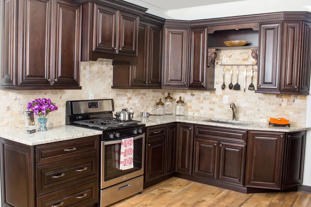
Espresso is a very dark brown, stained or painted, that reads almost black in low light but warmer up close. It pairs with pale counters, light walls, and warm metals, and it gives a formal feel to larger kitchens. Espresso shows dust, flour, and fingerprints clearly, so it suits households that wipe doors often. Strong under cabinet lighting helps separate dark cabinets from dark floors and keeps prep areas practical.
25. Natural Oak
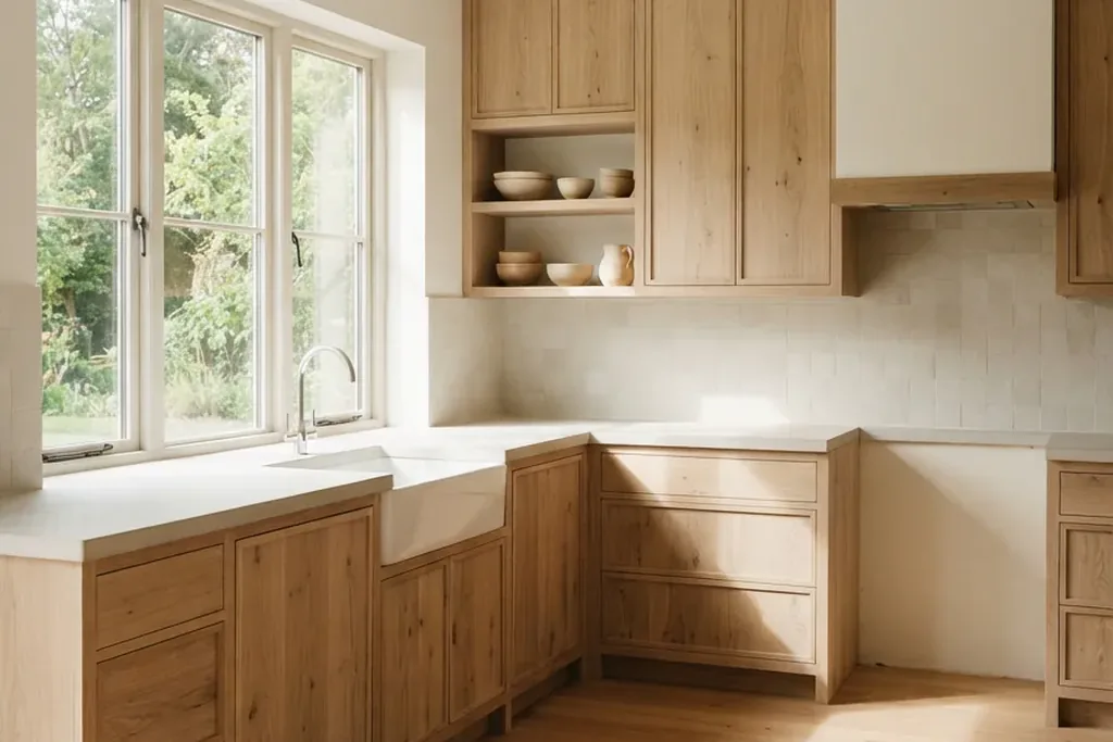
Natural oak keeps the light, honey toned look of the wood with a clear or pale finish. It is central to Scandinavian style kitchens and pairs with white walls, pale counters, and simple black or steel handles. Oak brings pattern through its grain, so keep other patterns in the room quiet. Protect it well around the sink and dishwasher, because water marks show on light wood, and expect the tone to deepen slowly with age and light.
26. Plum
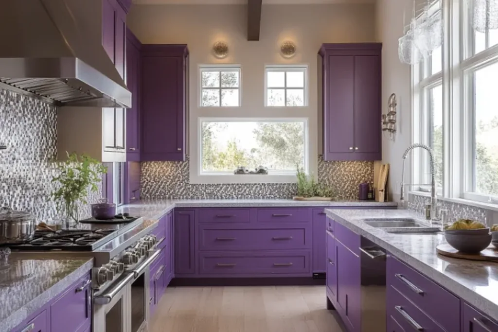
Plum is a deep purple with red and blue in balance, dramatic but softer than black. Pair it with pale counters, silver or chrome handles, and light walls so the color stays the clear feature of the room. In a small kitchen, plum on an island or a single run is easier to balance than a full set. Dark purple shows dust and chips stand out on it, so store touch up paint and wipe fronts regularly.
27. Coral
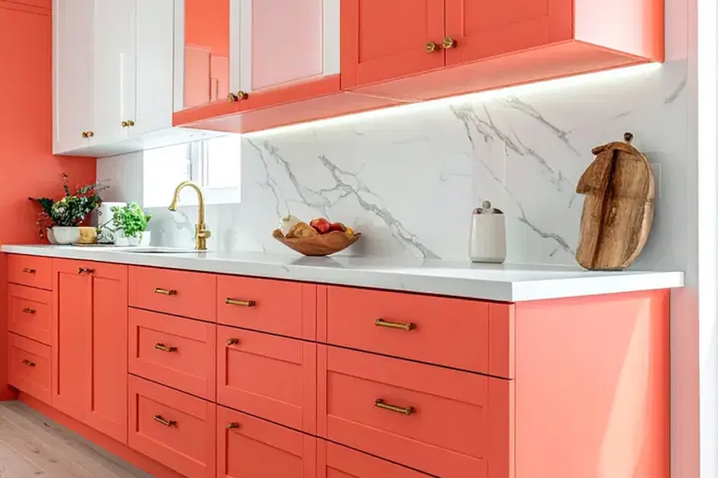
Coral is a warm mix of pink and orange that gives a kitchen energy and suits coastal or retro schemes. Pair it with white counters, light wood, and simple handles, and let it be the one strong color in the room. Coral looks brighter across large door fronts than on a small chip, so sample generously and check it in evening light. It shows marks like other mid tones and benefits from a smooth, washable satin finish.
28. Ink Blue
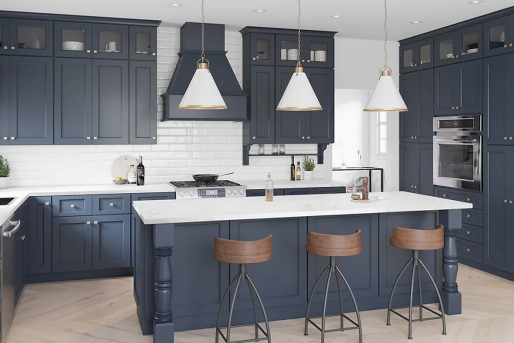
Ink blue is a blue so deep it borders on black, but with a softer edge than true black in daylight. It pairs with brass or chrome handles, pale counters, and warm wood floors, and it hides scuffs and cooking marks well. Ink blue suits homeowners who want dark cabinets with a hint of color. Expect dust and fingerprints to show, as with black, and plan lighting that keeps the blue visible rather than letting it fall to flat black at night.
29. Stone Gray
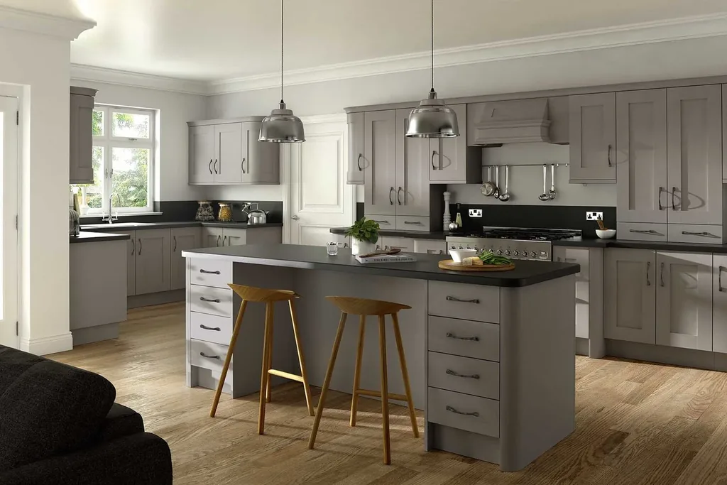
Stone gray is a mid gray with a slight warm cast, deeper than light gray and easier than charcoal. It is one of the most forgiving colors for your kitchen cabinets in daily use, hiding dust and light soil well. Pair it with white or wood counters and either black or brushed metal handles. Test the undertone beside your floor and counters, because stone gray can lean green or purple next to strong colors.
30. Mushroom
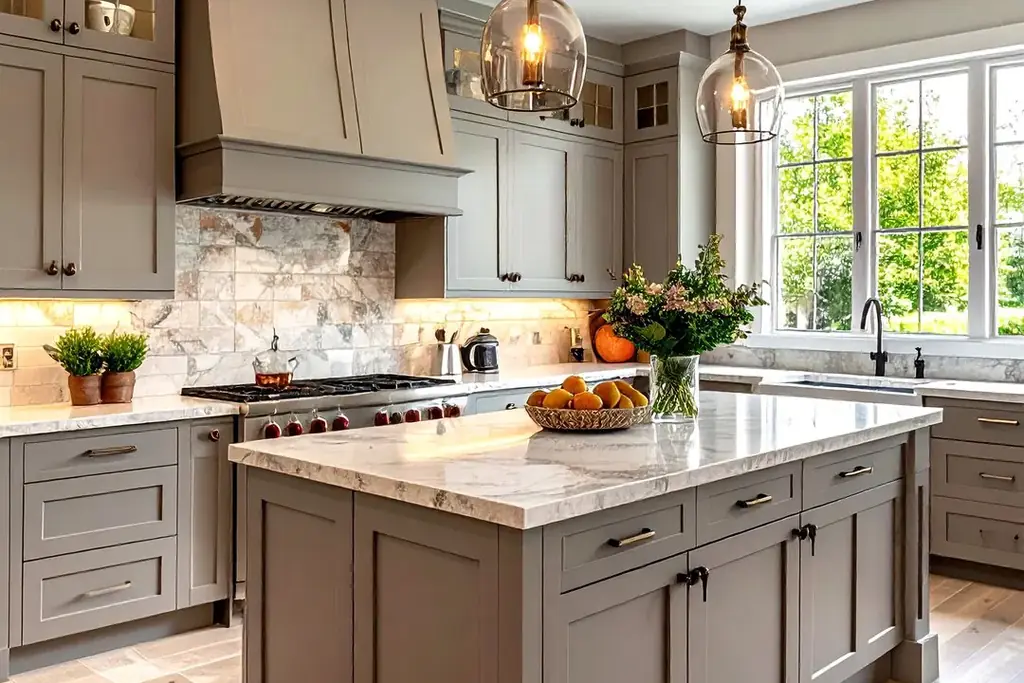
Mushroom is a warm gray brown, deeper than greige and softer than taupe, named for the color it copies from nature. It pairs with cream walls, pale counters, black or brass handles, and wood accents, and it works in both country and modern kitchens. Mushroom hides everyday marks well and changes gently with the light, from gray in the morning to warm brown by evening. Sample it beside your floor to be sure the warmth levels match.
Conclusion
The right cabinet color is the one that fits your light, your floor, and how much upkeep you accept, not simply the one that looks best on a small sample chip. Narrow this list to three colors, paint large boards, and live with them beside your counters for a few days. Warm neutrals such as greige, sand, and mushroom are the easiest starting point, while navy, forest green, and ink blue give depth without the full weight of black. Once your color is chosen, the same care with samples applies to handles, counters, and wall paint. For the table that sits beside the kitchen, the same color discipline helps with everyday dining table decor, and seasonal schemes such as these thanksgiving kitchen decor ideas show how one cabinet color can carry a whole room.
Save this list on Pinterest while you collect sample boards, and compare your three finalists in the same light before you order paint or doors.
FAQs
What is the most practical cabinet color for a busy kitchen?
Mid tone colors are usually the most practical, because they hide dust, splashes, and light scuffs better than very pale or very dark cabinets. Greige, stone gray, sage green, and mushroom are good starting points. Finish matters as much as color: a satin or semi gloss paint in a washable formula wipes clean more easily than a flat matte finish, especially on doors near the stove and sink.
How should I test a cabinet color before painting?
Paint a large sample board or one spare door, not just a small chip, and move it around the kitchen. Check it in morning light, midday light, and under your evening bulbs, and hold it beside the floor, counters, and appliances it will live with. Colors look stronger and darker across a full run of cabinets than on a small sample, so if you are torn between two shades, the paler one is usually the safer test. For more examples of colors shown in real kitchen settings, browse the kitchen paint color pages from Benjamin Moore before you order samples.
Do dark cabinets make a kitchen look smaller?
Dark cabinets can make a small, low light kitchen feel heavier, but they do not have to. Pale counters, a light backsplash, and keeping walls light will hold the balance, and using the dark color only on lower cabinets or an island is a common compromise. Good task lighting also matters: a well lit dark kitchen feels larger than a dim pale one. If your room has a large window, a full run of dark cabinets is easier to carry.
Which cabinet colors suit a north facing kitchen?
North facing rooms get cooler, flatter light, so warm undertones usually work better. Creamy off-white, butter yellow, warm taupe, sand beige, and mushroom all add visual warmth, while cool light grays and blue grays can turn chilly. Whatever color you like, test it in the room itself, because north light can also make colors look grayer and duller than they appear in a store or in photos online.
Are painted or stained cabinets easier to maintain?
Painted cabinets are easier to change later and simple to touch up if you keep leftover paint from the same batch, but chips can show a different color underneath on dark paints. Stained cabinets show the grain, so small marks blend in more easily, but changing the color later means stripping or sanding. Both need water wiped away promptly near the sink and dishwasher to protect the finish.
Can I use two cabinet colors in one kitchen?
Yes. A common approach is a deeper color on lower cabinets or the island and a pale color on uppers, which keeps the room light while adding contrast. Pick the two colors from the same undertone family, such as navy below and warm white above, and repeat each color somewhere small in the room, like handles or stools, so the split looks planned rather than accidental.