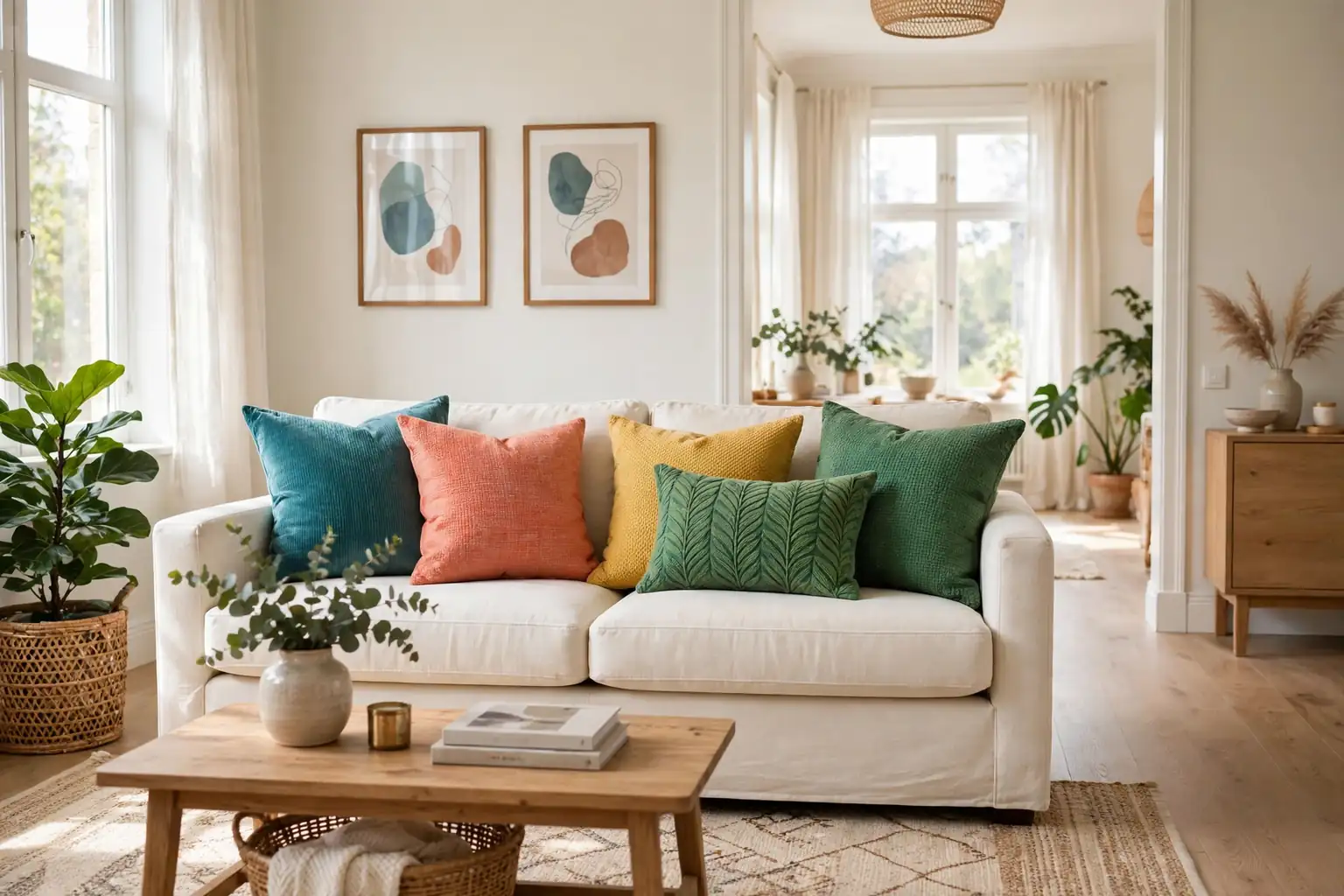
Colorful throw pillows brighten a living room fastest when you start with a plain sofa, pick two or three main colors, and repeat each color at least twice. Mix one strong pattern with plainer pillows, vary sizes from large to small, and leave clear seat space so the room looks lively and feels comfortable to sit on.
A plain sofa is a good starting point for color, because pillows can change the whole mood of the room in an afternoon. The ideas below move from simple solid color blocks to prints, color techniques, and ways to link pillows to the rest of the room. You can try one idea, such as a rainbow gradient, or combine two or three, such as jewel velvet with a plain anchor and one bright repeat in a throw. For a seasonal textile refresh that pairs well with a pillow change, see these fall living room decor ideas.
Key Takeaways
- Start with a plain sofa and pick two or three main colors, then repeat each color at least twice.
- Mix one strong pattern with plainer pillows so the arrangement looks lively, not busy.
- Vary pillow sizes from large at the back to small at the front for depth.
- Use texture, such as velvet, linen, and knit, to add interest without adding more colors.
- Repeat one bright color in a throw, rug, or piece of art so the pillows link to the room.
- Leave clear seat space and check the arrangement from the doorway before you finish.
1. Bold Solid Blocks on a Neutral Sofa
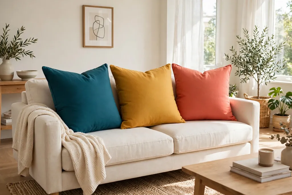
Set large solid pillows in strong colors against a cream, grey, or beige sofa, with no pattern at all in the first layer. Solid blocks are the clearest way to add color, because the eye reads each color at once and the sofa stays calm underneath. Try three colors, such as teal, mustard, and coral, with two pillows in each color or one of each color repeated on both sides.
Keep the pillow shapes simple, all square or one lumbar shape at the center, so color stays the focus. If the sofa is patterned, use solid pillows in colors drawn from that pattern instead, so the pillows calm the sofa rather than compete with it. Step back from the doorway to check that no one color looks heavier than the others, and swap a pillow from side to side until the weight feels even.
2. Jewel Tone Velvet Pairing
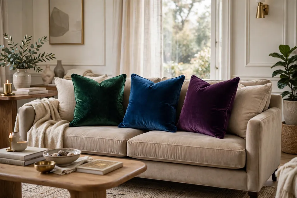
Pair deep jewel tones, such as emerald, sapphire, ruby, and plum, in velvet covers for a rich look that still suits everyday sitting. Velvet catches light, so jewel colors look deeper on velvet than on flat cotton, and two or three jewel pillows can carry a whole sofa. Use larger velvet pillows at the back and one smaller velvet pillow at the front, with a plain linen pillow beside them to keep the group from looking heavy.
This pairing suits a living room with dark wood, brass, or deep wall color, where the pillows can echo tones already in the room. Keep the rest of the palette quiet, with cream or charcoal as a base, so the jewel tones stand out. Brush velvet covers lightly to keep the pile even, and keep them out of strong direct sun if the color matters to you, since sun can fade deep dyes over time.
3. Rainbow Gradient Across the Sofa
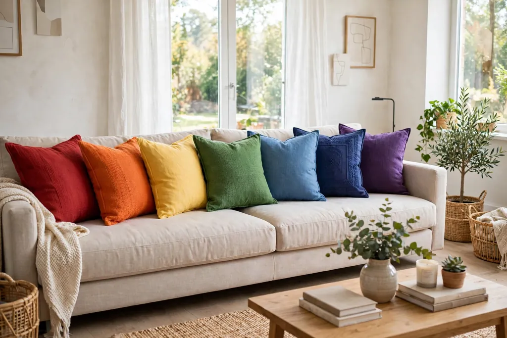
Arrange pillows in rainbow order from one end of the sofa to the other, such as red, orange, yellow, green, blue, and purple, with each color in a similar solid cover. A gradient works because the order is clear, so even six strong colors read as one planned idea rather than six separate choices. Use the same pillow size and fabric for the gradient row, so the color change is the only change the eye has to follow.
Place the gradient on a long sofa or sectional, where there is room for five or six pillows without crowding the seats. On a shorter sofa, use a shorter run, such as yellow, green, and blue, or red, orange, and pink, and repeat the first color at the far end to close the loop. Keep the rug, curtains, and art plain while the gradient is in place, so the sofa stays the clear color story in the room.
4. Sunset Palette in Terracotta, Mustard, and Coral
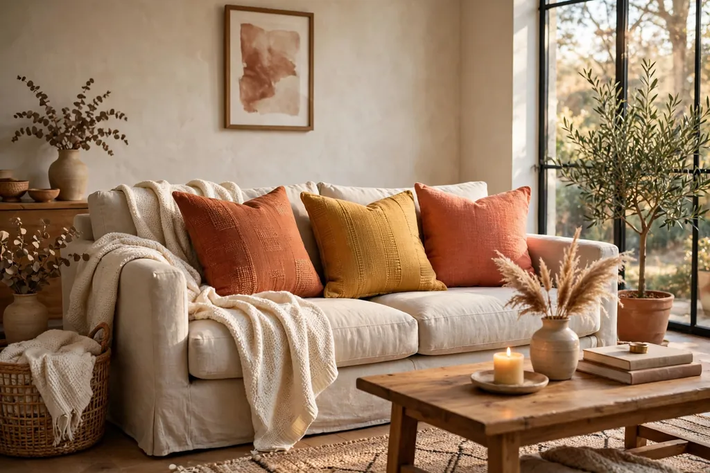
Build a warm sunset palette from terracotta, mustard, and coral, with cream as the base that keeps the warm tones from looking loud. These three colors sit near each other on the warm side of the color range, so they blend easily, and they suit wood floors, tan rugs, and warm white walls. Use terracotta as the largest block, mustard as the second color, and coral as the smallest accent, so the palette has a clear order.
Add texture to keep warm colors from flattening out, such as a woven terracotta cover, a smooth mustard cover, and a soft coral knit. Repeat one of the three colors in a throw on one arm, so the sofa links to the rest of the seating area. If the room already has cool grey walls, warm pillows can still work, but keep the warm set to two colors instead of three, with grey as the third, so the room stays balanced.
5. Ocean Blues and Teals for a Cool Lift
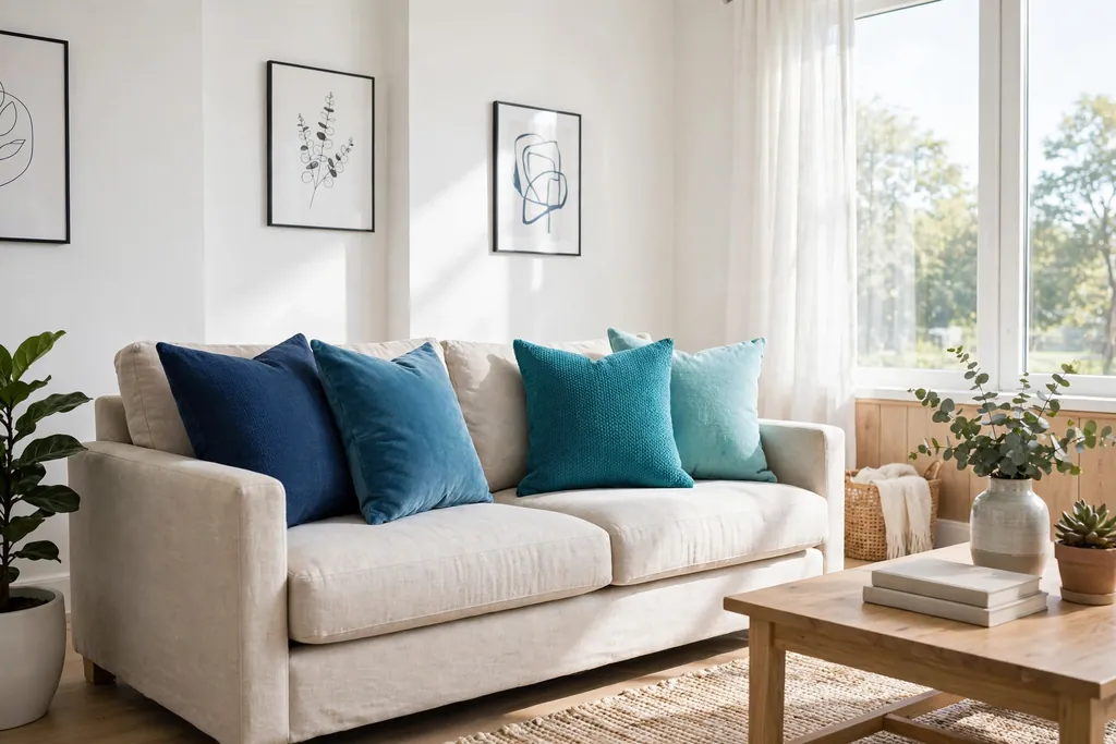
Use ocean blues and teals, from pale aqua to deep navy, to brighten a living room without adding warm color. Cool blues suit rooms with white walls, light wood, and natural fiber rugs, and they can make a sunny room feel calmer while still looking colorful. Mix three blues, such as navy at the back, teal in the middle, and aqua at the front, so the group has depth from dark to light.
Add one contrasting accent, such as coral or mustard, in a single small pillow, so the blue group has a focal point. Without that accent, a blue only group can look flat, especially in a room with little natural light. Keep patterns simple here, with one stripe or wave pattern at most, and let the shade changes do most of the work. For a calm base to compare against, see these farmhouse decor ideas for the living room, where plain linen and one checked pattern carry most of the look.
6. Soft Pastel Rainbow for a Light Room
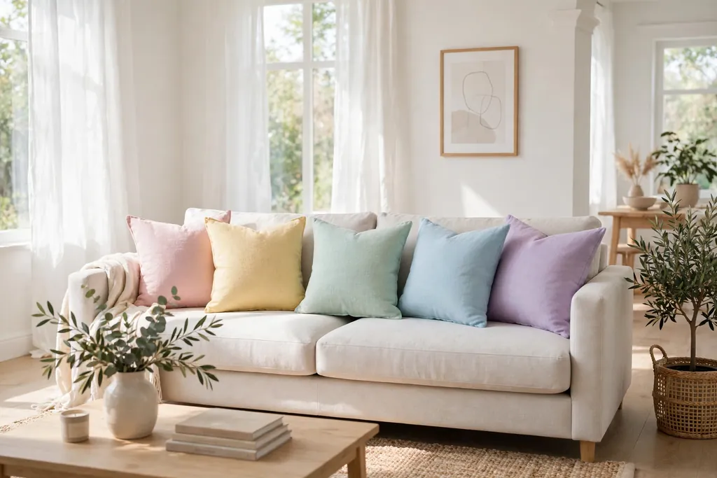
Choose a pastel rainbow, such as blush pink, butter yellow, mint, sky blue, and lilac, for a bright room that should still feel soft. Pastels work well in small living rooms and in rooms with pale walls, because they add color without adding visual weight. Use solid pastel covers in the same fabric, such as cotton or linen, so the group reads as one set, and keep one white or cream pillow in the mix to give the pastels breathing room.
Pastels need a little contrast to avoid looking washed out, so place them against a sofa in a slightly deeper neutral, such as light grey or natural linen, rather than pure white. Repeat one pastel, such as mint or sky blue, in a small vase, a book spine, or a piece of art, so the pillows do not sit alone in the room. In a sunny room, check pastel fabrics in daylight and evening light, since pink and lilac can shift a lot under warm bulbs.
7. Primary Colors for a Playful Family Room
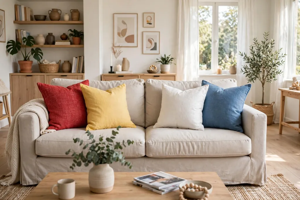
Use true primary colors, red, yellow, and blue, in plain covers for a playful family room that can handle daily use. Primary colors are easy to match, easy to replace, and easy for children to recognize, which makes them practical for a room used for play, reading, and television. Use red and blue as the larger pillows and yellow as the smaller accent, so the brightest color does not dominate the sofa.
Keep the sofa and rug neutral, such as grey, denim blue, or natural wood tones, so the primaries have a calm base. Add one white pillow to break up the three strong colors, and keep patterns out of this group, since three strong colors plus a pattern can quickly look busy. This palette also suits a room with colorful art or books, because the pillows can echo colors already on the shelves without copying any one piece.
8. Botanical Leaf and Fern Prints
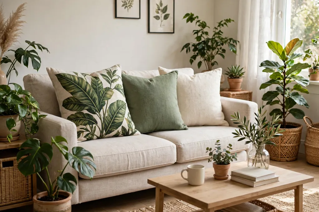
Choose botanical prints, such as large leaves, ferns, and palm fronds, in green with one or two bright accent colors, such as coral or mustard. Botanical prints bring a garden note indoors, and they work in rooms with plants, wood, and natural light, where the print can echo real greenery nearby. Use one botanical pillow as the statement piece, with plain green, cream, and one bright solid beside it, so the print has room to show.
Check the scale of the print against the pillow size before you buy or sew a cover, since a large leaf print can get lost on a small pillow and can overwhelm a large one if it repeats too often. Keep the botanical print to one or two pillows per sofa, and repeat the green in a plant pot or a throw, so the print links to the room. If the room has no plants, a botanical pillow still works, but pair it with a wood tray or a woven basket so the natural theme has a second anchor.
9. Bold Geometric Shapes
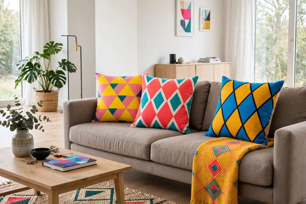
Use bold geometric prints, such as triangles, diamonds, circles, and zigzags, in two or three bright colors on a plain base. Geometric shapes suit modern living rooms with clean lines, straight sofa arms, and simple art, because the print echoes the room shape. Pick one geometric pillow as the focal point, with solid pillows in colors drawn from that print beside it, so the pattern and the solids clearly belong together.
Limit geometric prints to one or two pillows, and keep the shapes at a similar scale, since a tiny triangle print next to a huge diamond print can look mismatched. If the rug already has a strong geometric pattern, use plainer geometric pillows, such as a single stripe or a simple dot, so the rug and the pillows do not fight. Step back and check the group from across the room, since geometric prints read differently up close than they do from the doorway.
10. Mixed Bright Stripes
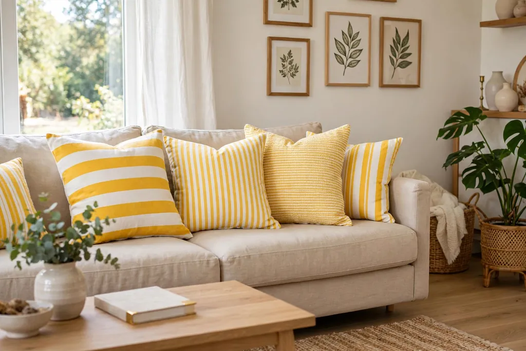
Mix bright stripes in different widths, such as a wide stripe, a narrow stripe, and a single bold stripe on a plain base, all sharing at least one color. Stripes are a useful bridge between solid pillows and busy prints, because they add pattern without a picture or a motif. Use one striped pillow on each side of the sofa, with solid pillows in the stripe colors between them, so the stripes repeat and the group looks planned.
Keep the stripe direction the same on all striped pillows, usually horizontal or vertical, so the group does not look tilted. If one striped pillow has a very bright color that the others lack, repeat that color in a small solid pillow or a throw, so it does not stand alone. Stripes also work well on a lumbar pillow at the center, where the long shape shows the stripe pattern clearly without taking up a full seat width.
11. Bright Floral Prints With a Plain Anchor
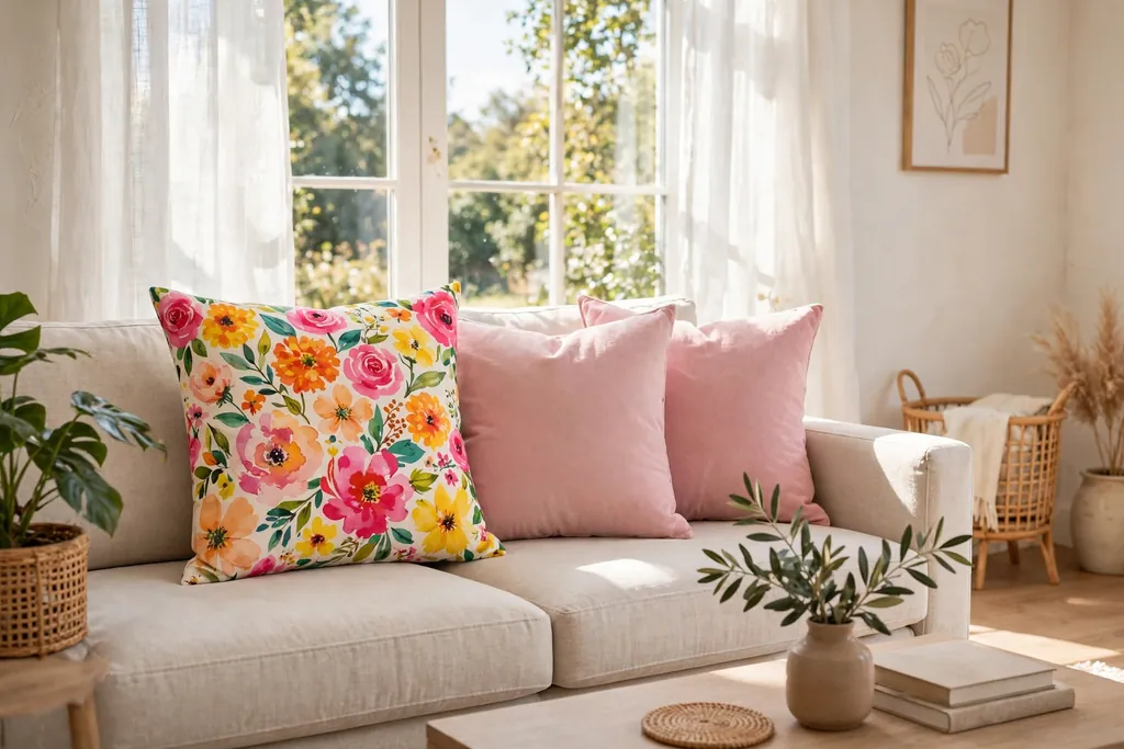
Pair a bright floral print, such as large blooms in pink, orange, and yellow, with plain pillows in one color drawn from the flowers. Floral prints can carry a lot of color at once, so the plain anchor is what keeps the group calm. Use the floral pillow in the middle or at one end, with plain pillows on both sides, so the flowers have clear space around them and the eye can rest on the solids.
Choose a floral scale that suits the room: large blooms suit a large sofa and a plain wall, while small blooms suit a smaller sofa and a room with other patterns. Repeat one flower color, such as pink or yellow, in a second place, such as a vase of fresh stems or a book cover, so the floral pillow links to the room. If the sofa fabric already has a floral or busy pattern, use a plain bright pillow instead, since two florals on one sofa rarely sit well together.
12. Global Boho Prints With Tassels
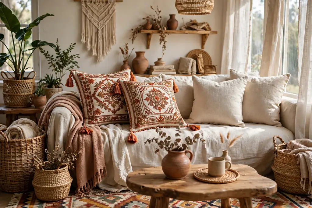
Use global inspired boho prints, such as mudcloth style marks, ikat shapes, and embroidered motifs, in bright colors with tassels or fringe at the corners. Boho prints suit rooms with woven baskets, rattan, wood, and layered rugs, where the handmade look fits the rest of the decor. Pick one or two boho pillows with tassels, and pair them with plain linen and one solid bright pillow, so the tassels and the print stay the focus.
Keep tassels clear of the seat edge where people sit, so they do not get crushed or pulled, and place tasseled pillows slightly forward so the trim shows. Mix no more than two boho patterns at once, since each pattern already carries a lot of detail, and keep the color palette to three colors across the whole group. If the room is already full of pattern, use a single boho pillow as an accent and keep the rest of the pillows plain, so the boho piece can stand out.
13. Two Tone Color Blocked Pillows
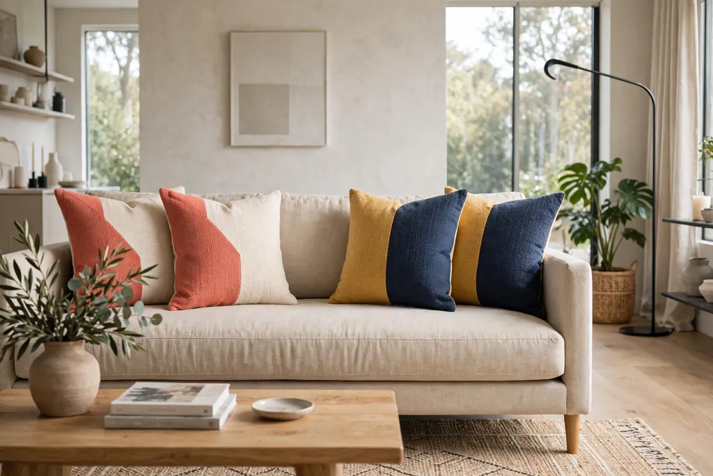
Choose color blocked pillows that pair two solid colors on one cover, such as half coral and half cream, or a mustard top with a navy base. Color blocking adds two colors in one pillow, which is useful on a small sofa where there is room for only three or four pillows but you still want a wide palette. Match the block colors to the solid pillows beside them, so each block color repeats at least once in the group.
Place color blocked pillows at the front of the arrangement, where both colors can be seen, rather than tucked behind larger pillows. Keep the block split simple, such as a straight horizontal or vertical split, since a complex split can look like a pattern rather than a color block. If you make your own covers, test the block proportions on paper first, since a half and half split reads differently from a two thirds and one third split on a square pillow.
14. Ombre and Tie Dye Washes
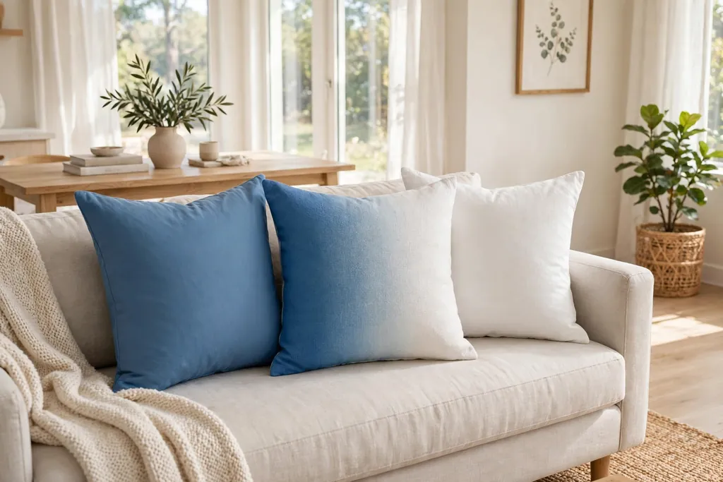
Use ombre and tie dye pillows in soft color washes, such as blue fading to white, pink fading to coral, or a tie dye swirl in two bright colors. Ombre and tie dye add color in a gradual way, so they suit rooms where solid brights feel too sharp but plain neutrals feel too flat. Use one ombre or tie dye pillow per sofa, with plain pillows in the lightest and darkest shades of the wash beside it, so the gradient links to the solids.
Keep the rest of the room simple while a tie dye pillow is in place, since the swirl pattern already carries a lot of movement. Place the pillow where its lightest area faces the room, so the color change reads clearly from across the sofa. Wash tie dye covers separately at first, since bright dyes can run, and check that the cover is fully dry before it goes back on the sofa, so damp dye does not mark the sofa fabric.
15. Small Neon Pops Against Calm Colors
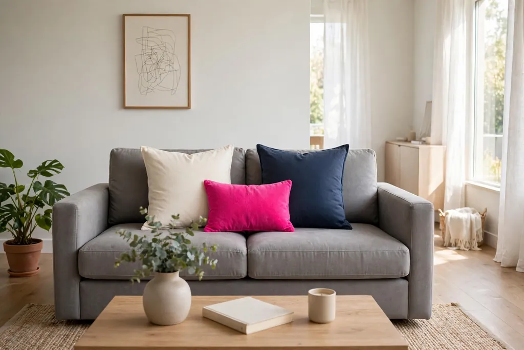
Add one or two small neon pops, such as hot pink, lime, or bright orange, against calm pillows in cream, grey, and navy. Neon works best in small doses, because a single bright pillow can lift a whole sofa while a full set of neon pillows can tire the eye quickly. Use the neon pillow as the smallest pillow in the group, at the front center, with larger calm pillows behind it, so the bright color reads as an accent rather than the main palette.
Repeat the neon color once more in a very small item, such as a candle, a book spine, or a small vase, so the pillow does not look like a mistake. Keep neon away from other very bright colors in the same group, since neon plus several brights can look chaotic. This idea suits a modern living room with white walls and simple furniture, where one bright note has room to show without competing with other strong colors.
16. Bright Gingham and Checks
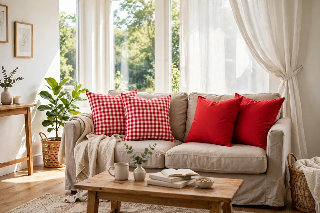
Use bright gingham and checks, such as red and white, blue and white, or green and cream, in a small or medium scale on pillow covers. Checks add a cheerful, classic pattern that works in farmhouse, coastal, and casual living rooms, and they are easy to pair with solid pillows in the check colors. Use one or two checked pillows per sofa, with plain pillows in the main check color beside them, so the pattern repeats without taking over.
Match the check scale to the sofa size: small checks suit a loveseat or a small sofa, while larger checks suit a long sofa where the pattern can be seen from across the room. Keep other patterns out of a checked group, since checks plus stripes or florals can look busy in a small space. Wash checked cotton covers before first use, since new cotton can shrink, and keep checked fabric out of strong direct sun if the color matters to you.
17. Leopard Print as a Warm Neutral With Brights
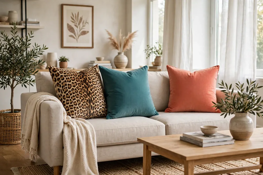
Treat leopard print as a warm neutral and pair it with bright solids, such as teal, coral, or mustard, rather than with other animal prints. Leopard print carries brown, black, and cream in one cover, so it can link warm and cool brights in the same group. Use one leopard pillow per sofa, placed near the center or at one end, with solid bright pillows on both sides, so the print acts as a bridge between the brights.
Keep the leopard scale moderate, so the spots read clearly but do not dominate the pillow, and avoid adding a second animal print, such as zebra or snake, in the same group. Repeat one leopard tone, such as warm brown or cream, in a throw or a wood frame nearby, so the print links to the room. If the room already has a lot of pattern, use a leopard pillow in a muted tone and keep the bright pillows to one color, so the group stays calm.
18. Opposite Colors From the Color Wheel
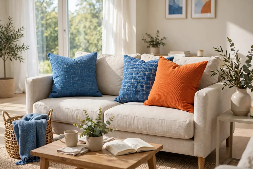
Pair opposite colors from the color wheel, such as blue and orange, purple and yellow, or teal and coral, for a lively contrast that still looks planned. Opposite pairs work because each color makes the other look stronger, so two pillows in opposite colors can carry a sofa without a large palette. Use one color as the larger block and the opposite color as the smaller accent, such as three blue pillows and one orange pillow, so the contrast has a clear order.
Test opposite pairs beside your sofa fabric and wall color before you commit, since a pair that looks good on paper can clash with a warm wood floor or a cool grey wall. Repeat each opposite color at least twice in the room, such as blue on pillows and a throw, and orange on one pillow and a small vase, so neither color sits alone. If the contrast feels too strong, add a cream or grey pillow between the opposite colors to give the eye a resting place.
19. Repeat One Bright Color Around the Room
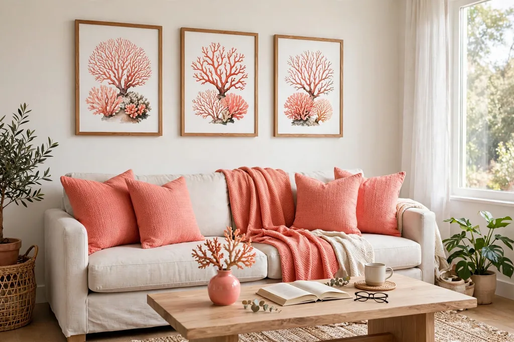
Repeat one bright color from the pillows around the room, in a throw, a rug border, a piece of art, and a small vase, so the pillows feel like part of the room rather than a separate set. This repeat is what turns a colorful sofa into a colorful living room, because the eye follows the color from the sofa to the walls and back. Pick the brightest pillow color for the repeat, and use it in small doses elsewhere, so the room stays balanced and the sofa stays the main color source.
Keep the repeat color to three or four places in total, including the pillows, so the room does not look themed around a single shade. Use the same shade, or a very close shade, in each repeat, since a coral pillow with a red throw and a pink vase can look like three different ideas rather than one thread. Step back to the doorway and check the repeats: you should be able to spot the color in at least three places without searching, but no single repeat should pull attention away from the sofa.
Conclusion
Colorful throw pillows work best when you start with a plain sofa, pick two or three main colors, and repeat each color at least twice. Solid blocks, jewel velvet, and a rainbow gradient give clear starting points, while stripes, florals, boho prints, and color blocking add pattern without losing control. Small neon pops, checks, leopard print, and opposite color pairs add contrast in measured doses, and repeating one bright color around the room ties the whole look together. Try one idea first, check it from the doorway, and add a second idea only when the first one sits well. For more ideas from Dwell Ovell, browse the home page for home decor guides.
FAQs
How many colorful throw pillows should I put on a living room sofa?
A loveseat usually suits three or four pillows, a standard three seat sofa suits five or six, and a long sofa or sectional suits six to eight in total. Choose the lower end of the range if the sofa is used daily for sitting, and check that each main seat can be used without moving more than one pillow first.
What colors go well together for colorful throw pillows?
Two or three main colors work well together when each color repeats at least twice and one color acts as the base, such as cream, grey, or navy. Warm palettes, such as terracotta, mustard, and coral, blend easily, while opposite pairs, such as blue and orange, give a stronger contrast that needs a calm pillow between them.
How do I mix colorful throw pillow patterns without clashing?
Mix patterns without clashing by using one strong pattern, such as a floral or geometric print, with plainer pillows in colors drawn from that print. Keep patterns at a similar scale, repeat at least one color across all the pillows, and avoid placing two strong patterns side by side without a plain pillow between them.
Can colorful throw pillows work in a small living room?
Yes, colorful throw pillows can work in a small living room when you keep the count low, use three or four pillows, and pick a small palette of two or three colors. Pastel or solid colors add brightness without visual weight, while one strong pattern at most keeps the sofa from looking crowded in a tight space.
How do I keep colorful throw pillows from looking messy?
Keep colorful throw pillows from looking messy by repeating each color at least twice, limiting strong patterns to one or two pillows, and varying sizes from large at the back to small at the front. Fluff each pillow, angle it slightly toward the center, and step back to check balance from the doorway before you finish.
Should throw pillow colors match the rug and curtains?
Throw pillow colors should link to the rug and curtains, but they do not need to match them exactly. Repeat at least one pillow color in the rug, curtains, art, or a throw, and keep the other pillow colors close to that shared color family, so the room reads as planned rather than matched piece by piece.