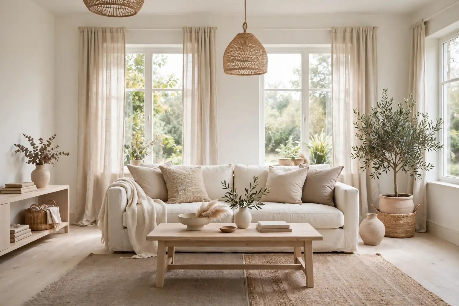
A neutral living room does not have to feel plain. When whites, beiges, and soft greys are layered with wood, linen, wool, and a little greenery, the room feels calm, bright, and easy to live in. The trick is contrast in texture rather than contrast in color: a smooth wall next to a nubby throw, or a pale sofa next to a dark wood table. These 22 neutral color living room decor ideas cover walls, seating, rugs, lighting, and small styling touches, so you can pick one change or plan a full refresh. For more room ideas from the same site, start at the Dwell Ovell home page.
Key Takeaways
- Start with one warm neutral base, such as warm white walls or a beige sofa, then add two or three close tones rather than a rainbow of shades.
- Mix textures to keep neutrals interesting: linen, wool, rattan, wood, stone, and boucle all read differently even in the same color family.
- Use wood tones and warm metals to stop an all white room from feeling cold.
- Keep large pieces neutral and let smaller items, such as throws and cushions, carry seasonal change.
- Add plants and natural light where you can, since both soften pale rooms without adding color.
- Test paint and fabric samples in your own daylight before you commit, because neutral shades shift a lot between morning and evening light.
1. Warm White Walls with Wood Accents
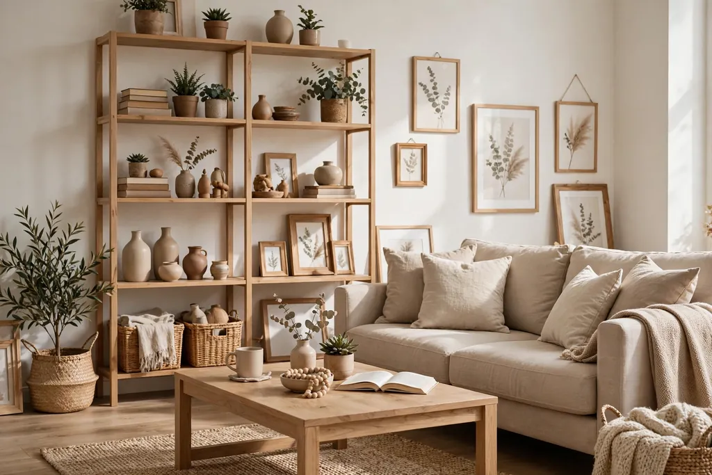
Paint the walls a warm white with a soft yellow or pink undertone, then add wood through a coffee table, picture frames, or open shelving. Warm white avoids the stark feel of a pure bright white, and wood gives the eye a natural place to rest. This pairing suits most room sizes and works with both modern and traditional furniture.
Keep trim in the same warm white family so the walls and woodwork read as one calm backdrop. If your room gets little daylight, choose the lighter end of warm white and add a wood toned floor lamp or side table to keep the space from feeling flat.
2. Layered Beige Sofa Styling
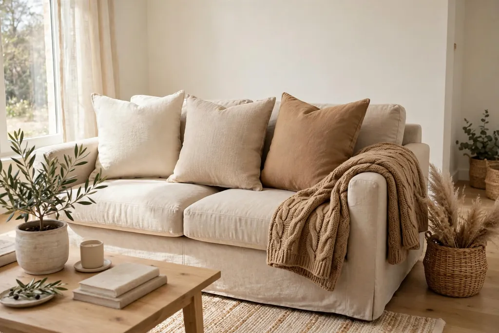
Style a beige sofa with cushions and throws in cream, sand, and camel so the seating area looks planned without looking matched. Layering close tones builds depth, and it lets you change one cushion at a time when you want a new look. A beige sofa also forgives everyday wear better than a bright white one.
Start with two larger cushions in a solid sand tone, add one patterned cushion in cream and taupe, and finish with a soft throw folded over one arm. Keep the throw in a different texture, such as chunky knit or waffle weave, so it stands out against the smooth sofa fabric.
3. Greige Built-In Shelving Wall
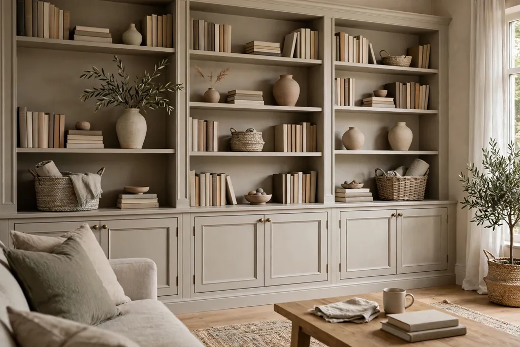
Build or dress a shelving wall in greige, the grey beige blend that sits between cool and warm neutrals. Paint the shelves the same greige as the wall behind them so books, vases, and baskets look tidy rather than busy. This idea suits a TV wall or a reading corner where storage and display share one surface.
Style the shelves in groups of three, mixing books laid flat, a ceramic vase, and a woven basket. Leave some shelves partly empty so the wall does not feel crowded, and repeat the greige tone in a rug or cushion to tie the wall into the rest of the room.
4. Cream Boucle Armchair Corner
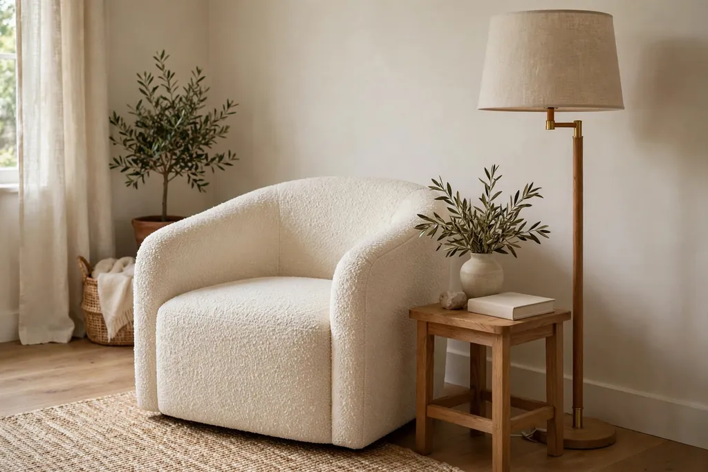
Place a cream boucle armchair in a corner with a small side table and a floor lamp to make a quiet reading spot. Boucle has a soft, looped texture that adds interest to a pale room without adding a strong color. The chair becomes a focal point simply because of its texture.
Add a small footstool in the same cream fabric or in light wood, and keep a basket of books beside the chair. If the corner is dark, choose a lamp with a linen shade that spreads light softly, since harsh light can make boucle look flat.
5. Taupe Rug Anchoring the Seating Area
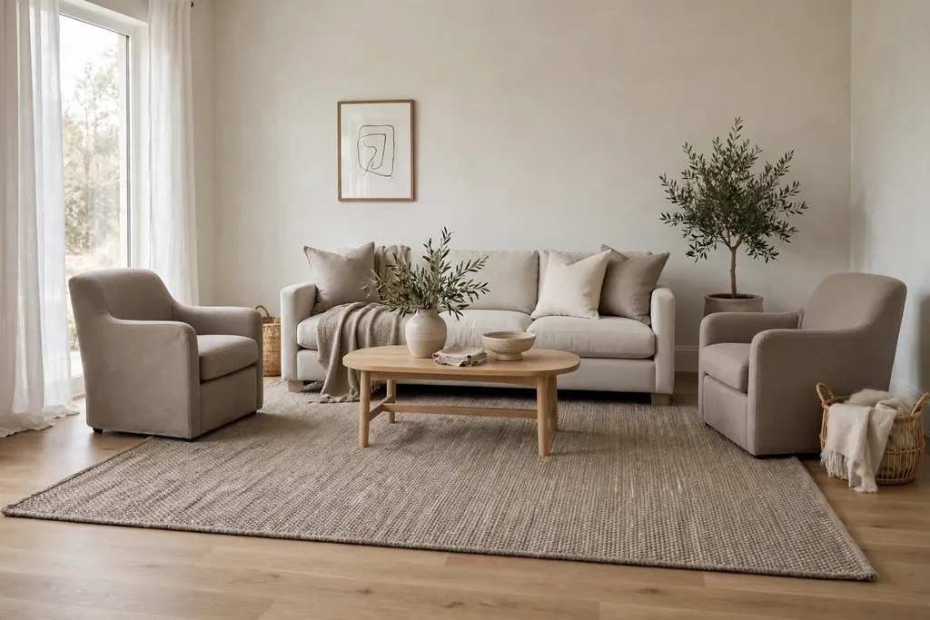
Lay a large taupe rug under the front legs of the sofa and chairs to anchor the seating area. A rug in a mid taupe tone grounds pale furniture and defines the conversation zone, especially in an open plan room. It also adds warmth underfoot in rooms with hard floors.
Choose a rug large enough that all front legs sit on it, since a small rug can make the seating group look scattered. A low pile wool rug is practical for daily use, while a flat weave works well under a coffee table that moves often.
6. Stone and Linen Coffee Table Vignette
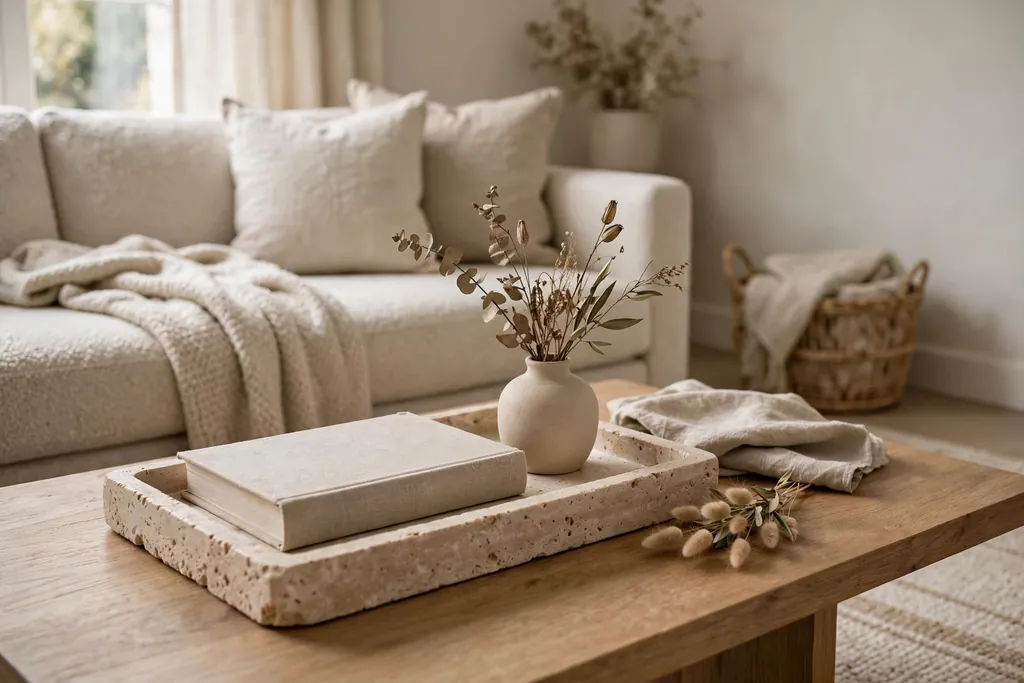
Style a coffee table with a stone tray, a linen covered book, and a small vase to create a calm centerpiece. Stone brings a cool, solid feel that balances soft linen and fabric seating, and the tray keeps small items corralled. This vignette works on wood, glass, or stone topped tables.
Keep the group low so it does not block sight lines across the room, and leave one third of the table surface clear for cups and everyday use. Swap the vase contents with the seasons, using dried stems in winter and fresh greenery in spring.
7. Oatmeal Curtains Hung to the Ceiling
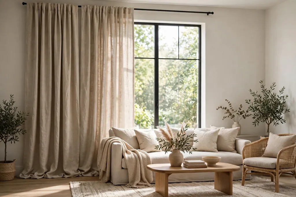
Hang oatmeal colored curtains from just below the ceiling to the floor to make windows look taller and the room feel softer. Oatmeal is a light warm neutral that filters daylight gently and pairs with white, beige, and grey walls. Full length curtains also hide plain window frames and add a finished feel.
Use a rod that extends past the window frame so the curtains can stack on the wall when open, letting in as much light as possible. Choose a linen look fabric for a relaxed drape, or a heavier cotton if you want more privacy in the evening.
8. Soft Grey Feature Wall with Art
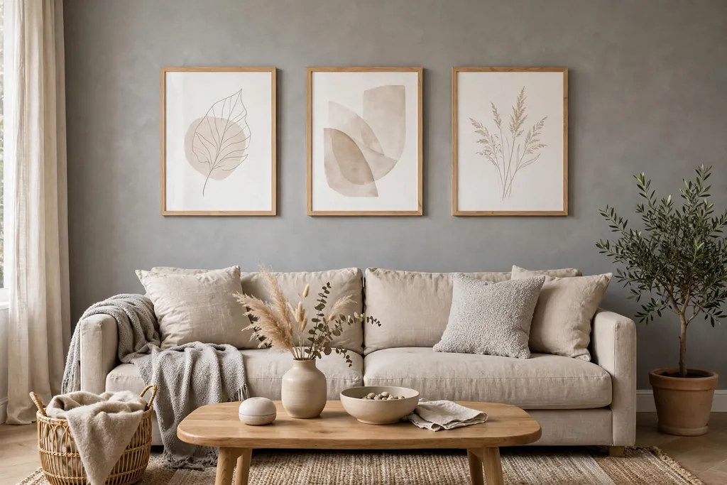
Paint one wall a soft grey and hang two or three framed prints in white or light wood frames. A single grey wall adds depth behind a sofa or fireplace without darkening the whole room, and pale frames keep the display light. This idea suits rooms that already have warm furniture and need a cooler balance.
Keep the art simple, with landscapes, line drawings, or abstract shapes in muted tones. Hang the center of the grouping at eye level, and leave breathing space between frames so the grey wall itself stays part of the look.
9. Wood Slat Accent Panel
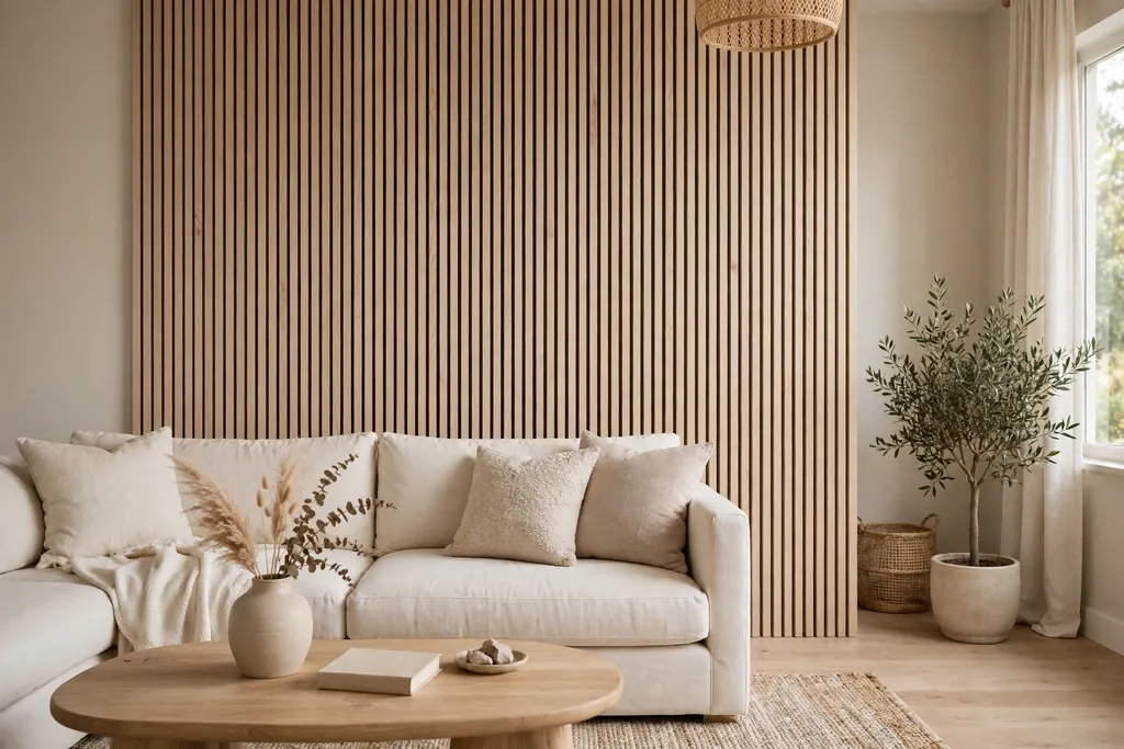
Add a wood slat panel to one wall, using pale oak or ash slats with narrow gaps between them. The vertical lines add rhythm and warmth, and the natural wood grain gives a neutral room a crafted feel. A slat panel works well behind a sofa, beside a fireplace, or in an entry corner of the living room.
Fix the slats to a backing board painted in a matching pale tone so the gaps read as shadow rather than bare wall. Keep furniture in front of the panel simple, since the panel itself is the decoration, and avoid hanging busy art over it.
10. Ivory Fireplace with Simple Mantel Styling
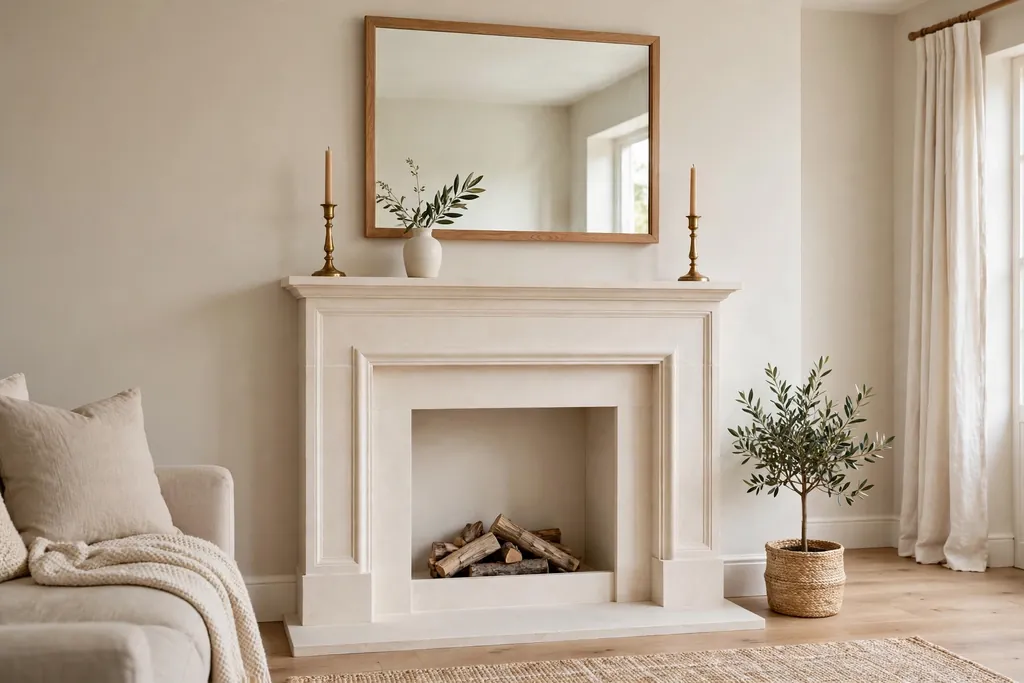
Paint or limewash a fireplace surround in ivory and style the mantel with just three items: a mirror or framed print, a pair of candlesticks, and a small vase. An ivory fireplace brightens a dark corner and gives the room a natural focal point. Simple mantel styling keeps the focus on the fireplace shape rather than clutter.
Choose candlesticks in wood or brushed brass for warmth, and keep the mirror frame in a pale wood or cream finish. If the fireplace is not used, place a cluster of pillar candles inside the opening for a soft glow in the evening.
11. Mixed Neutral Throw Pillow Palette
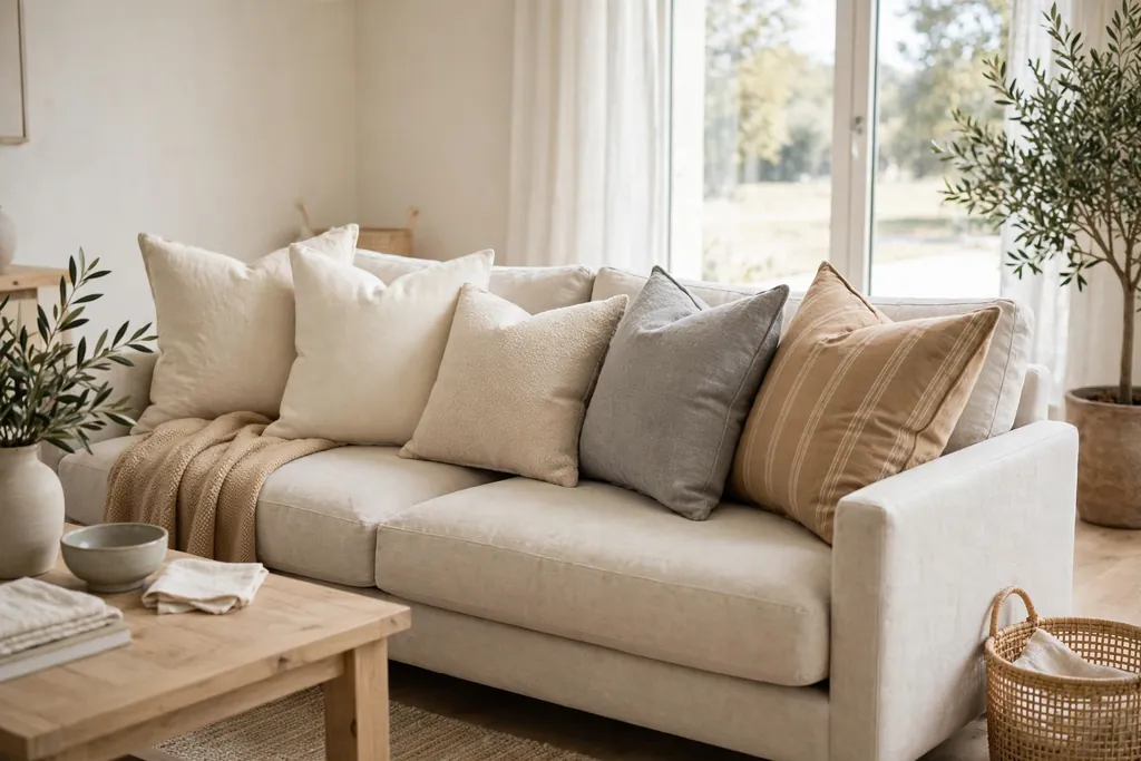
Build a throw pillow palette from five cushions in cream, ivory, sand, stone grey, and camel, mixing solids with one subtle stripe or woven pattern. A mixed palette looks collected over time rather than bought as a set, and it lets you move cushions between rooms. Keep all five within the same warm or cool family so they sit together.
Use different sizes, with two large square cushions at the back, two standard cushions in front, and one smaller lumbar cushion at the center. Remove one cushion when the sofa feels crowded, since a neutral room looks best when seating still looks inviting.
12. Rattan and Wicker Natural Texture
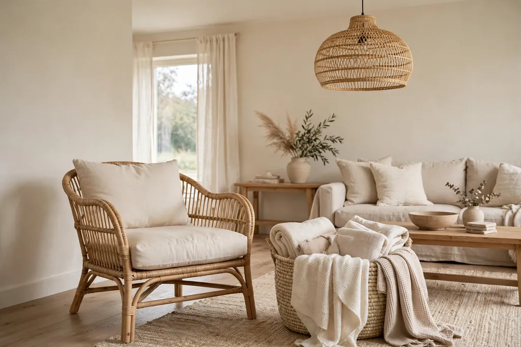
Add rattan or wicker through a chair, a basket, or a pendant light to bring natural texture into a neutral room. Rattan has a warm honey tone that sits well with cream and beige, and its open weave keeps a pale room from feeling heavy. One or two rattan pieces are enough to change the mood of the space.
Use a rattan basket for throws or magazines, and pair it with a woven pendant over a side table. If your room already has a lot of wood, choose a lighter rattan finish so the two wood tones do not compete.
13. Beige Gallery Wall with Wood Frames
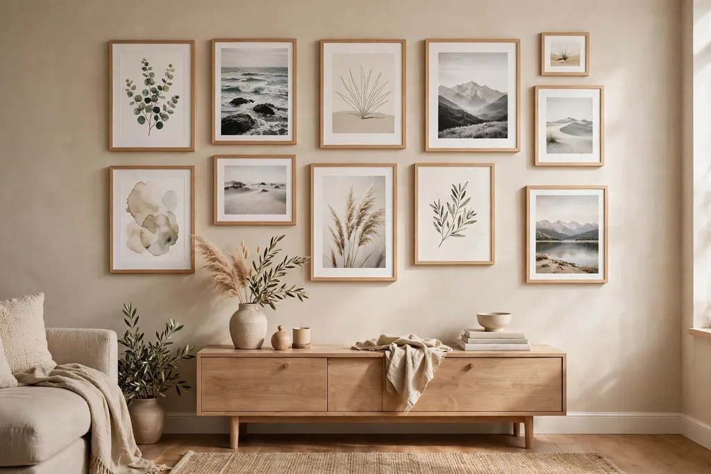
Create a gallery wall in beige tones, using photographs, prints, and sketches in matching light wood frames. A single frame finish unifies different images, and beige toned art keeps the wall calm. This idea works in a hallway wall of the living room or above a console table.
Plan the layout on the floor first, starting with the largest frame in the center and building outward. Keep equal gaps between frames, and include one or two small frames with texture, such as a woven wall hanging, to break up the flat prints.
14. Cream Sectional for a Family Room
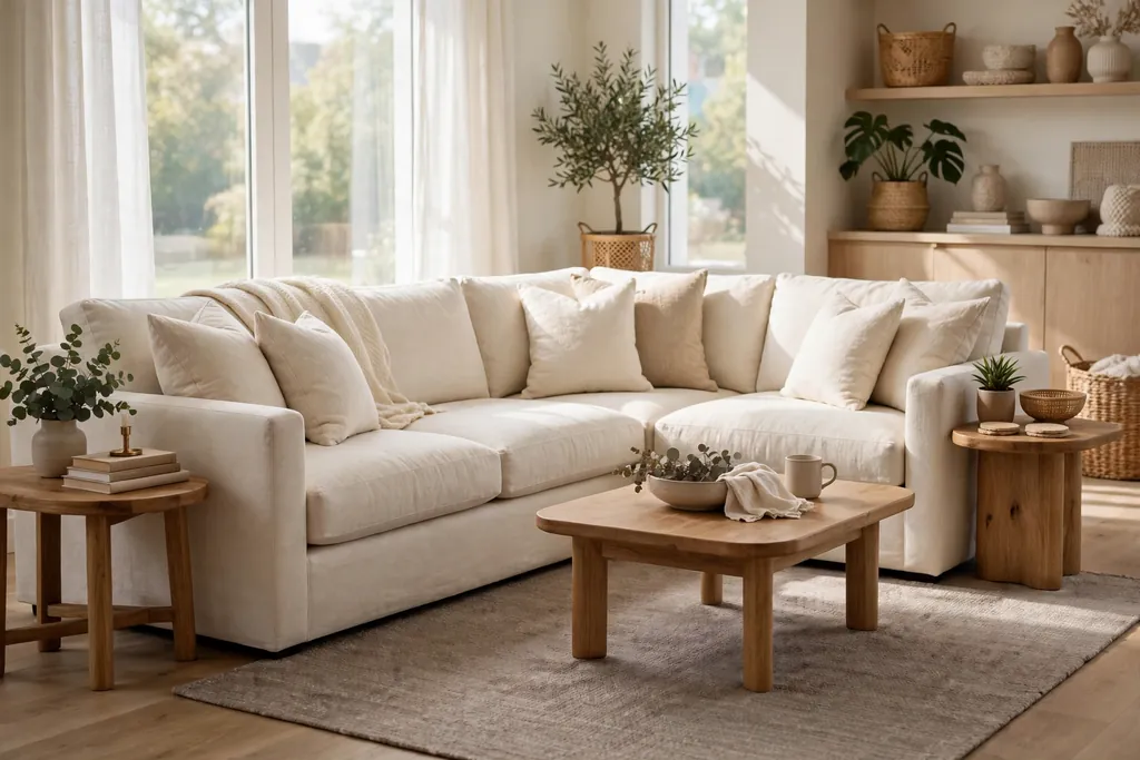
Choose a cream sectional for a family living room, since its long shape seats several people and its pale color keeps a large piece from dominating the room. A sectional also defines zones in an open plan space, with its back acting as a soft room divider. Cream fabric reflects light, which helps larger rooms feel airy.
Protect the fabric with washable covers or a throw over the most used seat, and add a darker taupe rug underneath to ground the pale shape. Keep side tables in wood so the room has a solid anchor beside the soft seating.
15. Taupe and White Open Shelving Display
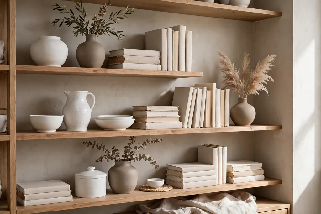
Style open shelves in taupe and white, mixing white ceramics, taupe vases, and a few books with pale spines. Open shelving in two close neutrals looks tidy and calm, and it lets you display items you use daily. This idea suits a living room wall near a dining area or a wide alcove.
Group items by height, with taller vases at the ends and shorter bowls in the middle, and repeat white and taupe across each shelf. Leave the top shelf lighter than the lower ones, since heavy items up high can make the wall feel top heavy.
16. Warm Neutral Reading Nook by the Window
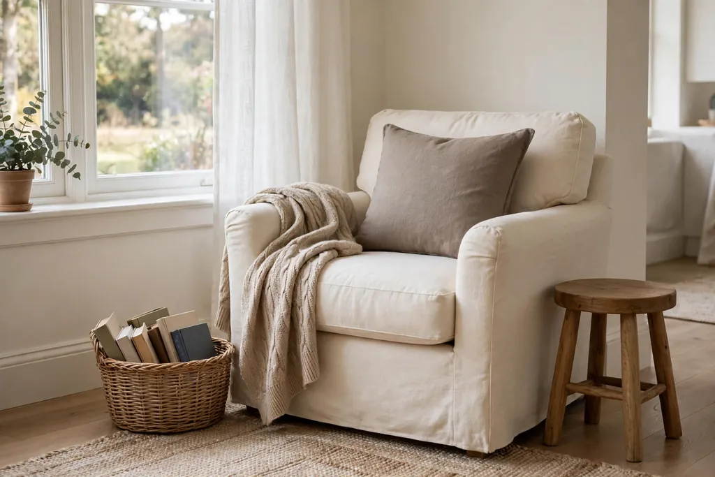
Set up a reading nook by a window with a cream armchair, a taupe cushion, a small wood side table, and a soft throw. Daylight makes pale fabrics look their best, and a window seat feel comes from just a chair and a table placed well. This nook gives a large living room a smaller, quieter zone.
Add a basket for books and a small plant on the windowsill to soften the frame. If the window gets strong afternoon sun, choose a light filtering blind in oatmeal so the nook stays comfortable through the day.
17. Stone Fireplace Surround in Pale Tones
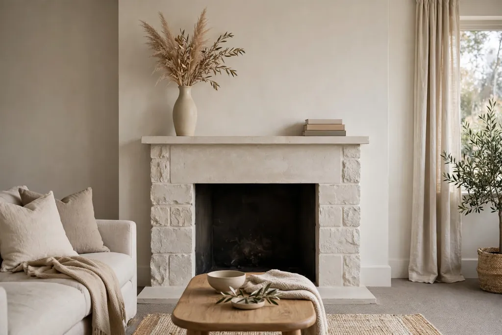
Use pale stone, such as limestone look tiles or light stacked stone, for a fireplace surround in a neutral living room. Stone adds a natural, solid texture that contrasts with soft sofas and curtains, and pale tones keep it from dominating the room. This works for both working fireplaces and decorative surrounds.
Keep the hearth clear and the mantel styling simple, with one tall vase and a small stack of books. Pair the stone with wood furniture nearby, since wood and stone together give a neutral room a grounded, natural feel.
18. Jute and Wool Layered Rugs
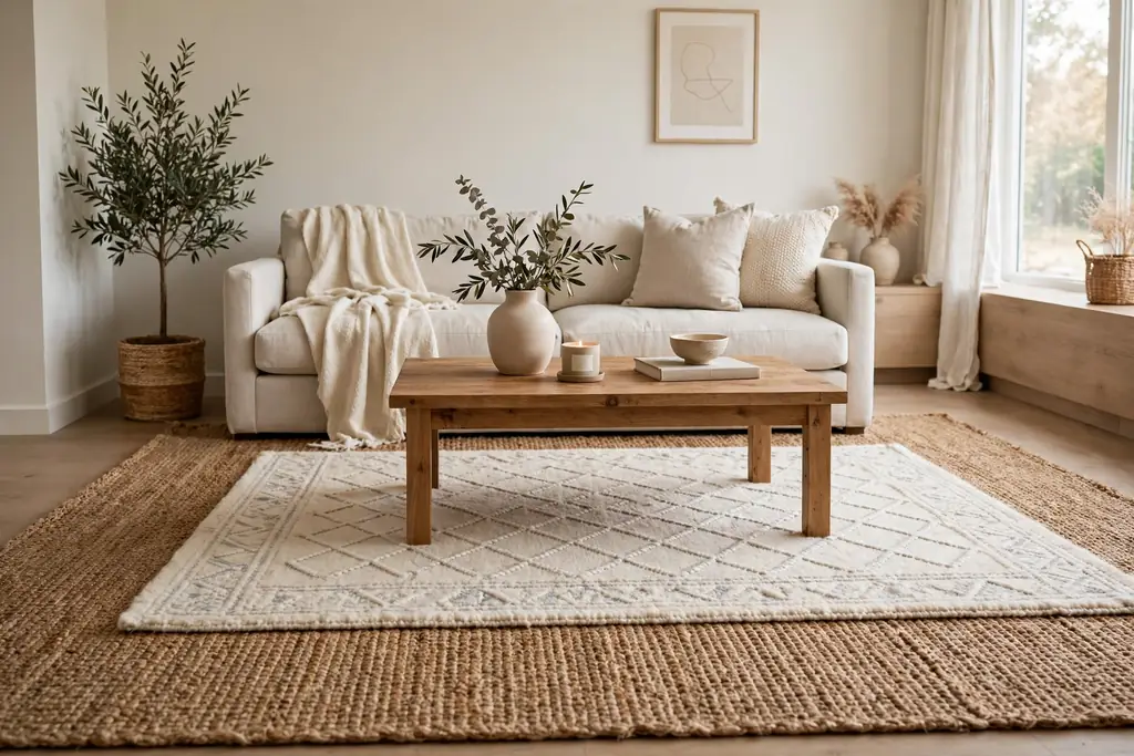
Layer a large jute rug under a smaller wool rug to add texture and warmth without adding color. Jute gives a natural, slightly rough base, while wool on top feels soft underfoot and defines the seating area. Layering also lets you use a smaller, better quality wool rug over a budget friendly jute base.
Offset the top rug slightly toward the sofa so the jute border shows on one side, which makes the layering look intentional. Choose both rugs in close natural tones, such as sand jute and ivory wool, so the layers blend rather than clash.
19. Neutral Dining and Living Zone in One Room
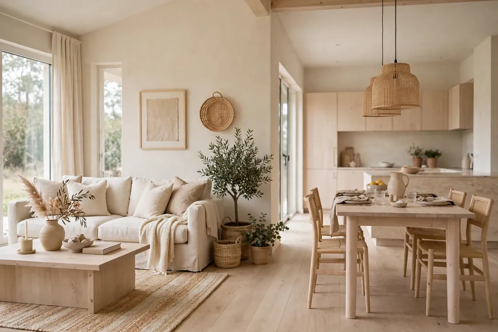
Define a dining and living zone in one open room using a shared neutral palette of cream, beige, and pale wood. Use the same rug tone and curtain color across both zones, and let a console or open shelving unit mark the boundary. A shared palette makes an open room feel calm instead of split in two.
Repeat one accent material, such as oak, in both the dining table and the living room coffee table. Keep dining chairs in a light neutral fabric so they do not draw the eye away from the living seating, and use one pendant style over the table and a matching floor lamp in the living zone.
20. Pale Oak Floor with Cream Furniture
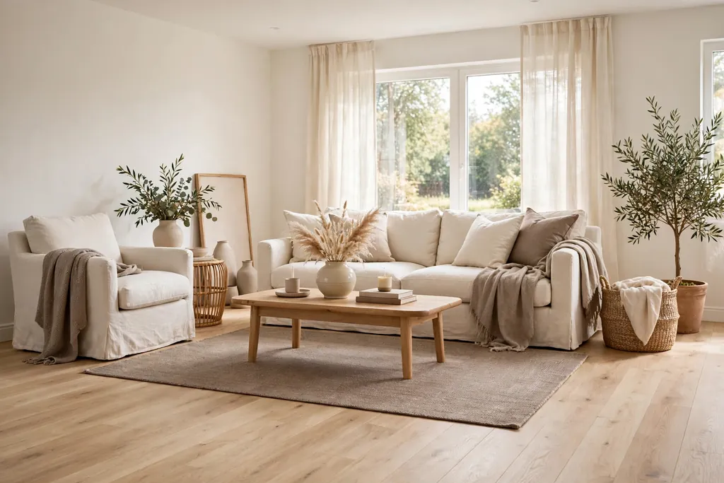
Pair a pale oak floor with cream furniture to build a light, even base for the whole room. Pale oak has a soft grain that adds warmth without the strong color of darker wood floors, and cream furniture sits gently on it. This base lets you change cushions, art, and throws without redoing the room.
Add a mid tone rug in taupe or stone grey to stop the floor and furniture from blending into one flat pale field. Use wood side tables in a slightly darker oak to give the room depth, and keep wall color in warm white so the floor remains the warmest element.
21. Warm Metal Accents in a Neutral Room
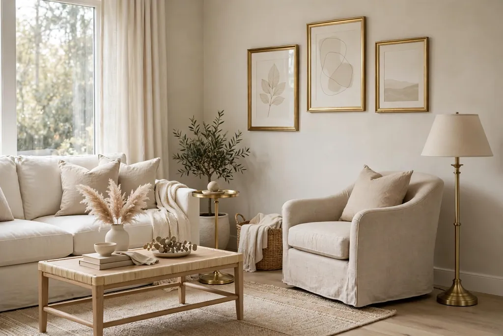
Add warm metal accents, such as brushed brass or soft bronze, through a lamp base, picture frames, and a small side table. Warm metal catches light and gives a pale room a gentle glow, without introducing a strong color. A few metal pieces are enough, since too many can make the room feel busy.
Use the same metal finish across the room, for example brass on a lamp and a tray, so the accents read as a set. Pair brass with cream and beige rather than cool grey, since warm metal suits warm neutrals best.
22. Seasonal Neutral Swaps for a Fresh Look
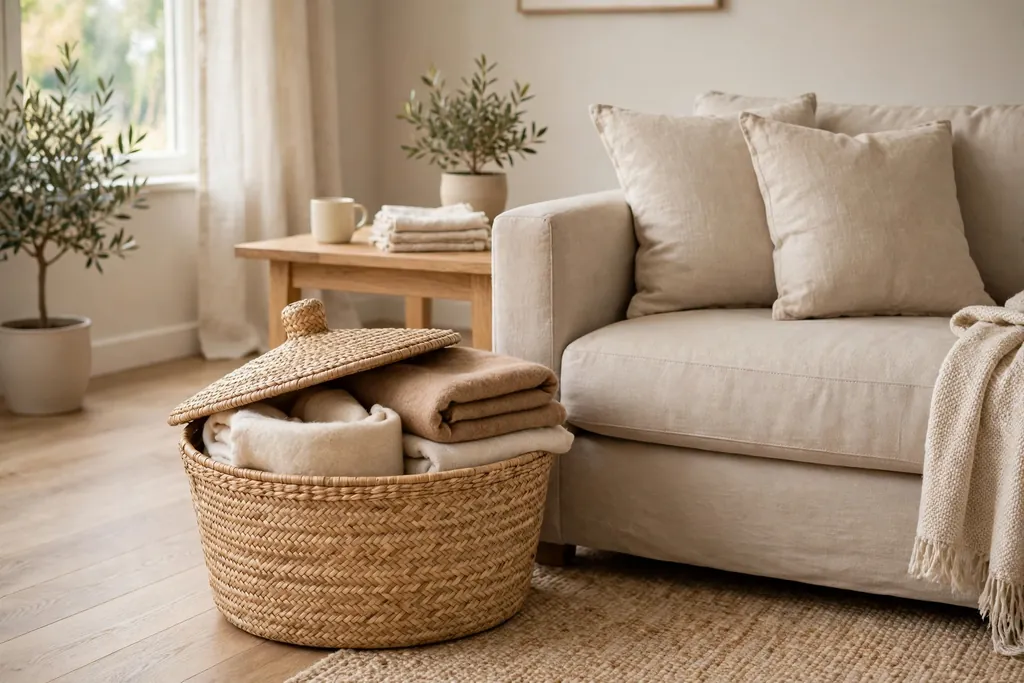
Keep the room neutral all year and change only small items with the seasons: chunky wool throws and candles in winter, light linen throws and fresh greenery in summer. Seasonal swaps give the room a fresh look without repainting or buying new furniture, and they keep the neutral base working hard. This approach also makes storage simple, since only a basket of throws needs to change.
Store off season throws in a lidded basket in the living room itself, so swaps take minutes. In winter, add a wool cushion cover in camel; in summer, switch to a cotton cover in ivory, and let daylight do the rest of the refreshing.
Conclusion
Neutral living rooms work best when texture, wood, and light do the work that color often does. Start with a calm base, layer close tones, add one natural material such as wood or rattan, and keep large pieces simple so small swaps can refresh the room. Pick the idea that fits your room today, whether that is a taupe rug, oatmeal curtains, or a cream armchair corner, and build from there. Save this guide on Pinterest to come back to when you are ready for the next change.
FAQs
1. What colors count as neutral for a living room?
Neutrals for a living room include white, cream, ivory, beige, sand, taupe, greige, soft grey, and pale wood tones. Warm neutrals lean yellow or pink, while cool neutrals lean grey or blue. Most rooms look best with one main neutral plus two or three close tones.
2. How do I keep a neutral living room from looking boring?
Mix textures rather than adding bright color. Combine linen, wool, boucle, rattan, wood, and stone in the same color family, and vary shapes through round tables, tall lamps, and layered rugs. Plants and varied lighting also add life without breaking the calm palette.
3. Should neutral living room walls be warm white or cool white?
Warm white suits rooms with wood furniture, beige sofas, and north facing light that can feel cold. Cool white suits rooms with grey furniture and strong daylight. Test a sample on each wall, since the same paint can look warm on one wall and cool on another.
4. What sofa color works best in a neutral living room?
Beige and greige sofas are the most forgiving, since they hide everyday wear and pair with both warm and cool accents. Cream sofas look lighter and brighter but need washable covers in busy households. Choose the sofa tone first, then match cushions and rugs to it.
5. Can I mix warm and cool neutrals in one room?
Yes, if one family leads and the other appears in small amounts. For example, use warm beige and cream as the base, then add a soft grey cushion or a grey toned print as a cool note. Keep the mix to two or three tones so the room still reads as neutral.
6. How often should I refresh a neutral living room?
Small refreshes work well each season, by swapping throws, cushion covers, and vase stems. Larger changes, such as a new rug or curtains, can wait until the current ones wear out or the room stops feeling comfortable. A neutral base makes both kinds of refresh simple and low cost.