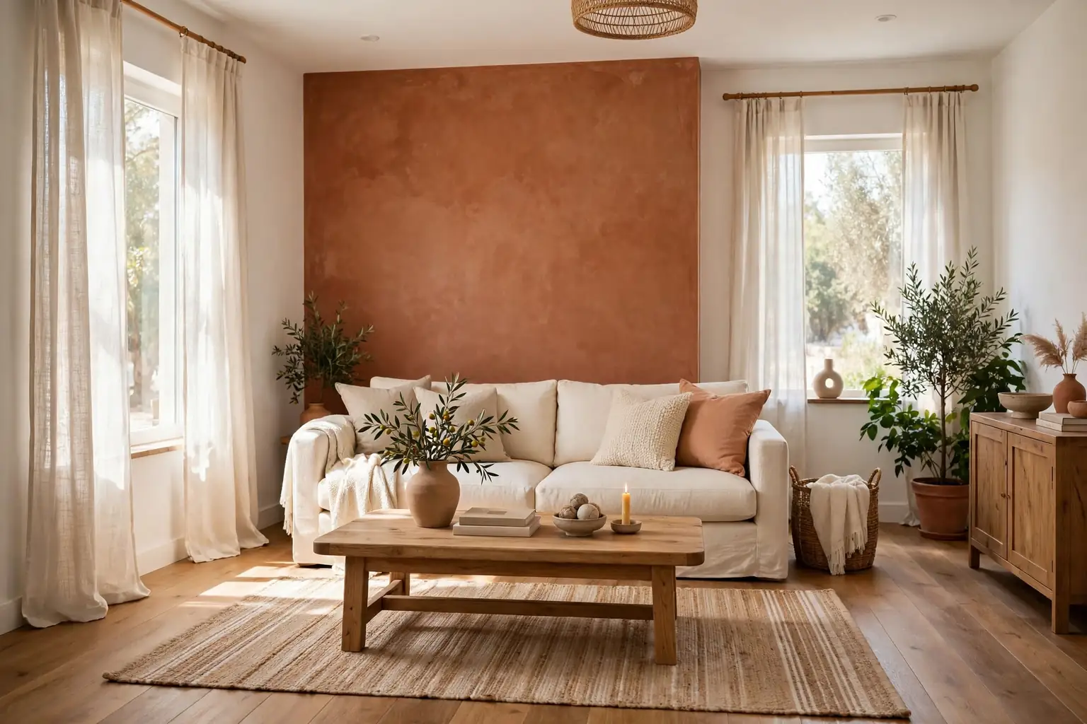
A living room color palette works when each color has a clear job: one sets the mood, one supports it, and a third, often white, wood, or metal, keeps the two from fighting. Most rooms go wrong not from a bad color, but from too many strong colors at once, or from a bold shade with nothing calm beside it. The palettes below each name where the colors go, which trim and furniture suit them, and what kind of light they need. Test a large painted sample on the wall before you buy a full can, and check it in morning light, midday light, and evening lamplight.
Key Takeaways
- Give each color a job: one main color, one supporting color, and white, wood, or metal trim to separate them.
- Put the strongest color where it earns its place, such as one wall, the sofa, or the lower half of the walls, and keep the rest of the room calmer.
- Match the palette to your light: warm palettes suit north facing or dim rooms, while cooler palettes suit bright, sunny rooms.
- Repeat the accent color once more, in cushions, art, or a rug, so the palette looks planned rather than random.
- Keep ceilings and trim in a simple white or cream unless the palette is designed to wrap the whole room.
- Paint a large sample on two walls and live with it for a few days before committing to a full room.
1. Warm White and Terracotta for a Sunlit Room
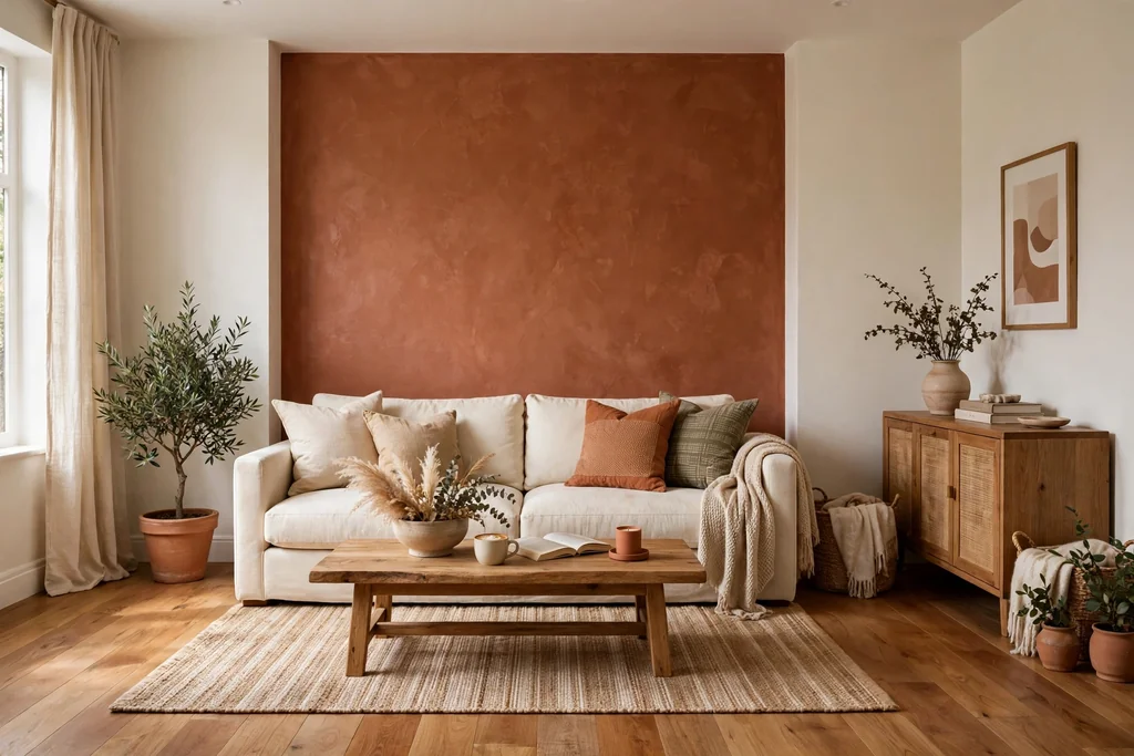
Paint three walls warm white and one wall terracotta, a warm clay tone between orange and brown, for a room that feels sunny even on a grey day. The terracotta wall suits the wall behind the sofa, where furniture already breaks up the surface. Warm white keeps the other walls bright, so the room still feels open with one strong wall in it.
Balance the warmth with cream linen, rattan or light wood, and black or bronze details for contrast. Avoid pairing terracotta with pink toned floors, since the two warm tones can clash. Test the terracotta in evening light too, because warm wall colors deepen a lot under lamps.
2. Navy and Cream for a Formal Sitting Room
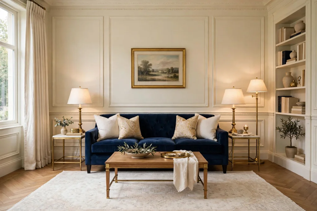
Paint the walls cream and bring navy in through the sofa, curtains, or one accent wall for a sitting room that feels formal without feeling stiff. Navy gives the room weight, while cream keeps it bright and easy to live in. This palette suits a room used for reading and conversation, where a calm backdrop matters more than a bright one.
Use brass for lamps and frames, since warm metal softens navy, and keep the rug in a pale, plain tone so the floor reflects light back up. Add navy once more in a cushion or a throw. In a small room, use navy on one wall only and cream on the rest, so the dark tone frames the room instead of closing it in.
3. Sage Green and Warm White for a Calm Everyday Room
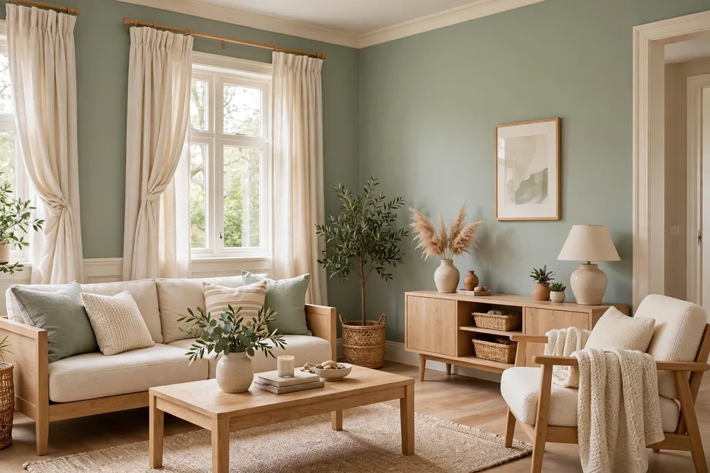
Pair soft sage green walls with warm white trim, cream curtains, and light oak furniture for a room that feels calm without feeling washed out. Sage sits between green and grey, so it reads as a color in daylight and as a soft neutral in the evening. Warm white keeps it gentle, while a cold bright white would make the green look colder by comparison.
Use wood in a light oak tone for tables and frames, and add one deeper green plant or cushion for depth. Keep patterns quiet, such as a plain linen sofa with a single striped throw, so the wall color stays the main note. Sage suits a room with modest daylight, since it does not need strong sun to look clear.
4. Charcoal and Soft Blush for a Modern Room
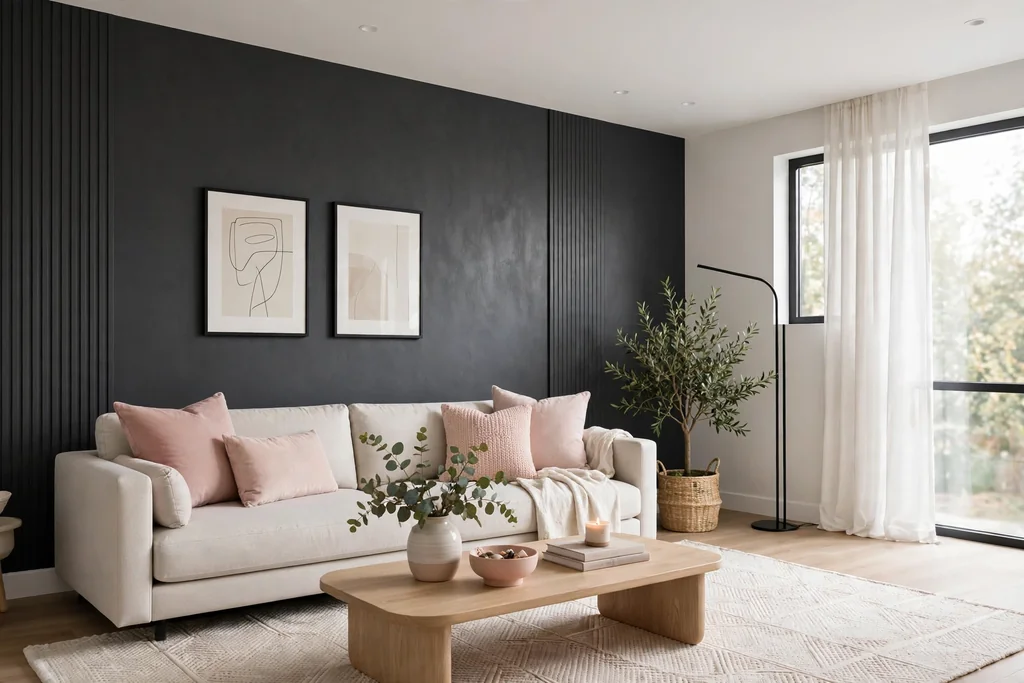
Combine charcoal walls or a charcoal sofa with soft blush cushions, art, and a pale rug for a modern room with a warm edge. Charcoal gives the room structure, while blush stops it from feeling cold or hard. This palette suits a room with good daylight, where blush stays clear instead of turning muddy beside dark grey.
Keep wood tones light or mid brown, use brushed nickel or black for lamps and handles, and keep the ceiling white. If charcoal on every wall feels like a big step, paint one wall charcoal and keep the rest pale grey first, then extend the dark tone later if you like it. For more ways to use pink as a main color, see these pink kitchen ideas for blush paired with white, wood, and brass.
5. Greige and Matte Black for a Clean Contemporary Room
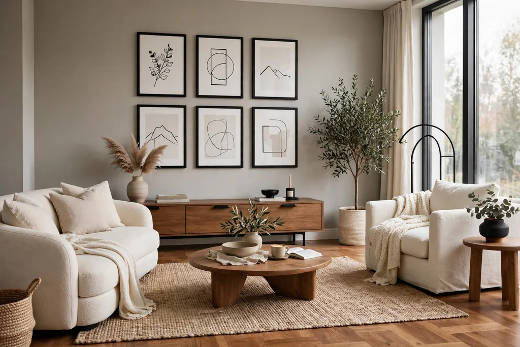
Paint the walls greige, a blend of grey and beige, and add matte black in frames, lamp bases, and one piece of furniture for a clean contemporary room. Greige shifts through the day, looking greyer in morning light and warmer at night, which keeps a plain room from feeling flat. Black details give the neutral walls a clear outline.
Keep floors and large furniture in warm wood or cream so the greige does not turn cold. Add contrast with one deep toned cushion, since an all neutral room needs at least one darker note. This palette suits a room where furniture, art, or a view should lead, and it works with almost any sofa color, which makes it a safe choice for a first repaint.
6. Deep Teal and Mustard for a Bold Room
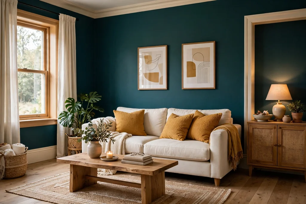
Paint the walls deep teal and add mustard in cushions, a throw, and one piece of art for a bold room that still feels livable. Teal sits between blue and green, so it feels rich without the heaviness of navy, and mustard gives it a warm lift. This palette suits a living room with good daylight, where teal stays clear rather than reading as near black.
Use warm white, not bright white, for trim and curtains, since a cold white can make teal look harsh. Keep the rug in a pale, plain tone and the sofa in a simple cream or light grey, so the two strong colors have a calm base. In a small room, use teal on two walls only and warm white on the rest.
7. Dusty Blue and Natural Wood for a Coastal Room
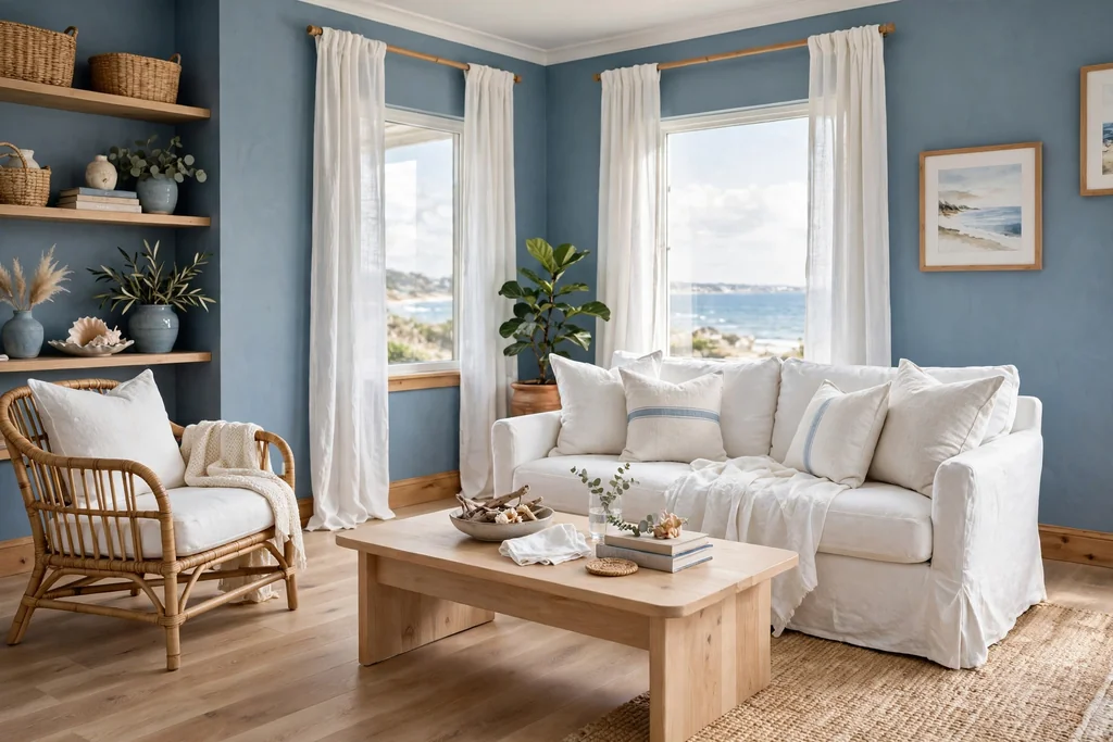
Pair dusty blue walls with natural wood floors, a light wood coffee table, and white linen for a coastal room that feels fresh without feeling themed. Dusty blue is soft enough to cover all four walls, while wood warms it up and stops it from feeling cold. White trim and curtains keep the room bright.
Add texture through woven baskets, a jute rug, and plain linen cushions in white and one deeper blue. Keep patterns simple, such as stripes in blue and white, and avoid adding a third strong color. This palette suits a bright room, since dusty blue needs decent daylight to stay clear, and it pairs well with plants for a fresh green note.
8. Olive Green and Cream with Leather for an Earthy Room
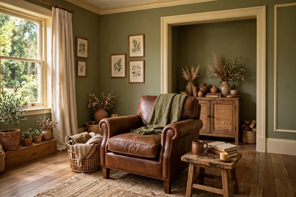
Pair olive green walls, an earthy green with a yellow brown base, with cream trim and a brown leather chair or sofa for an earthy room that feels grounded. Olive suits a room with warm wood floors and terracotta or clay accents, and leather adds a worn, lived in texture that flat fabric cannot. Cream keeps the scheme light, while white would fight the warmth of the olive.
Keep patterns simple and natural, such as linen, wood grain, and woven baskets, and add one plant for a fresher green note. Olive can look murky beside cool grey floors, so test it against your flooring first. This palette suits a room where you want color that still feels quiet, such as a reading room or a family room used every evening.
9. Butter Yellow and Soft Grey for a Bright Small Room
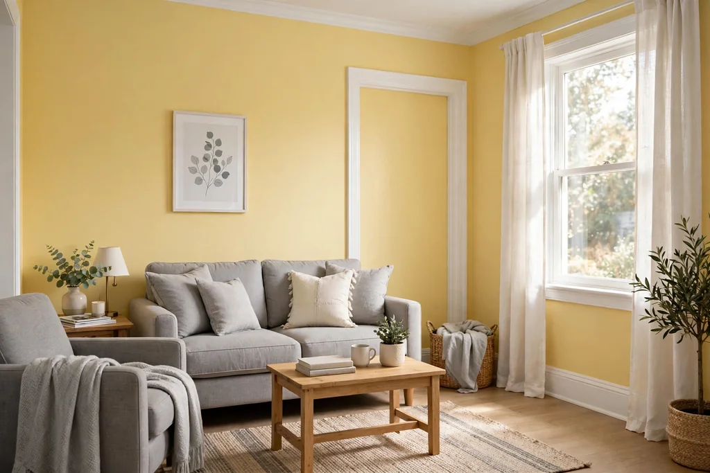
Paint the walls butter yellow, a soft creamy yellow, and pair them with soft grey upholstery and white trim for a small room that feels brighter without shouting. The yellow cheers up a room with limited daylight, while grey furniture stops it from feeling too sweet. The key is restraint: pick a yellow one step paler than the chip you first like, since color looks stronger across four walls.
Keep shelves and large furniture in white or pale wood so the yellow leads. Add one deeper note, such as a dark wood frame or a green plant, so the room does not feel washed out. Butter yellow can clash with warm orange wood floors, so check samples together before you commit.
10. Burgundy and Gold for a Rich Evening Room
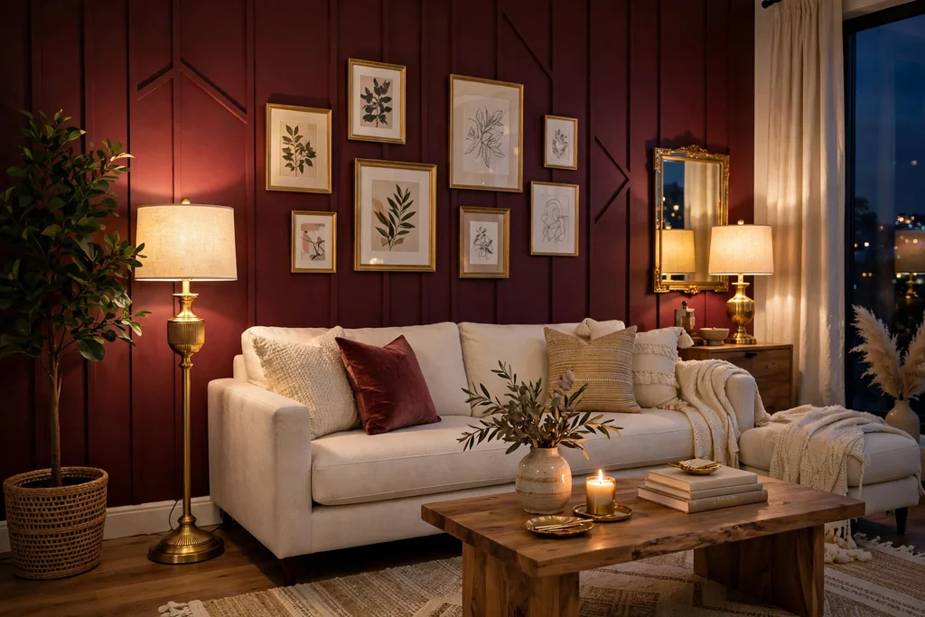
Use burgundy on one wall or in velvet cushions and curtains, with gold in frames, lamps, and a mirror, for a room that feels rich in the evening. Burgundy is a deep red with a brown base, so it reads as warm rather than bright, and gold lifts it without adding another strong color. This palette suits a room used mainly in the evening, where lamplight makes both colors glow.
Keep the other walls in a warm cream and the sofa in a plain neutral, so burgundy and gold have room to stand out. Avoid adding a third jewel tone, such as emerald, or the room can feel busy. A plain rug in cream or soft brown grounds the scheme, and dimmable lamps let you control how deep the burgundy looks at night.
11. Pale Pink and Taupe for a Soft Neutral Room
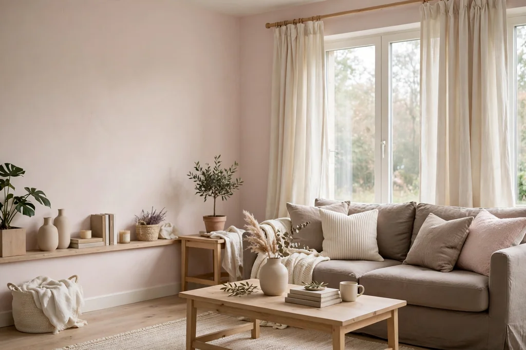
Combine pale pink walls with taupe upholstery, cream curtains, and light wood for a room that feels soft and grown up rather than sweet. Pale pink reads as a warm neutral when the taupe beside it is soft and muted, and taupe stops the pink from feeling too bright. This palette suits a room with good daylight, where pink stays clear instead of turning peach.
Keep wood tones light, use brass or brushed nickel for lamps and handles, and use white for the ceiling and trim. If pink on every wall feels like a big step, paint one wall pale pink and keep the rest taupe first, then extend the pink later if you like it. For more guidance on how one strong neutral behaves across a whole room, these grey kitchen ideas show grey paired with white, wood, and warm metal in the same careful way.
12. Forest Green and Brass for a Library Feel Room
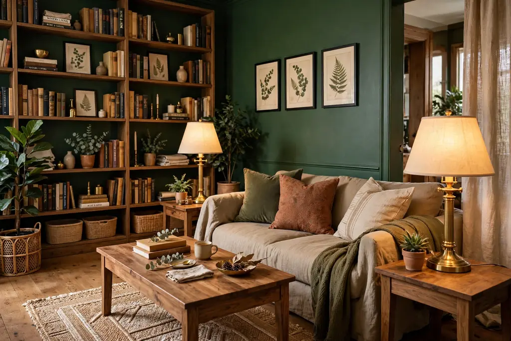
Paint the walls forest green and add brass in lamps, picture frames, and shelf details for a room with a library feel. Forest green is deep enough to make bookshelves and art stand out, while brass keeps it warm and stops it from feeling like a dark cave. This palette suits a room with shelves, a reading chair, and a desk or side table, where the color supports quiet use.
Keep the ceiling and trim in warm white, and use mid wood for shelves and tables so the green has a warm partner. Add cream or tan in cushions and a rug to lift the floor area. Forest green needs decent light, so add a floor lamp beside the reading chair and keep curtains light, or use the green on two walls only in a dim room.
13. Slate Grey and Copper for an Industrial Room
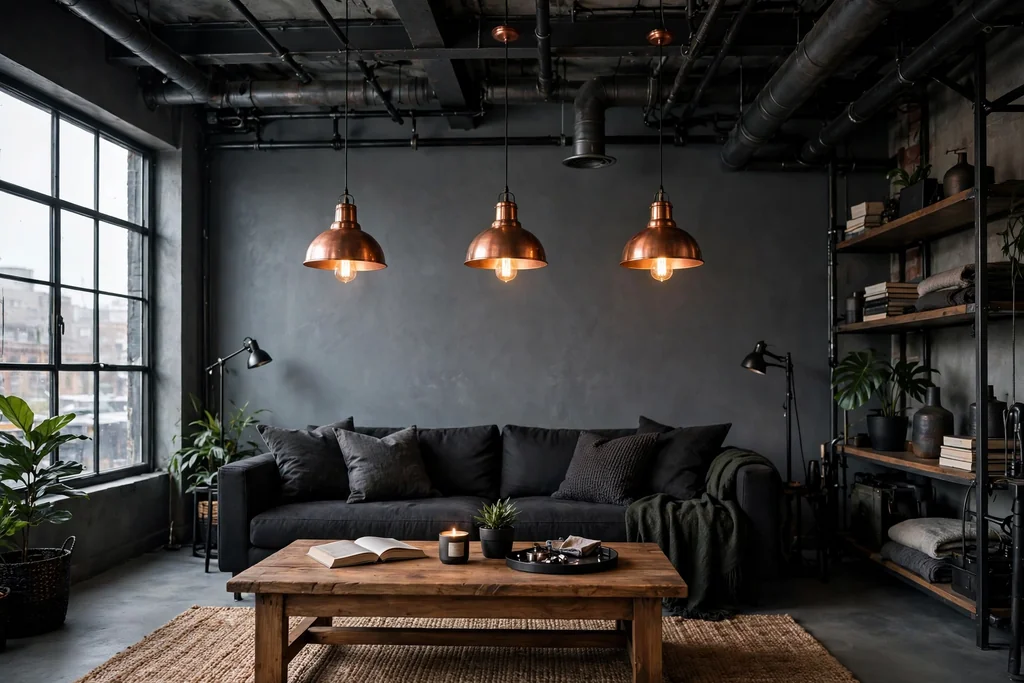
Pair slate grey walls with copper in pendant lights, a tray, and small details for an industrial room that still feels warm. Slate grey is a blue grey that suits concrete, brick, and black metal, while copper is the warm note that stops the room from feeling like a workshop. This palette suits a room with exposed brick, metal shelving, or a concrete floor.
Keep furniture simple, such as a leather or dark fabric sofa and a wood coffee table, and use a plain rug in charcoal or cream. Avoid adding chrome beside copper, since two metals can fight; pick copper as the single metal and repeat it at least twice. Wipe copper details often, since fingerprints show on warm metal, and keep the ceiling pale to balance the mid grey walls.
14. Cream and Chocolate Brown for a Classic Room
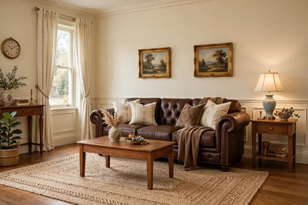
Use cream walls, cream curtains, and a chocolate brown sofa or armchairs for a classic room that suits almost any house. Cream keeps the room bright, while chocolate brown gives it weight and hides everyday wear better than a pale sofa. This palette suits a family room, since both colors are forgiving and easy to add to over time.
Add warmth with mid wood tables, a woven rug, and cushions in tan, rust, or soft gold, but keep the total color count low so the room stays calm. Avoid pairing chocolate brown with black furniture, since the two dark tones can blur together; use wood or cream for tables and shelves instead. This is a good palette if you want a room that still looks right in ten years.
15. Lavender Grey and White for a Quiet Room
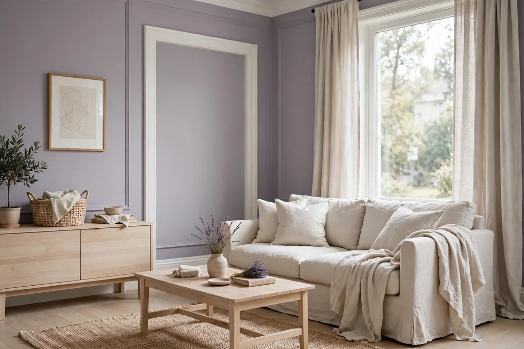
Pair lavender grey walls, a grey with a soft purple tint, with white trim, white bedding style linen, and pale wood for a quiet room that feels restful. Lavender grey reads as a color in daylight and as a soft neutral in the evening, which suits a room used for rest and slow mornings. White keeps it fresh, while cream would warm it more than this palette needs.
Use silver or brushed nickel for lamps and handles, and add one deeper purple cushion or throw for depth. Keep patterns quiet, such as plain linen and one simple stripe, so the wall color stays the main note. Lavender grey can look cold beside warm wood floors, so test it against your flooring first, and pick a warmer grey purple if your room faces north.
16. Rust and Denim Blue for a Warm Casual Room
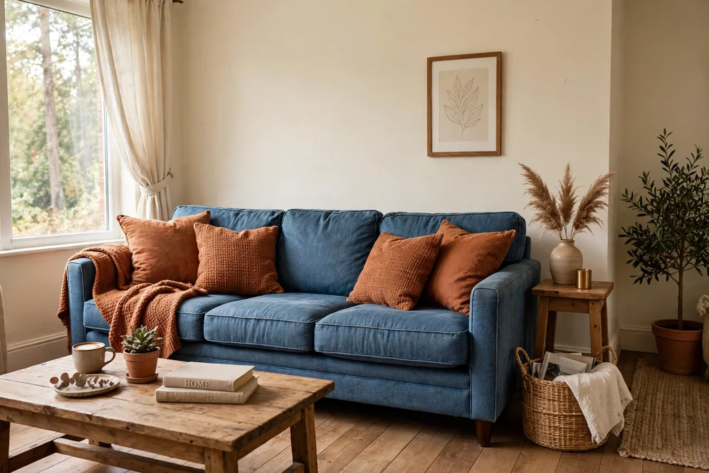
Combine rust cushions, a rust throw, and one rust accent wall with denim blue upholstery and cream walls for a warm casual room. Rust is a warm orange brown that feels lived in, while denim blue cools it down just enough to keep the room from feeling hot. This palette suits a family room with jeans friendly furniture and a wood floor.
Keep the rug in a plain natural tone, such as jute or cream wool, and use black or dark wood for small details. Avoid adding bright orange beside rust, since the two can clash; let rust be the only warm accent. This palette works well with plants, woven baskets, and well worn leather, which all suit its casual mood.
17. Black, White and One Red Accent for a Graphic Room
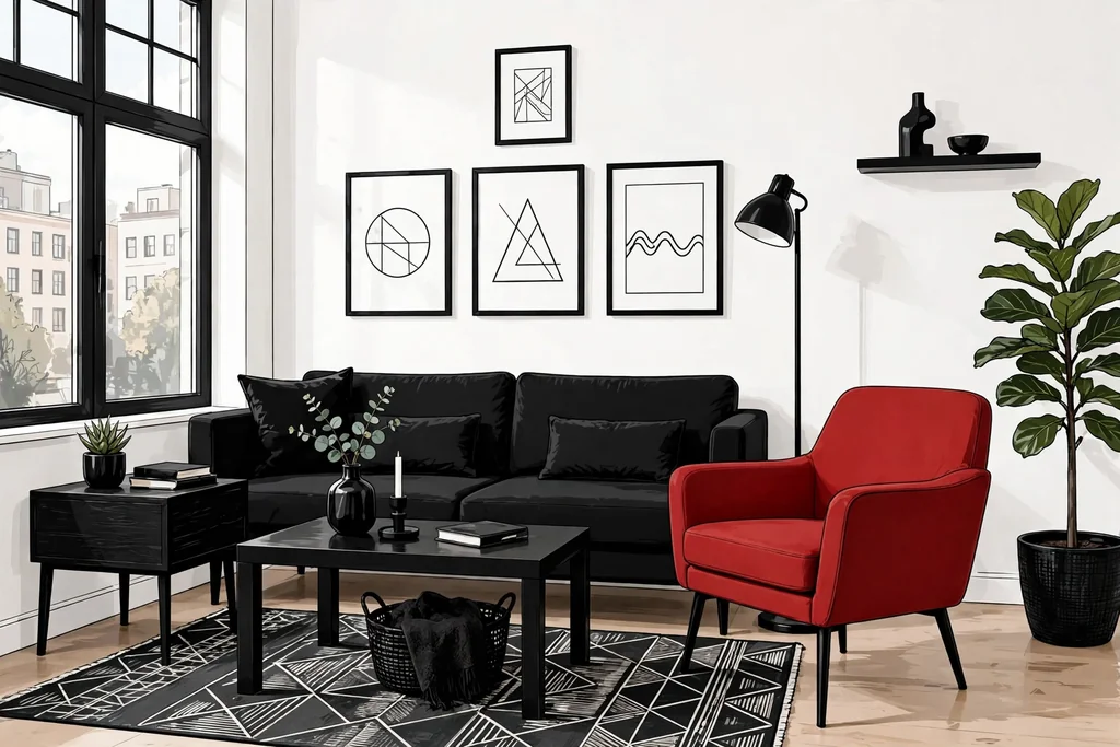
Use black and white as the base, in walls, furniture, and art, and add one red accent, such as a red chair, red cushions, or a red vase, for a graphic room with a clear focal point. Black and white give the room strong lines, while a single red accent stops it from feeling like a showroom. This palette suits a room with simple furniture and bold art, where the shapes matter as much as the colors.
Keep the red to one or two spots only, and repeat the exact same red in both spots so it reads as a choice, not an accident. Use white walls and a pale floor to keep the black from closing the room in, and add wood in one table or frame to soften the contrast. If red feels too loud, try it first in cushions, which are easy to swap.
18. Seafoam and Sand for a Breezy Room
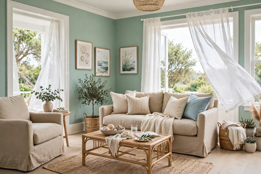
Pair seafoam green walls, a pale blue green, with sand colored upholstery, a light wood floor, and white trim for a breezy room that feels light all year. Seafoam is soft enough for all four walls, while sand warms it up and keeps it from feeling cold. This palette suits a bright room with large windows, where the pale colors can reflect daylight.
Add texture through linen, woven baskets, and a pale rug, and keep patterns simple, such as white and seafoam stripes. Avoid adding a strong navy beside seafoam, or the room loses its soft feel; use one deeper green plant instead for contrast. This palette pairs well with glass and pale ceramic details, which suit its airy mood.
19. Plum and Pale Grey for a Moody Evening Room
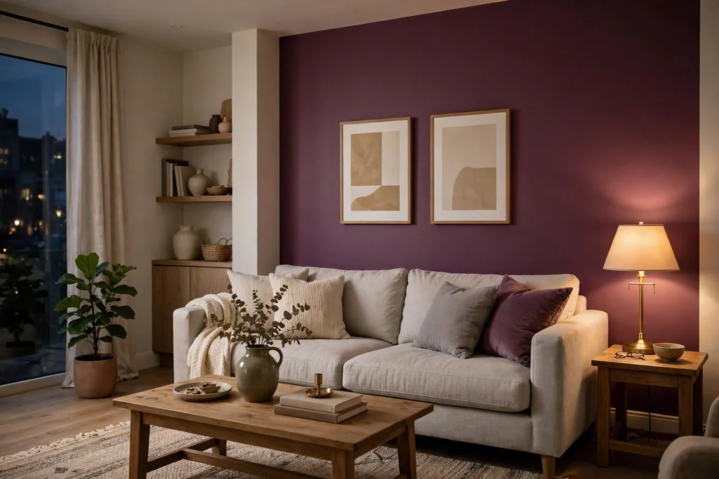
Use plum on one wall or in velvet cushions and curtains, with pale grey walls, a grey sofa, and silver or brushed nickel details, for a moody evening room. Plum is a deep purple with a red base, so it reads as warm rather than cold, and pale grey keeps the room from feeling heavy. This palette suits a room used mainly in the evening, where lamplight makes plum look rich.
Keep the rug and curtains in pale grey or cream, and avoid adding a second deep color, such as burgundy, beside plum. Use mirrors or glass details to bounce lamplight around, since deep colors absorb light. If plum on a wall feels like a big step, try it first in curtains and cushions, which are easy to change with the seasons.
20. Warm Beige and Burnt Orange for an Autumn Room
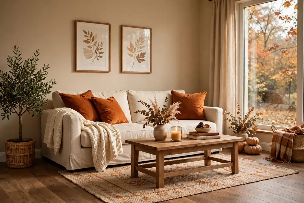
Paint the walls warm beige and add burnt orange in cushions, a throw, and one piece of art for an autumn room that feels warm without needing a seasonal redecoration. Beige keeps the room calm all year, while burnt orange gives it a clear warm note that suits wood floors and leather. This palette suits a room with warm wood, woven textures, and a fireplace or a reading corner.
Keep the sofa in beige or cream, and use dark wood or black for small details to ground the orange. Avoid adding bright yellow beside burnt orange, since the two warm tones can fight; let orange be the only strong warm accent. Swap the orange cushions for cream ones in summer if you want the room to feel cooler for a few months.
21. Cool White and Ice Blue for a Bright Minimal Room
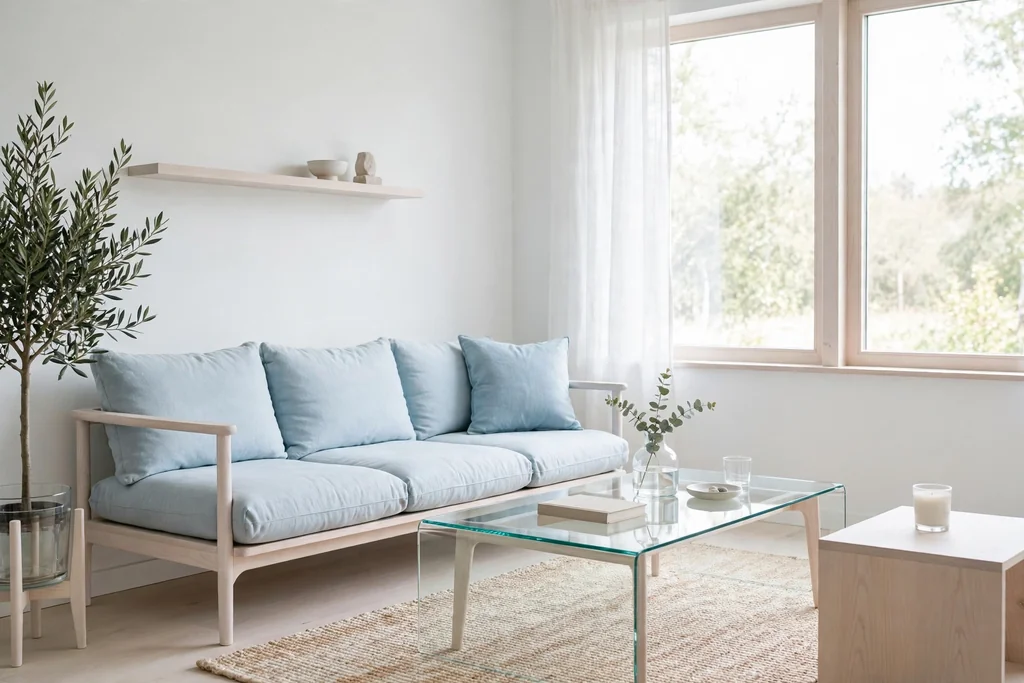
Paint the walls cool white and add ice blue in cushions, art, and one chair for a bright minimal room that feels open and tidy. Cool white reflects light well, which suits a small or dim room, while ice blue gives it a faint color note without breaking the minimal feel. This palette suits a room with simple furniture, clear surfaces, and one or two pieces of art.
Keep wood tones pale, such as ash or light oak, and use chrome or brushed nickel for lamps and handles. Avoid adding warm cream beside cool white, since the two whites can clash; pick one white and use it for walls, trim, and ceiling. A plain rug in pale grey or ice blue grounds the scheme, and a single plant adds the only green note the room needs.
22. Layered Neutrals with Texture for a Room Without Strong Color
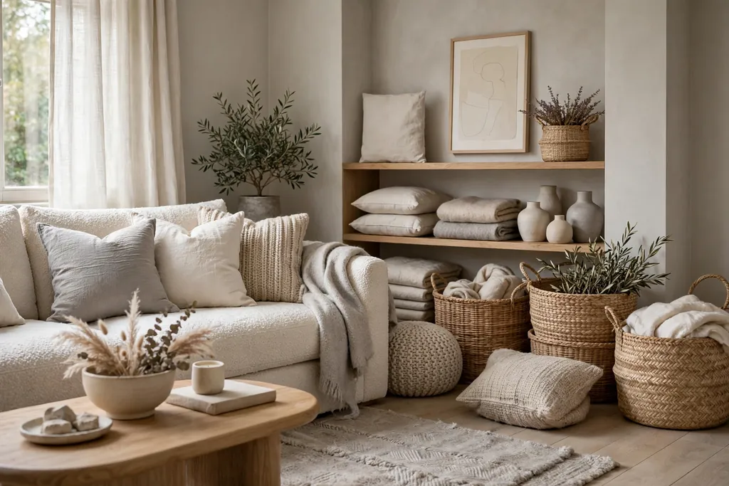
Use layered neutrals, in white, cream, beige, and soft grey, and let texture do the work, through boucle, linen, wool, wood grain, and woven baskets, for a room without a strong color. This palette suits a room where you want calm above all else, or a room with a strong view, since the neutrals let the view lead. The interest comes from touch and tone, not from color contrast.
Mix at least three textures, such as a boucle chair, a linen sofa, and a wool rug, so the neutrals do not blur into one flat tone. Add one dark note, such as a dark wood frame or a black lamp base, to give the room an outline. Keep the wall color in a single warm white, and vary the neutrals in furniture and soft furnishings, so the room feels layered rather than blank.
Conclusion
A good living room palette is less about finding a rare color and more about giving each color a job and a place. Start with the mood you want in the evening, since that is when most living rooms get used, then pick one main color, one supporting color, and a calm base. Test a large sample in your own light, repeat the accent color once more, and keep the rest of the room simple. Save the palette you like best, and try it one wall or one piece of furniture at a time.
FAQs
1. How many colors should a living room palette have?
Three is a good number for most rooms: one main color, one supporting color, and one neutral for walls, trim, or floors. A fourth color works only if it is a small accent, such as a metal finish or a single cushion color, repeated in two spots. More than four strong colors usually makes a room feel busy, even if each color looks good on its own.
2. Should the sofa match the wall color?
No, the sofa should sit beside the wall color, not match it exactly. If the sofa matches the walls, the room can look flat and the furniture can disappear. Pick a sofa one or two steps lighter or darker than the walls, or in a calm neutral, so the seating area reads as its own zone. Use cushions to link the sofa color back to the walls.
3. What color palette suits a small living room best?
Pale, warm palettes suit small rooms best, such as warm white with sage, butter yellow with soft grey, or cool white with ice blue. Keep the strongest color to one wall or to soft furnishings, and keep the floor and ceiling pale so the room feels taller. Mirrors and light curtains help too, since they bounce daylight around a compact room.
4. How do I test a living room color before painting the whole room?
Paint a large sample board, at least the size of a cushion, and move it between two walls. Check it in morning light, midday light, and evening lamplight, and beside your floor, sofa fabric, and rug. Live with the sample for a few days before you buy a full can, since color looks stronger across four walls than on a small chip.
5. Can I mix warm and cool colors in one living room?
Yes, if one side leads and the other supports it. For example, warm wood and cream can support a cool dusty blue wall, or a cool grey sofa can sit beside warm terracotta cushions. The mix fails when warm and cool colors are used in equal strength, since neither leads. Pick a lead temperature, then use the other temperature in smaller amounts.
6. What trim color works with most living room palettes?
A simple white or warm cream trim works with most palettes in this guide. Use warm cream beside warm palettes, such as terracotta, olive, and beige, and a cleaner white beside cool palettes, such as dusty blue, seafoam, and ice blue. Keep the ceiling in the same trim color unless the palette is designed to wrap the whole room in one color.