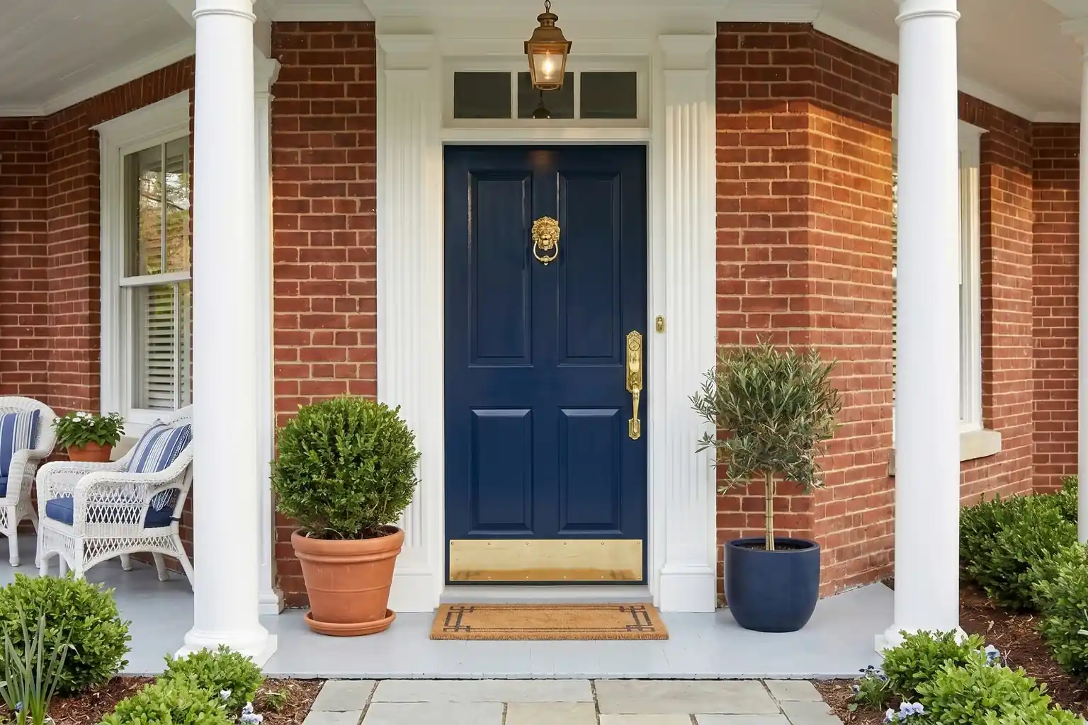
Blue is one of the most flexible front door colors because it runs from near black navy to pale sky, and each depth suits a different house. These 34 blue front door colors are organized by shade family, with the undertone, the house styles each one flatters, and the hardware finish that pairs well with it. Read the undertone notes first, since a blue that leans green behaves very differently from one that leans gray. Then narrow your list to three shades and test them on the door before you commit to a full repaint.
Key Takeaways
- Start with undertone: green leaning blues feel fresh and coastal, gray leaning blues feel calm and classic, and clear blues feel bold and modern.
- Dark blues such as navy, midnight, and indigo act almost like neutrals and suit brick, stone, and white siding.
- Light blues work best on shaded or north facing entries, where deep shades can read almost black.
- Hardware is part of the color choice: brass warms a cool blue, black sharpens it, and nickel keeps it quiet.
- Always test two or three sample shades on the actual door and check them morning, noon, and evening before painting.
1. Classic Navy
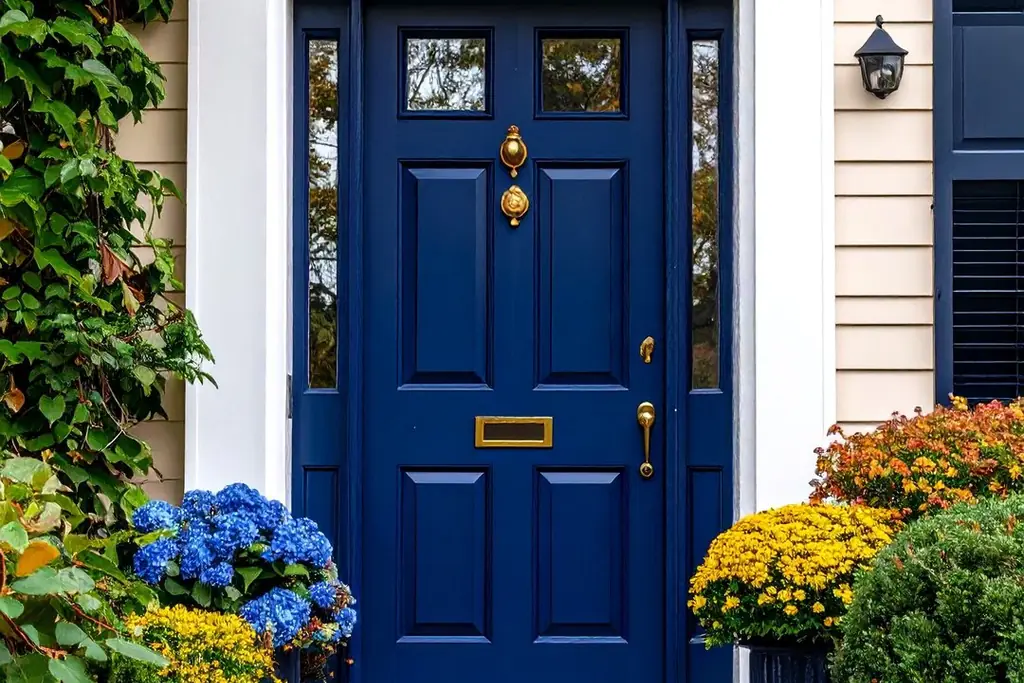
Classic navy is a deep, slightly gray leaning blue that reads almost neutral from the street. It suits colonial, craftsman, and traditional brick homes, and it holds up well against white or cream siding. Pair it with polished brass or antique brass hardware, which warms the cool depth and keeps the entry from feeling flat. Choose a satin or semi gloss finish so the color keeps its richness in flat midday light.
2. Midnight Blue
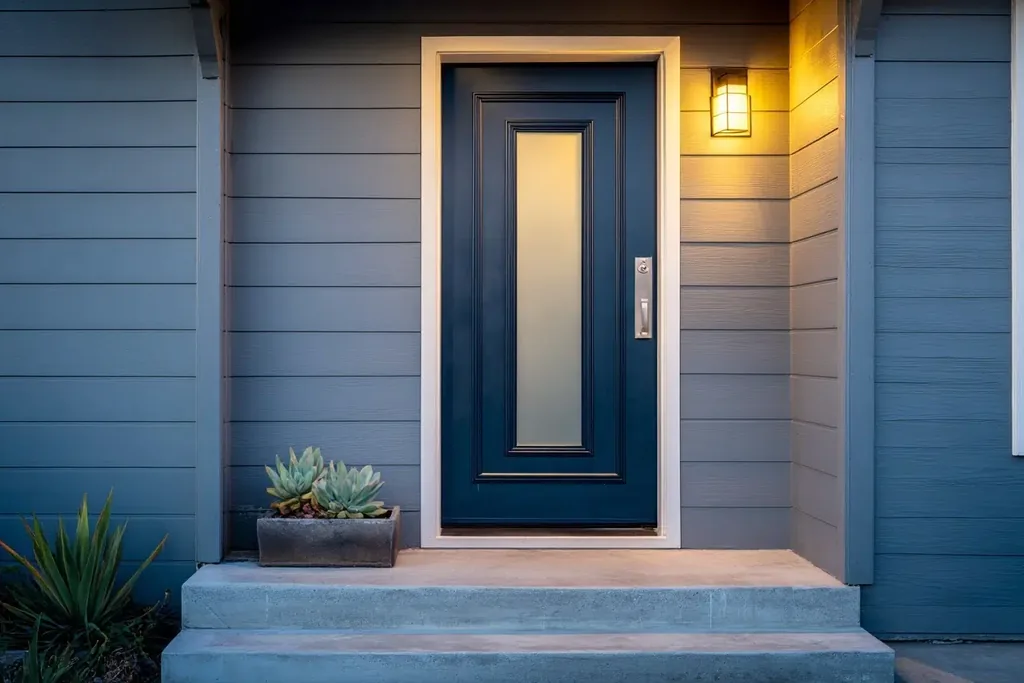
Midnight blue is darker than navy, with a soft black undertone that makes it read nearly black in shade and clearly blue in sun. It fits modern farmhouse and contemporary homes with pale siding or light stone. Use bright nickel or chrome hardware for a crisp line against the dark panel. Because midnight can hide detail, it works best on doors with simple panels or full glass that catches the light.
3. Royal Sapphire
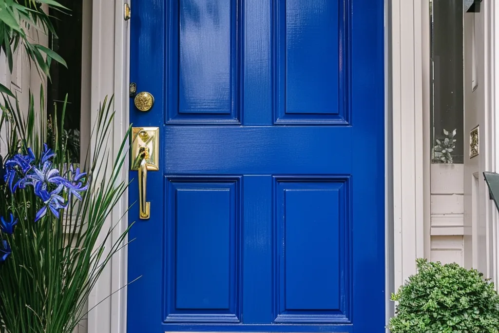
Royal sapphire is a saturated, clear blue with no gray in it, so it stays vivid even on a shaded porch. It suits stucco, Mediterranean inspired, and white painted brick homes that can carry a strong color note. Keep hardware simple in brushed nickel so the door stays the single bold element. This shade shows brush marks more than muted blues, so spray or use a high quality brush and level the coats carefully.
4. Cobalt Blue
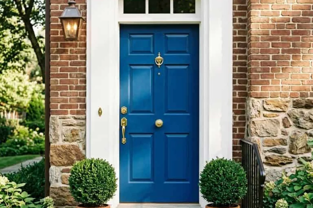
Cobalt is a bright, slightly violet leaning blue that feels energetic and modern. It works on mid century homes, plain ranch facades, and cottages that need one strong accent against quiet siding. Matte black hardware sharpens cobalt and keeps the look graphic rather than playful. Balance the door with a plain wreath and restrained porch decor, because the color already does most of the work at the entry.
5. Cornflower Blue
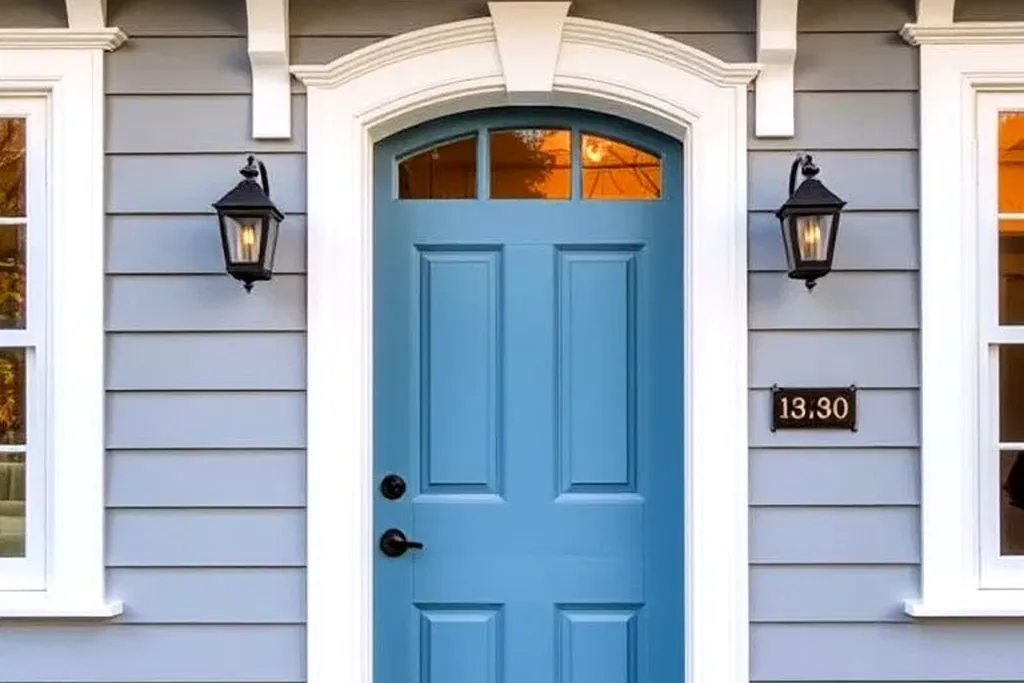
Cornflower is a clear mid tone blue with a soft violet hint, lighter than sapphire and calmer than cobalt. It is a natural fit for cottages, cape cod homes, and houses with flower filled front beds. Antique brass or oil rubbed bronze hardware adds a little age so the color feels settled rather than new. Cornflower fades gracefully, but a quality exterior paint still matters on a south facing door.
6. Powder Blue
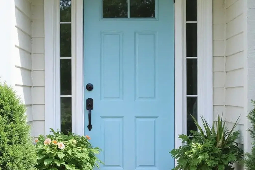
Powder blue is a pale, slightly gray tint that feels clean and quiet at the entry. It suits coastal homes, pale brick, and gray siding where a strong door color would fight the facade. Polished nickel or chrome hardware keeps the palette cool and light. Powder blue shows dirt and scuffs faster than deeper shades, so plan on a wipe down each season and expect the kick plate area to need touch ups first.
7. Pale Sky Blue
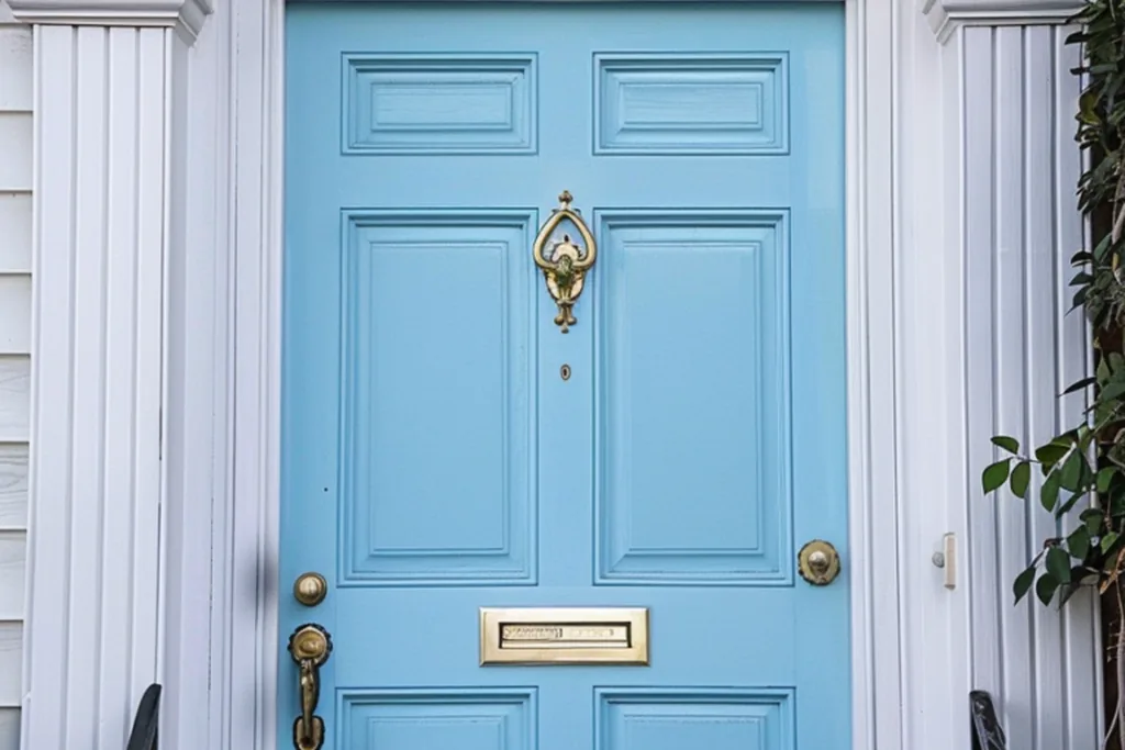
Pale sky blue is the lightest clear blue on this list, with almost no gray, so it reads fresh in bright sun. It belongs on beach cottages, small bungalows, and homes with white trim and light landscaping. White or satin nickel hardware keeps the whole entry airy. On a very sunny facade this shade can wash out to near white, so test it one step deeper than the swatch you first pick.
8. Robin’s Egg Blue
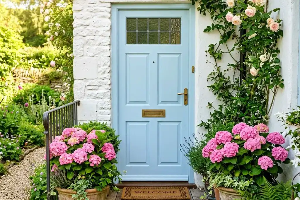
Robin’s egg blue is a soft blue green tint, warmer and greener than sky blue. It suits southern porches, Victorian homes with detailed trim, and cottages with brick paths. Aged brass or unlacquered brass hardware deepens its vintage feel. Because it leans green, hold it against your siding in daylight: next to yellow toned stone it can look greener than the sample card suggests.
9. Teal Blue
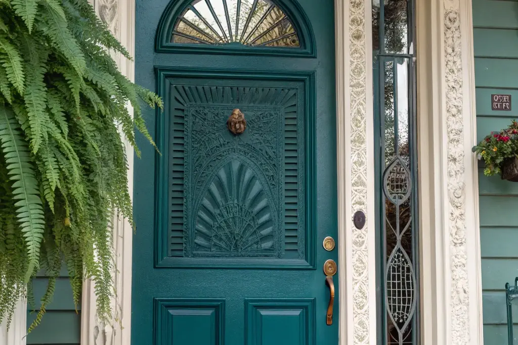
Teal sits halfway between blue and green, rich and saturated without going dark. It pairs well with warm wood siding, red brick, and desert or southwestern style homes. Copper or oil rubbed bronze hardware picks up the warmth in the brick and timber around it. Teal is a forgiving mid depth shade that hides dust well, which makes it practical for doors on busy streets.
10. Peacock Blue
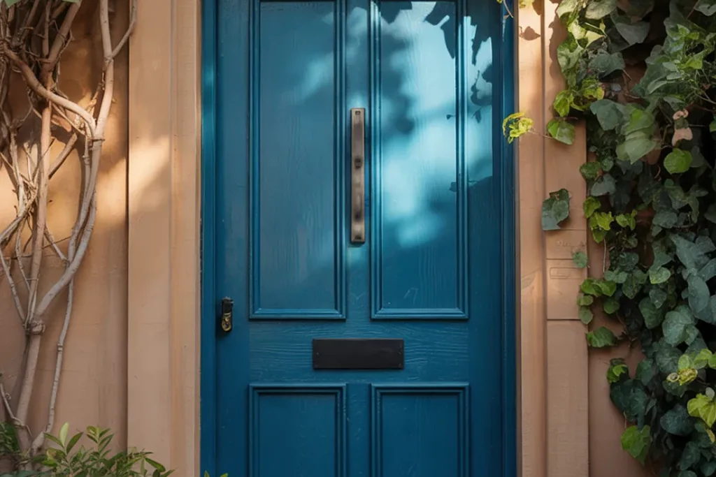
Peacock blue is a deep blue green with a jewel tone intensity, darker and moodier than teal. It suits eclectic, Victorian, and arts and crafts homes, especially with dark trim or stained wood around the entry. Gold toned or antique brass hardware underlines its richness. Keep the porch palette simple beside it: one planter pair and a plain mat let the door carry the color story.
11. Slate Blue
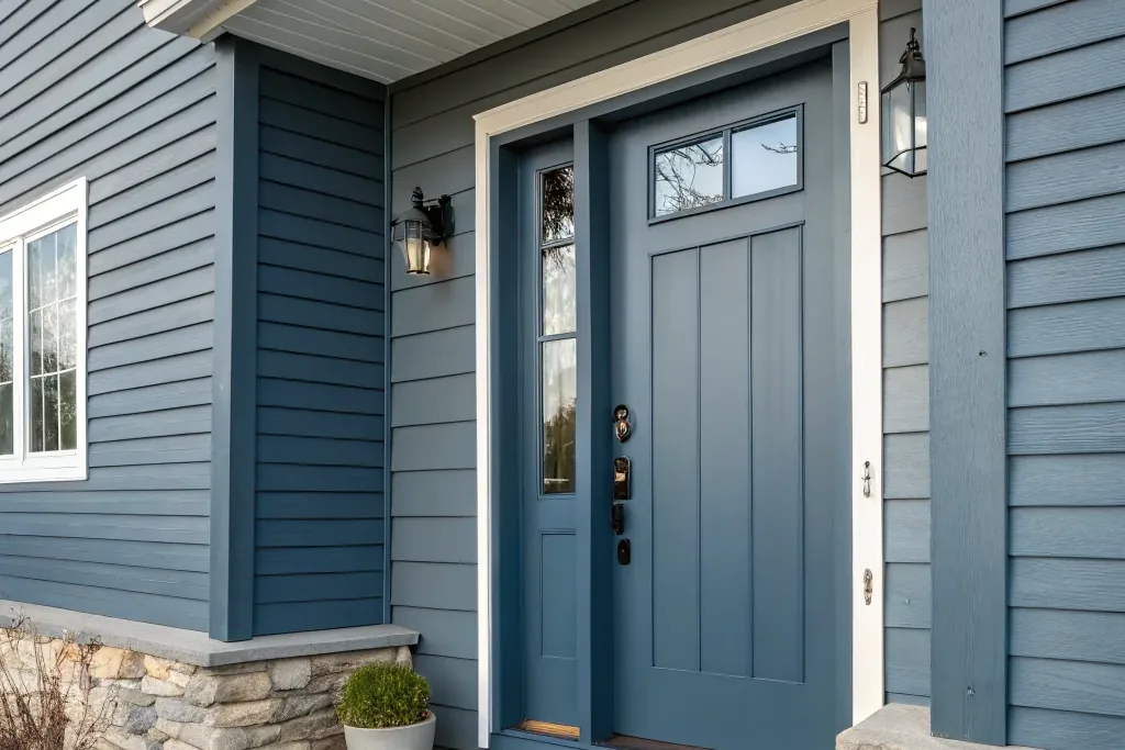
Slate blue is a gray heavy mid tone that reads calm and tailored from the street. It is one of the safest blues for stone houses, gray siding, and traditional suburban facades because it borrows color from the masonry. Matte black or pewter hardware fits its muted character. Slate can look flat on an overcast day, so a semi gloss finish helps it keep a little life and sheen.
12. Steel Blue
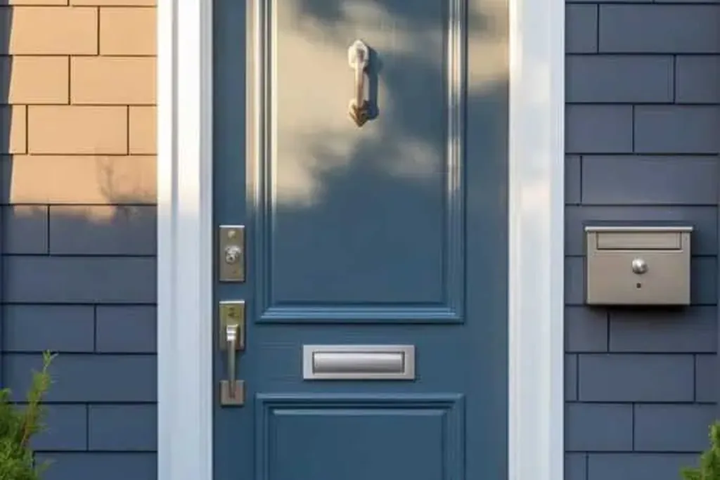
Steel blue is a cool, medium gray blue with a faint metallic feel, deeper than slate and cleaner in tone. It suits industrial, modern, and minimalist homes with concrete, black window frames, or pale stucco. Stainless or brushed nickel hardware continues the cool, precise line. Avoid warm brass here unless the house has other warm notes, since the mix can make the steel tone look unintentionally green.
13. Denim Blue
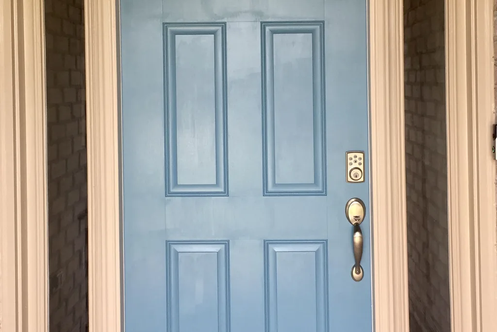
Denim blue is a dusty mid blue that mimics worn indigo fabric: casual, slightly faded, and easy to live with. It fits farmhouse, ranch, and relaxed suburban homes, especially with white board and batten siding. Black hardware gives it a tidy outline, while a natural wood bench or planters echo its informal feel. Denim hides scuffs well and suits households that want color without formality.
14. Indigo
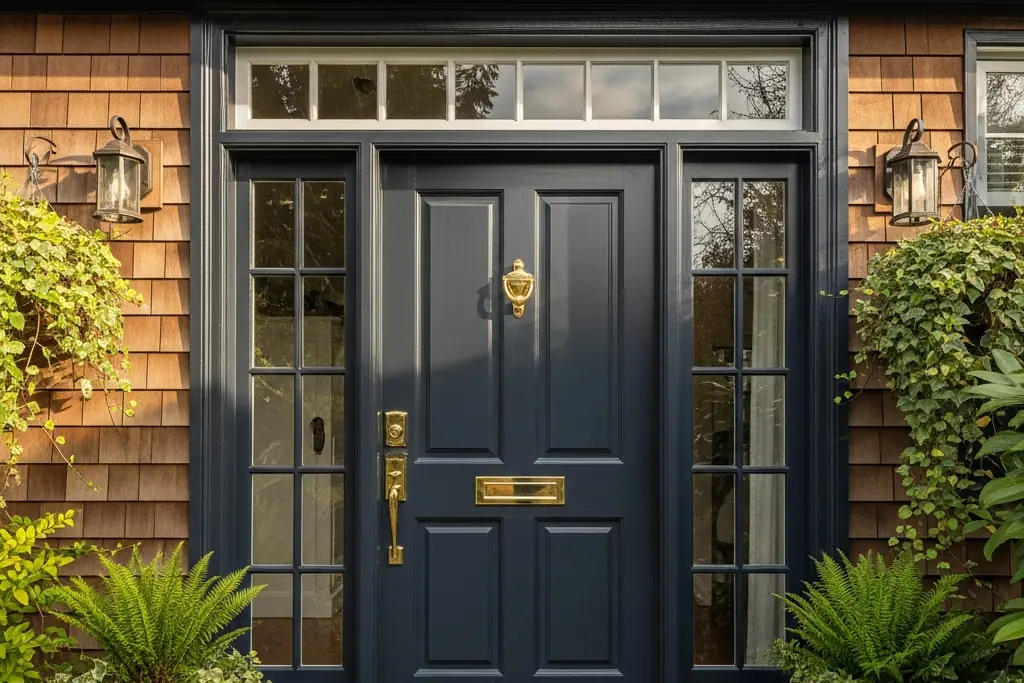
Indigo is a deep blue with a clear violet undertone, sitting between navy and purple. It suits shingle style homes, arts and crafts facades, and houses with dark roofs where a straight navy might disappear. Antique brass hardware warms the violet edge and keeps it welcoming. Check indigo at dusk before committing: in low light the purple note strengthens, which some owners love and others find too much.
15. Periwinkle
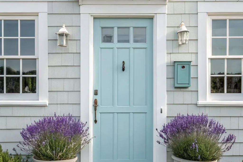
Periwinkle is a light blue violet, softer than cornflower and a little playful. It works on cottages, small colonials, and homes with lavender or purple toned flower beds nearby. Satin nickel hardware keeps it fresh, and white trim gives it the contrast it needs to read as a deliberate color. Periwinkle can look sweet on the wrong house, so it pairs best with simple architecture and tidy landscaping.
16. Dusty Blue
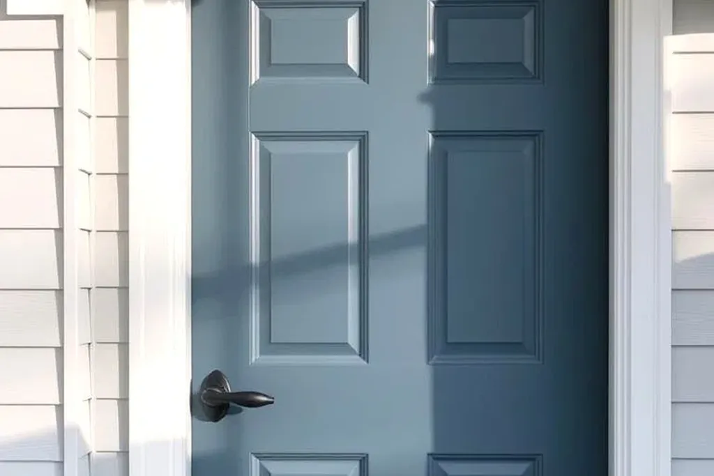
Dusty blue is a muted mid tone with a gray veil over it, the faded look of old painted wood. It suits French country, cottage, and older homes where a bright new color would feel out of place. Oil rubbed bronze or aged pewter hardware matches its softness. Dusty blue blends quietly with gray roofs and weathered stone, so add contrast at the entry with a light colored mat or pale planters.
17. French Blue
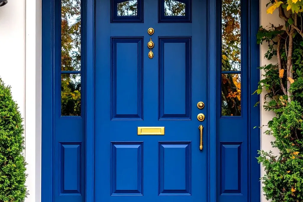
French blue is a clean mid tone with a balanced undertone, neither green nor gray, inspired by painted shutters in French villages. It suits provincial, cottage, and traditional homes with cream or warm white siding. Polished brass hardware is the classic partner and lifts the color on cloudy days. French blue also works as a repeat color on shutters, which ties a plain facade together without more contrast.
18. Aegean Blue
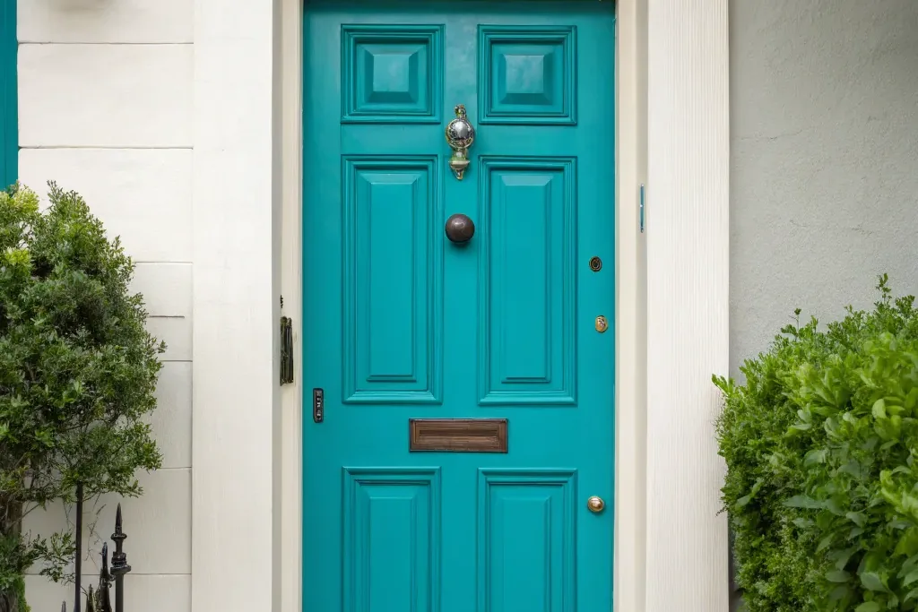
Aegean blue is a clear sea blue, greener than French blue and brighter than teal, recalling Mediterranean doors against whitewash. It suits stucco, coastal, and Spanish inspired homes with white or sand colored walls. Keep hardware in brushed nickel or weather resistant brass. This shade looks best with sun on it; on a permanently shaded entry it can turn somber, so test it through a full day first.
19. Turquoise
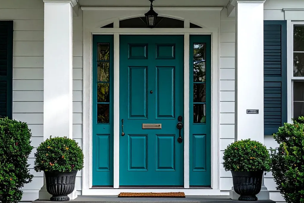
Turquoise is a bright blue green, lighter and fresher than teal, with a cheerful retro character. It suits mid century homes, adobe and southwestern facades, and beach houses with pale siding. Simple black or white hardware keeps it from tipping into theme territory. Turquoise is a strong personality color: sample it on the full door rather than a small board, because the area of color changes how bold it feels.
20. Aqua Blue
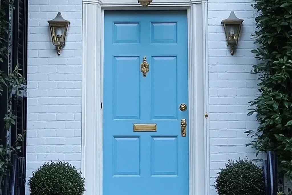
Aqua is a pale, clear blue green tint, the lightest of the green leaning blues here. It belongs on coastal cottages, small porches, and homes with white trim and shell or gravel paths. Chrome or satin nickel hardware keeps the effect clean and breezy. Like other pale tints, aqua shows marks easily, so a washable semi gloss paint and a door mat that actually gets used will help it stay fresh.
21. Blue Gray
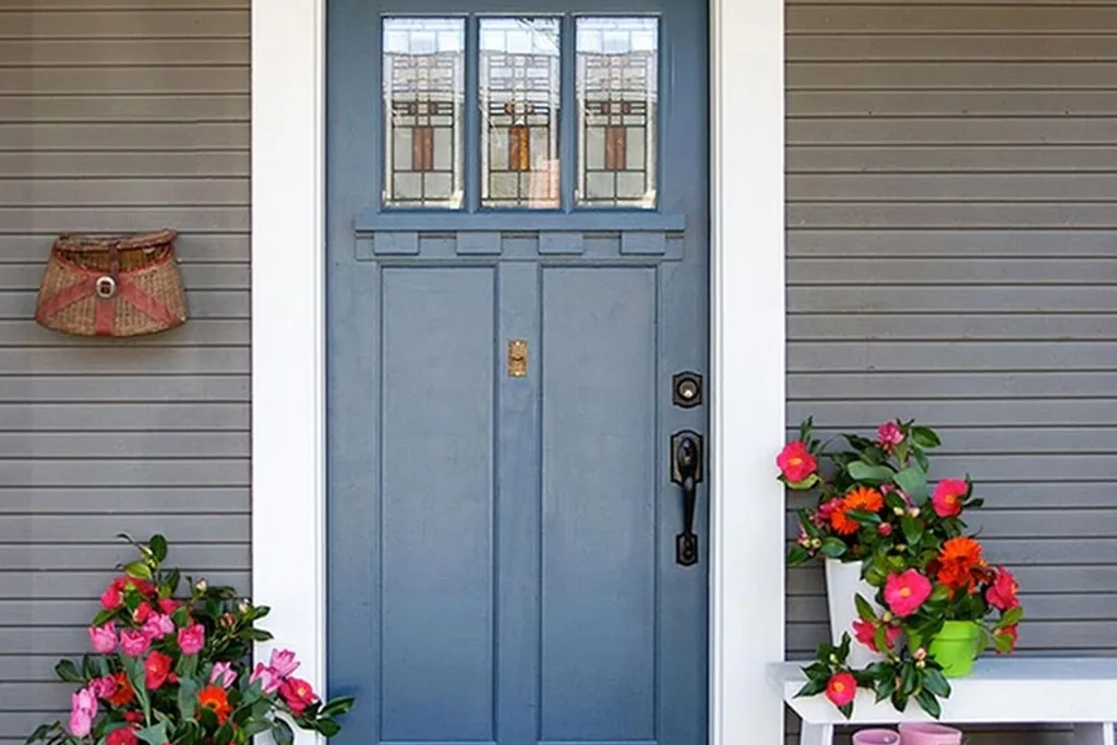
Blue gray is the most neutral option on this list, a gray first with a clear blue cast behind it. It suits almost any house style, especially gray stone, weathered shingles, and homes where the door should whisper rather than shout. Matte black hardware gives it structure, and a black mailbox or light fixture nearby completes the restrained palette. If you plan to sell soon, this is one of the safest shades to choose.
22. Cadet Blue
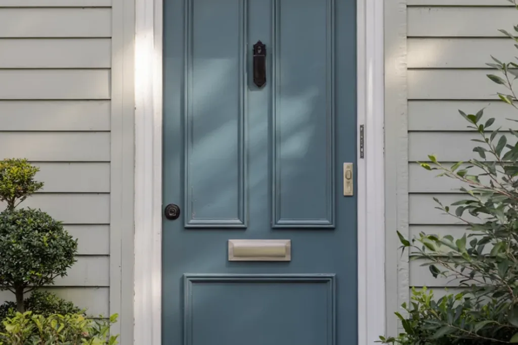
Cadet blue is a medium gray blue, a step deeper than blue gray and traditionally used on uniforms, so it reads tidy and composed. It suits colonial revival, cape cod, and brick homes with white trim. Pewter or brushed nickel hardware fits its even tempered tone. Cadet is a good middle path for owners who find navy too dark and powder blue too pale for their facade.
23. Wedgwood Blue
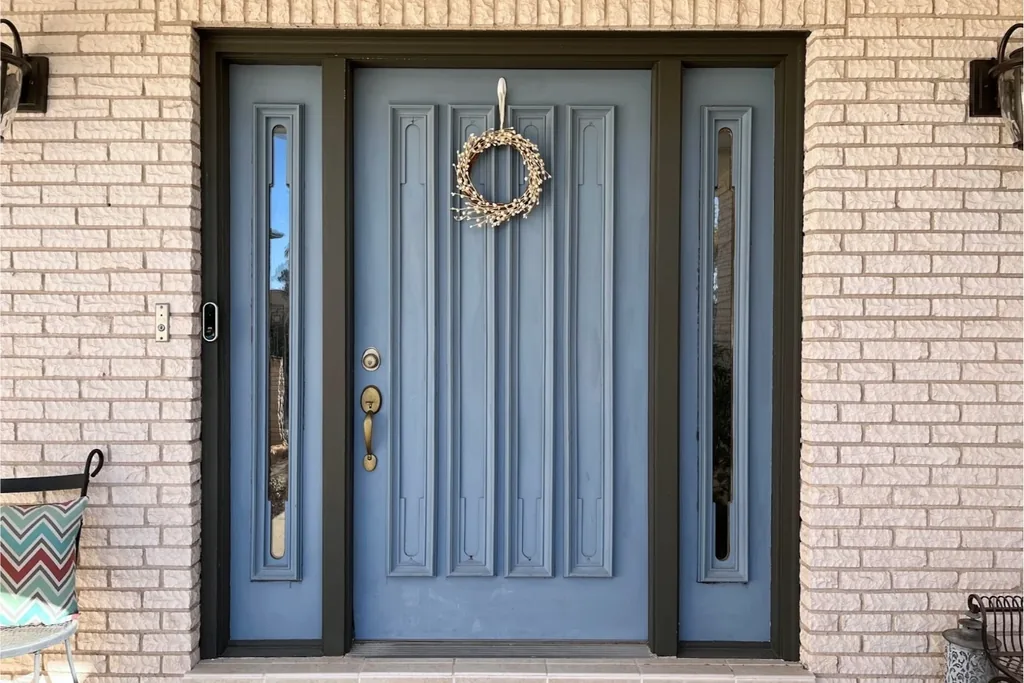
Wedgwood blue is a soft, chalky mid light blue with a powdery gray finish, named for the classic pottery it resembles. It suits English cottage, Georgian, and traditional homes with cream trim and climbing plants. Antique brass hardware and a brass mail slot continue the heritage feel. The chalky quality mutes glare on sunny porches, but choose a durable exterior formula since matte looking finishes can mark more easily.
24. Delft Blue
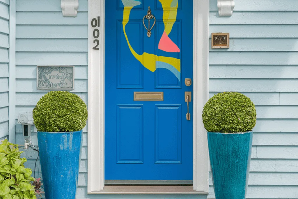
Delft blue is a clear, medium china blue, brighter than Wedgwood and cleaner than French blue, echoing Dutch tilework. It suits Dutch colonial, cottage, and white sided homes, and it looks especially crisp with a white door frame. Polished nickel hardware keeps the blue and white scheme sharp. Delft rewards neat edges, so mask the frame carefully and keep the trim repainted white to hold the contrast.
25. Colonial Blue
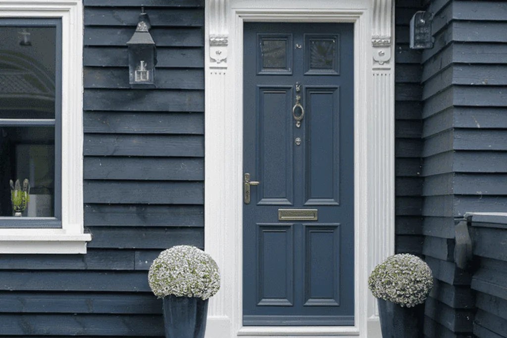
Colonial blue is a muted, gray softened mid blue based on historic American paint tones, deeper than dusty blue but never bright. It suits colonial revival, saltbox, and older brick homes where authenticity matters. Black iron or oil rubbed bronze hardware matches its period character. Colonial blue pairs naturally with a brass or copper lantern beside the door, and with natural wreaths through the seasons.
26. Charcoal Blue
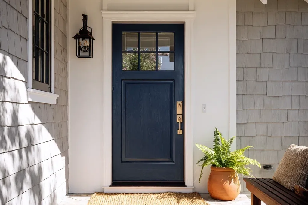
Charcoal blue is the darkest shade here, a blue black that reads as soft black from a distance and reveals its blue only up close or in sunlight. It suits modern and transitional homes, dark siding, and entries framed in black. Choose hardware in black for a seamless look, or brass if you want one clear point of contrast. On a north facing door it can read pure black, so confirm that is the effect you want.
27. Cerulean Blue
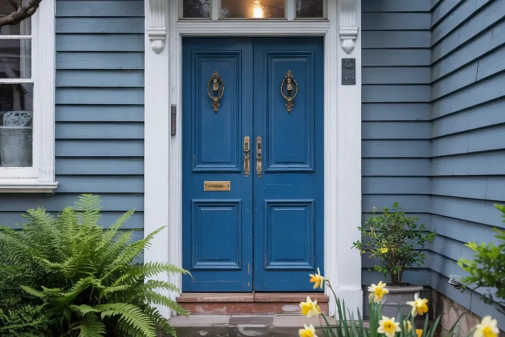
Cerulean is a bright, clear sky leaning blue, deeper than sky tint and cleaner than cornflower. It suits contemporary homes, plain facades that need one optimistic note, and coastal houses with white railings. Brushed stainless or chrome hardware keeps the mood crisp. Cerulean can feel exposed on a house with no other color, so echo it once more in a planter glaze or house numbers to settle it.
28. Ice Blue
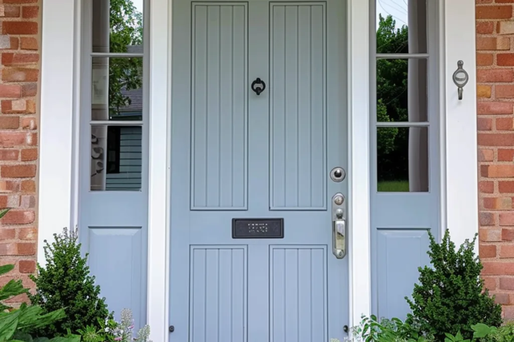
Ice blue is a very pale blue with a cool gray base, almost white but with a definite chill of color. It suits Scandinavian inspired, modern, and minimalist homes with pale render or light wood cladding. Matte black hardware gives ice blue the contrast it needs to register as a color at all. On bright white siding it may disappear, so it works better against light gray, stone, or natural timber.
29. Blue Green
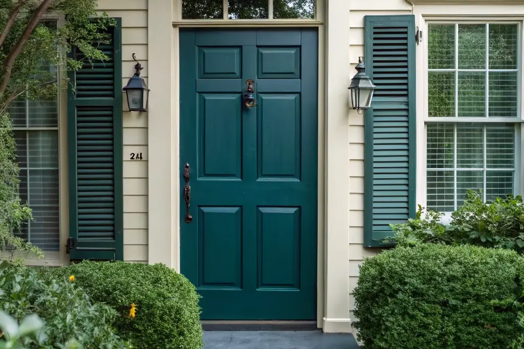
Blue green in its mid tone form is greener than teal is blue, a lagoon shade with real depth. It suits tropical, coastal, and eclectic homes, and it looks at home beside lush planting and warm wood. Weathered brass or copper hardware suits the organic feel. Keep nearby greens in mind when testing: against blue toned foliage it reads green, and against yellow greens it reads bluer.
30. Petrol Blue
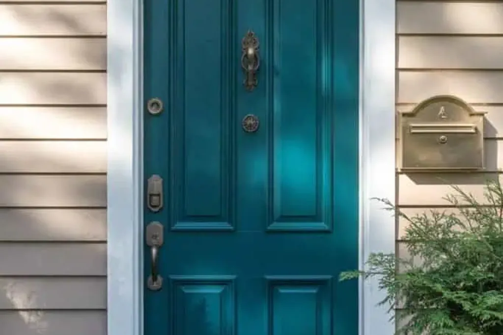
Petrol blue is a dark blue green, deep and slightly inky, the moody end of the teal family. It suits Victorian terraces, modern townhouses, and homes with black or charcoal trim. Antique brass hardware glows against it and is the classic city pairing. Petrol is dramatic on a small entry, so keep the step and porch tidy and let lighting do the decorating after dark.
31. Smoky Blue
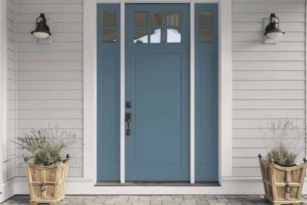
Smoky blue is a hazy mid tone, grayed like slate but softer and a touch warmer. It suits transitional homes, gray brick, and facades with mixed materials where a clear blue would clash. Pewter or satin nickel hardware respects its quiet tone. Smoky blue is a good choice beside busy stonework, because it calms the wall around the door instead of competing with the pattern in the masonry.
32. Marine Gray Blue
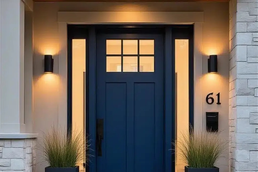
Marine gray blue is a desaturated deep blue, the color of a calm sea under cloud, grayer than navy and softer than indigo. It suits coastal traditional, shingle, and craftsman homes, especially with weathered wood or gray shingles nearby. Oil rubbed bronze hardware adds warmth without shine. This shade changes gently through the day, from gray at dawn to clearly blue by afternoon, which many owners count as its charm.
33. Primary Blue
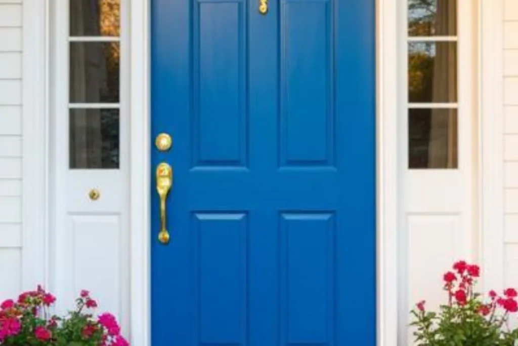
Primary blue is a pure, saturated mid blue with no gray, green, or violet lean: the boldest straightforward blue you can choose. It suits modern homes, plain white facades, and playful cottages where the door is meant to be the landmark of the street. Gloss black or white hardware keeps the statement clean. Use a high gloss finish if you want the full graphic effect, and keep the porch styling minimal.
34. Chambray Blue
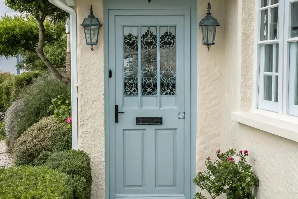
Chambray blue is a light, heathered looking blue with a soft gray white mix, like the woven fabric it is named for. It suits relaxed cottages, farmhouse entries, and homes with pale stone or limewashed brick. Brushed nickel or weathered zinc toned hardware fits its easy character. Chambray is gentle enough for a door in full sun, and it pairs well with natural linen colored wreaths and unglazed clay planters.
Conclusion
The right blue front door color comes down to three checks: the undertone against your siding, the depth against your light, and the hardware against both. Dark blues such as navy, indigo, and petrol give a calm, classic entry on almost any house. Mid tones like French blue, slate, and denim are the flexible middle ground, and pale blues from powder to ice suit bright, coastal, and cottage facades. For seasonal balance around the entry, the same restraint used in these fall living room decor ideas works outdoors too: one strong color, natural texture, and clear surfaces. Pick three finalists, paint large samples, and live with them for a day before you decide.
Save this list on Pinterest before you buy paint, and pin the shades closest to your house style so you can compare them side by side at the store.
FAQs
How do I choose between navy and a lighter blue for my front door?
Start with the light your entry gets. A shaded or north facing door makes every color look darker, so a mid blue there can read like navy, while a sunny facade can support true navy without going black. Then check your siding: navy gives strong contrast on white and cream, while lighter blues sit better on gray or mid tone siding where navy may look heavy. Paint both on sample boards and view them at the door morning and evening.
What hardware finish works with most blue front doors?
Brass is the most flexible partner for blue because its warmth balances both cool gray blues and green leaning teals. Black hardware is the second safe choice and suits modern, farmhouse, and graphic color schemes. Nickel and chrome fit cool, pale, and contemporary blues best. Whichever finish you pick, repeat it on the handle, hinges if visible, and any mail slot or house numbers so the entry reads as one set. General finish guidance is also covered on the Benjamin Moore front door color page.
Should a blue front door match blue shutters or trim?
It does not need to match exactly, and an exact match can look flat. A better approach is to keep the door one or two steps deeper than blue shutters, or to let the door be the only blue and keep shutters and trim neutral. If you repeat the color, use the same undertone family: a teal door with gray blue shutters will fight, while a navy door with slate shutters sits comfortably together.
What paint finish is best for a front door?
A satin or semi gloss exterior paint is the usual choice because it resists weather, wipes clean, and shows the door panels with a soft sheen. High gloss gives the most formal, reflective result and suits bold shades like primary blue or cobalt, but it shows every dent and brush mark, so the door surface must be smooth. Avoid flat finishes outdoors, since they mark easily and are harder to wash.
How can I test a blue shade before painting the whole door?
Buy small sample pots of two or three finalists and paint large boards, or paint one panel section of the door itself if you plan to repaint anyway. Live with the samples for at least a full day and check them in morning shade, midday sun, and evening light. Blue shifts more than most colors: gray blues can go flat in dull weather, and green leaning blues can look turquoise in strong sun.
Do blue front doors work with red brick houses?
Yes, brick is one of the best partners for blue because the orange red of brick and the blue of the door sit opposite each other and make both look richer. Navy, slate, teal, and colonial blue are the most reliable choices with red brick. Avoid very pale blues unless the brick is also pale, since a light door can look washed out against strong brick. Brass or black hardware both work; let the mortar color guide you, with warm gray mortar favoring brass.
Can I use a blue front door color on a house with a blue roof or blue siding?
Yes, but separate the shades clearly. If the siding is blue, choose a door at least two steps darker or lighter, and consider a different undertone so the two blues do not blur together. A white or pale door frame helps draw a line between them. With a blue gray roof, most mid and dark door blues work, since the roof reads as a neutral from the street.